Wikipedia:Featured picture candidates/NASA-Apollo8-Dec24-Earthrise.jpg
Earthrise


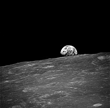
For your consideration, the first-ever photo (by humans) of the Earth rising above the surface of the moon, taken on December 24, 1968, during the Apollo 8 mission by Bill Anders.
- Nominate and support. howcheng {chat} 21:27, 21 August 2006 (UTC)
- Support TomStar81 21:37, 21 August 2006 (UTC)
- Oppose it looks dull. The gray surface of the moon doesn't make it too apealing IMO.Nnfolz 02:18, 22 August 2006 (UTC)
- Support either/both I love it! I'm not sure how you could spruce up the moon's surface - plant flowers? The gray surface juxtaposed with the earth is part of what really draws me to the picture. InvictaHOG 02:20, 22 August 2006 (UTC)
- Comment LOL! Now that I see the color image i would support that one rather than the black & white one (can I do that by the way?).Nnfolz 02:58, 22 August 2006 (UTC)
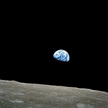
- Comment This is undoubtedly an historic image, but I think it doesn't have the emotional impact of the colour image taken a short time later, which I believe (and according to the article) is the more famous image. Seeing the contrast between the stark, barren and monochramatic moon and the colour and life of Earth, as well as seeing our home planet rendered as something so tiny had a profound effect on how we regarded the planet from that point onward.--Melburnian 02:27, 22 August 2006 (UTC)
- Yeah, I like that one too. I guess it's a question of historic significance (first photo) or greater cultural impact. I could go with either. howcheng {chat} 03:07, 22 August 2006 (UTC)
- Both are nice, in my opinion - InvictaHOG 03:20, 22 August 2006 (UTC)
- Support. may not be color, but historic, clear, and nicely framed. Outriggr 05:09, 22 August 2006 (UTC)
- Support either Glaurung 06:42, 22 August 2006 (UTC)
- Support colored image per Melburnian's reasoning. --WillMak050389 15:23, 22 August 2006 (UTC)
- Support either. Historicaly notable. --Billpg 15:38, 22 August 2006 (UTC)
- Support color image; Weak oppose black & white. The color image is more famous for a reason -- it's a much more compelling image, IMO. -- Moondigger 21:10, 22 August 2006 (UTC)
- Support color image; Oppose B&W The color image is more appealing and just as historically relevant Rtcpenguin 21:38, 22 August 2006 (UTC)
- Support color image - more historically "iconic". --Davepape 00:48, 23 August 2006 (UTC)
- Support colour image -formalising vote as per my earlier comment--Melburnian 02:54, 23 August 2006 (UTC)
- Support monochrome image, but strong oppose color — The color image is far more blurry than the monochrome, plus, Earth is further out. The reason the monochrome version was nominated was because of the sharpness and position of our planet in the photo. Beautiful art doesn't have to be colorful. ♠ SG →Talk 22:25, 23 August 2006 (UTC)
- Support grayscale. Like SG said above, the color has some technical issues, while the grayscale is sharper, more historically significant, and the position of the moon is better. I like the color for its contrast of grayscale and color, but that's all I like about it. --Tewy 01:42, 24 August 2006 (UTC)
- Comment. The difference in sharpness isn't nearly as dramatic as implied above, and the position of Earth w/r/t the moon's horizon is a subjective matter -- I prefer it up and away a bit, which makes for a more balanced composition in the color image. The sharpness of the color image could easily be tweaked with unsharp masking. -- Moondigger 14:31, 24 August 2006 (UTC)
- Support. Wonderful picture, much detail, good subject, etc. Generalnonsensecomic 19:46, 24 August 2006 (UTC)
- Support either/both, especially colour one. --jjron 07:20, 27 August 2006 (UTC)
- Support Colour image, Oppose B&W. Excellent framing on the color version, poor framing on the B&W. Both are historically significant, but the colored version highlights the "pretty blue marble" by the very nature of being in color. Autopilots 04:29, 29 August 2006 (UTC)
Support The colour image is better because it shows the contrast between the two bodies. One is uninhabited and the other is full of life. It is also a great picture because of its sharpness and greyscale. --midnight_rider 01:50, 31 August 2006 (UTC)
Promoted Image:NASA-Apollo8-Dec24-Earthrise.jpg Raven4x4x 08:58, 1 September 2006 (UTC)
🔥 Top keywords: Main PageSpecial:SearchIndian Premier LeagueWikipedia:Featured picturesPornhubUEFA Champions League2024 Indian Premier LeagueFallout (American TV series)Jontay PorterXXXTentacionAmar Singh ChamkilaFallout (series)Cloud seedingReal Madrid CFCleopatraRama NavamiRichard GaddDeaths in 2024Civil War (film)Shōgun (2024 miniseries)2024 Indian general electionJennifer PanO. J. SimpsonElla PurnellBaby ReindeerCaitlin ClarkLaverne CoxXXX (film series)Facebook2023–24 UEFA Champions LeagueYouTubeCandidates Tournament 2024InstagramList of European Cup and UEFA Champions League finalsJude BellinghamMichael Porter Jr.Andriy LuninCarlo AncelottiBade Miyan Chote Miyan (2024 film)