| Sans-serif typeface | |
 | Serif typeface |
 | Serifs (coloured in red) |
In typography and lettering, a sans-serif, sans serif (/ˈsæn(z) ˈsɛrɪf/), gothic, or simply sans letterform is one that does not have extending features called "serifs" at the end of strokes.[1] Sans-serif typefaces tend to have less stroke width variation than serif typefaces. They are often used to convey simplicity and modernity or minimalism. For the purposes of type classification, sans-serif designs are usually divided into these major groups: § Grotesque and § Neo-grotesque, § Geometric, § Humanist and § Other or mixed.

Sans-serif typefaces have become the most prevalent for display of text on computer screens. On lower-resolution digital displays, fine details like serifs may disappear or appear too large. The term comes from the French word sans, meaning "without" and "serif" of uncertain origin, possibly from the Dutch word schreef meaning "line" or pen-stroke.[2] In printed media, they are more commonly used for display use and less for body text.
Before the term "sans-serif" became standard in English typography, a number of other terms had been used. One of these terms for sans-serif was "grotesque", often used in Europe, and "gothic", which is still used in East Asian typography and sometimes seen in typeface names like News Gothic, Highway Gothic, Franklin Gothic or Trade Gothic.
Sans-serif typefaces are sometimes, especially in older documents, used as a device for emphasis, due to their typically blacker type color.
Classification
For the purposes of type classification, sans-serif designs are usually divided into three or four major groups, the fourth being the result of splitting the grotesque category into grotesque and neo-grotesque.[3][4]
Grotesque

This group features most of the early (19th century to early 20th) sans-serif designs. Influenced by Didone serif typefaces of the period and sign painting traditions, these were often quite solid, bold designs suitable for headlines and advertisements. The early sans-serif typefaces often did not feature a lower case or italics, since they were not needed for such uses. They were sometimes released by width, with a range of widths from extended to normal to condensed, with each style different, meaning to modern eyes they can look quite irregular and eccentric.[5][6]
Grotesque typefaces have limited variation of stroke width (often none perceptible in capitals). The terminals of curves are usually horizontal, and many have a spurred "G" and an "R" with a curled leg. Capitals tend to be of relatively uniform width. Cap height and ascender height are generally the same to produce a more regular effect in texts such as titles with many capital letters, and descenders are often short for tighter line spacing.[7] They often avoid having a true italic in favor of a more restrained oblique or sloped design, although at least some sans-serif true italics were offered.[8][9]
Examples of grotesque typefaces include Akzidenz-Grotesk, Venus, News Gothic, Franklin Gothic, IBM Plex and Monotype Grotesque. Akzidenz Grotesk Old Face, Knockout, Grotesque No. 9 and Monotype Grotesque are examples of digital fonts that retain more of the eccentricities of some of the early sans-serif types.[10][11][12][13]
According to Monotype, the term "grotesque" originates from Italian: grottesco, meaning "belonging to the cave" due to their simple geometric appearance.[14] The term arose because of adverse comparisons that were drawn with the more ornate Modern Serif and Roman typefaces that were the norm at the time.[15]
Neo-grotesque

Neo-grotesque designs appeared in the mid-twentieth century as an evolution of grotesque types. They are relatively straightforward in appearance with limited stroke width variation. Similar to grotesque typefaces, neo-grotesques often feature capitals of uniform width and a quite 'folded-up' design, in which strokes (for example on the 'c') are curved all the way round to end on a perfect horizontal or vertical. Helvetica is an example of this. Unlike earlier grotesque designs, many were issued in large families from the time of release.
Neo-grotesque type began in the 1950s with the emergence of the International Typographic Style, or Swiss style. Its members looked at the clear lines of Akzidenz-Grotesk (1898) as an inspiration for designs with a neutral appearance and an even colour on the page. In 1957 the release of Helvetica, Univers, and Folio, the first typefaces categorized as neo-grotesque, had a strong impact internationally: Helvetica came to be the most used typeface for the following decades.[16][b]
Geometric

Geometric sans-serif typefaces are based on geometric shapes, like near-perfect circles and squares.[18] Common features are a nearly-circular capital 'O', sharp and pointed uppercase 'N' vertices, and a "single-storey" lowercase letter 'a'. The 'M' is often splayed and the capitals of varying width, following the classical model.
The geometric sans originated in Germany in the 1920s.[19] Two early efforts in designing geometric types were made by Herbert Bayer and Jakob Erbar, who worked respectively on Universal Typeface (unreleased at the time but revived digitally as Architype Bayer) and Erbar (c. 1925).[20] In 1927 Futura, by Paul Renner, was released to great acclaim and popularity.[21]
Geometric sans-serif typefaces were popular from the 1920s and 1930s due to their clean, modern design, and many new geometric designs and revivals have been developed since.[c] Notable geometric types of the period include Kabel, Semplicità, Bernhard Gothic, Nobel and Metro; more recent designs in the style include ITC Avant Garde, Brandon Grotesque, Gotham, Avenir, Product Sans, HarmonyOS Sans and Century Gothic. Many geometric sans-serif alphabets of the period, such as those authored by the Bauhaus art school (1919–1933) and modernist poster artists, were hand-lettered and not cut into metal type at the time.[23]
A separate inspiration for many types described "geometric" in design has been the simplified shapes of letters engraved or stenciled on metal and plastic in industrial use, which often follow a simplified structure and are sometimes known as "rectilinear" for their use of straight vertical and horizontal lines. Designs which have been called geometric in principles but not descended from the Futura, Erbar and Kabel tradition include Bank Gothic, DIN 1451, Eurostile and Handel Gothic, along with many of the typefaces designed by Ray Larabie.[24][25]
Humanist

Humanist sans-serif typefaces take inspiration from traditional letterforms, such as Roman square capitals, traditional serif typefaces and calligraphy. Many have true italics rather than an oblique, ligatures and even swashes in italic. One of the earliest humanist designs was Edward Johnston's Johnston typeface from 1916, and, a decade later, Gill Sans (Eric Gill, 1928).[26] Edward Johnston, a calligrapher by profession, was inspired by classic letter forms, especially the capital letters on the Column of Trajan.[27]
Humanist designs vary more than gothic or geometric designs.[28] Some humanist designs have stroke modulation (strokes that clearly vary in width along their line) or alternating thick and thin strokes. These include most popularly Hermann Zapf's Optima (1958), a typeface expressly designed to be suitable for both display and body text.[29] Some humanist designs may be more geometric, as in Gill Sans and Johnston (especially their capitals), which like Roman capitals are often based on perfect squares, half-squares and circles, with considerable variation in width. These somewhat architectural designs may feel too stiff for body text.[26] Others such as Syntax, Goudy Sans and Sassoon Sans more resemble handwriting, serif typefaces or calligraphy.
Frutiger, from 1976, has been particularly influential in the development of the modern humanist sans genre, especially designs intended to be particularly legible above all other design considerations. The category expanded greatly during the 1980s and 1990s, partly as a reaction against the overwhelming popularity of Helvetica and Univers and also due to the need for legible computer fonts on low-resolution computer displays.[30][31][32][33] Designs from this period intended for print use include FF Meta, Myriad, Thesis, Charlotte Sans, Bliss, Skia and Scala Sans, while designs developed for computer use include Microsoft's Tahoma, Trebuchet, Verdana, Calibri and Corbel, as well as Lucida Grande, Fira Sans and Droid Sans. Humanist sans-serif designs can (if appropriately proportioned and spaced) be particularly suitable for use on screen or at distance, since their designs can be given wide apertures or separation between strokes, which is not a conventional feature on grotesque and neo-grotesque designs.
Other or mixed

Due to the diversity of sans-serif typefaces, many do not exactly fit into the above categories. For example, Neuzeit S has both neo-grotesque and geometric influences, as does Hermann Zapf's URW Grotesk. Whitney blends humanist and grotesque influences, while Klavika is a geometric design not based on the circle. Sans-serif typefaces intended for signage, such as Transport and Tern (both used on road signs), may have unusual features to enhance legibility and differentiate characters, such as a lower-case 'L' with a curl or 'i' with serif under the dot.[34]
Modulated sans-serifs
A particular subgenre of sans-serifs is those such as Rothbury, Britannic, Radiant, and National Trust with obvious variation in stroke width. These have been called 'modulated', 'stressed' or 'high-contrast' sans-serifs. They are nowadays[when?] often placed within the humanist genre, although they predate Johnston which started the modern humanist genre. These may take inspiration from sources outside printing such as brush lettering or calligraphy.[35]
History
Letters without serifs have been common in writing across history, for example in casual, non-monumental epigraphy of the classical period. However, Roman square capitals, the inspiration for much Latin-alphabet lettering throughout history, had prominent serifs. While simple sans-serif letters have always been common in "uncultured" writing and sometimes even in epigraphy,[36] such as basic handwriting, most artistically-authored letters in the Latin alphabet, both sculpted and printed, since the Middle Ages have been inspired by fine calligraphy, blackletter writing and Roman square capitals. As a result, printing done in the Latin alphabet for the first three hundred and fifty years of printing was "serif" in style, whether in blackletter, roman type, italic or occasionally script.
The earliest printing typefaces which omitted serifs were not intended to render contemporary texts, but to represent inscriptions in Ancient Greek and Etruscan. Thus, Thomas Dempster's De Etruria regali libri VII (1723), used special types intended for the representation of Etruscan epigraphy, and in c. 1745, the Caslon foundry made Etruscan types for pamphlets written by Etruscan scholar John Swinton.[37] Another niche used of a printed sans-serif letterform from 1786 onwards was a rounded sans-serif script typeface developed by Valentin Haüy for the use of the blind to read with their fingers.[38][39][40]
 Sans-serif letterforms in ancient Etruscan on the Cippus Perusinus
 Roman square capitals, the inspiration for serif letters
![A 12th-century[41] Medieval Latin inscription in Italy featuring sans-serif capitals](//upload.wikimedia.org/wikipedia/commons/thumb/f/f2/Iscrizione_sulla_fondazione_della_Cattedrale_di_Rieti.jpg/180px-Iscrizione_sulla_fondazione_della_Cattedrale_di_Rieti.jpg) A 12th-century[41] Medieval Latin inscription in Italy featuring sans-serif capitals
A 12th-century[41] Medieval Latin inscription in Italy featuring sans-serif capitals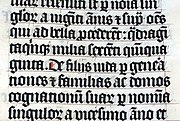 Blackletter calligraphy in a fifteenth-century bible


![A 12th-century[41] Medieval Latin inscription in Italy featuring sans-serif capitals](https://www.search.com.vn/wiki/en/File:Iscrizione_sulla_fondazione_della_Cattedrale_di_Rieti.jpg)

Developing popularity
.jpg)

Towards the end of the eighteenth century neoclassicism led to architects increasingly incorporating ancient Greek and Roman designs in contemporary structures. Historian James Mosley, the leading expert on early revival of sans-serif letters, has found that architect John Soane commonly used sans-serif letters on his drawings and architectural designs.[43][47] Soane's inspiration was apparently the inscriptions dedicating the Temple of Vesta in Tivoli, Italy, with minimal serifs.[43]
These were then copied by other artists, and in London sans-serif capitals became popular for advertising, apparently because of the "astonishing" effect the unusual style had on the public. The lettering style apparently became referred to as "old Roman" or "Egyptian" characters, referencing the classical past and a contemporary interest in Ancient Egypt and its blocky, geometric architecture.[43][48]
Mosley writes that "in 1805 Egyptian letters were happening in the streets of London, being plastered over shops and on walls by signwriters, and they were astonishing the public, who had never seen letters like them and were not sure they wanted to".[37] A depiction of the style, as an engraving, rather than printed from type, was shown in the European Magazine of 1805, described as "old Roman" characters.[44][49] However, the style did not become used in printing for some more years.[g] (Early sans-serif signage was not printed from type but hand-painted or carved, since at the time it was not possible to print in large sizes. This makes tracing the descent of sans-serif styles hard, since a trend can arrive in the dated, printed record from a signpainting tradition which has left less of a record or at least no dates.)
The inappropriateness of the name was not lost on the poet Robert Southey, in his satirical Letters from England written in the character of a Spanish aristocrat.[51][52] It commented: "The very shopboards must be ... painted in Egyptian letters, which, as the Egyptians had no letters, you will doubtless conceive must be curious. They are simply the common characters, deprived of all beauty and all proportion by having all the strokes of equal thickness, so that those which should be thin look as if they had the elephantiasis."[53][43] Similarly, the painter Joseph Farington wrote in his diary on 13 September 1805 of seeing a memorial[h] engraved "in what is called Egyptian Characters".[54][43]
Around 1816, the Ordnance Survey began to use 'Egyptian' lettering, monoline sans-serif capitals, to mark ancient Roman sites. This lettering was printed from copper plate engraving.[44][40]
Entry into printing
Around 1816, William Caslon IV produced the first sans-serif printing type in England for the Latin alphabet, a capitals-only face under the title 'Two Lines English Egyptian', where 'Two Lines English' referred to the typeface's body size, which equals to about 28 points.[55][56] Although it is known from its appearances in the firm's specimen books, no uses of it from the period have been found; Mosley speculates that it may have been commissioned by a specific client.[57][i]
A second hiatus in interest in sans-serif appears to have lasted for about twelve years, until Vincent Figgins' foundry of London issued a new sans-serif in 1828.[59][60][61] David Ryan felt that the design was "cruder but much larger" than its predecessor, making it a success.[62] Thereafter sans-serif capitals rapidly began to be issued from London typefounders.
Much imitated was the Thorowgood "grotesque" face of the early 1830s. This was arrestingly bold and highly condensed, quite unlike the classical proportions of Caslon's design, but very suitable for poster typography and similar in aesthetic effect to the (generally wider) slab serif and "fat faces" of the period. It also added a lower-case. The term "grotesque" comes from the Italian word for cave, and was often used to describe Roman decorative styles found by excavation, but had long become applied in the modern sense for objects that appeared "malformed or monstrous".[7] The term "grotesque" became commonly used to describe sans-serifs.
Similar condensed sans-serif display typefaces, often capitals-only, became very successful.[43] Sans-serif printing types began to appear thereafter in France and Germany.[63][64]
![Specimen by William Caslon IV showing his Two Lines English Egyptian sans-serif, the first general-purpose "sans-serif" printing type ever.[65] Cut in only one size, it was apparently not promoted with any prominence.](//upload.wikimedia.org/wikipedia/commons/thumb/9/91/Caslon_Two_Lines_English_Egyptian.jpg/180px-Caslon_Two_Lines_English_Egyptian.jpg) Specimen by William Caslon IV showing his Two Lines English Egyptian sans-serif, the first general-purpose "sans-serif" printing type ever.[65] Cut in only one size, it was apparently not promoted with any prominence.
Specimen by William Caslon IV showing his Two Lines English Egyptian sans-serif, the first general-purpose "sans-serif" printing type ever.[65] Cut in only one size, it was apparently not promoted with any prominence.![The largest type in this image is the second sans-serif type known, published by Figgins in 1828.[61]](//upload.wikimedia.org/wikipedia/commons/thumb/b/b1/Figgins_large_sans-serifs%2C_reversed_antique.jpg/180px-Figgins_large_sans-serifs%2C_reversed_antique.jpg) The largest type in this image is the second sans-serif type known, published by Figgins in 1828.[61]
The largest type in this image is the second sans-serif type known, published by Figgins in 1828.[61]![Sample image of condensed sans-serifs from the Figgins foundry of London in an 1845 specimen-book. Much less influenced by classical models than the earliest sans-serif lettering, these faces became extremely popular for commercial use.[66]](//upload.wikimedia.org/wikipedia/commons/thumb/5/57/Figgins_sans-serif_specimen.jpg/142px-Figgins_sans-serif_specimen.jpg) Sample image of condensed sans-serifs from the Figgins foundry of London in an 1845 specimen-book. Much less influenced by classical models than the earliest sans-serif lettering, these faces became extremely popular for commercial use.[66]
Sample image of condensed sans-serifs from the Figgins foundry of London in an 1845 specimen-book. Much less influenced by classical models than the earliest sans-serif lettering, these faces became extremely popular for commercial use.[66]
![Specimen by William Caslon IV showing his Two Lines English Egyptian sans-serif, the first general-purpose "sans-serif" printing type ever.[65] Cut in only one size, it was apparently not promoted with any prominence.](https://www.search.com.vn/wiki/en/File:Caslon_Two_Lines_English_Egyptian.jpg)
![The largest type in this image is the second sans-serif type known, published by Figgins in 1828.[61]](https://www.search.com.vn/wiki/en/File:Figgins_large_sans-serifs,_reversed_antique.jpg)
![Sample image of condensed sans-serifs from the Figgins foundry of London in an 1845 specimen-book. Much less influenced by classical models than the earliest sans-serif lettering, these faces became extremely popular for commercial use.[66]](https://www.search.com.vn/wiki/en/File:Figgins_sans-serif_specimen.jpg)
A few theories about early sans-serifs now known to be incorrect may be mentioned here. One is that sans-serifs are based on either "fat face typefaces" or slab-serifs with the serifs removed.[67][68] It is now known that the inspiration was more classical antiquity, and sans-serifs appeared before the first dated appearance of slab-serif letterforms in 1810.[40] The Schelter & Giesecke foundry also claimed during the 1920s to have been offering a sans-serif with lower-case by 1825.[69][70] Wolfgang Homola dated it in 2004 to 1882 based on a study of Schelter & Giesecke specimens;[71] Mosley describes this as "thoroughly discredited"; even in 1986 Walter Tracy described the claimed dates as "on stylistic grounds ... about forty years too early".[40][72]
Sans-serif lettering and typefaces were popular due to their clarity and legibility at distance in advertising and display use, when printed very large or small. Because sans-serif type was often used for headings and commercial printing, many early sans-serif designs did not feature lower-case letters. Simple sans-serif capitals, without use of lower-case, became very common in uses such as tombstones of the Victorian period in Britain.
The first use of sans-serif as a running text has been proposed to be the short booklet Feste des Lebens und der Kunst: eine Betrachtung des Theaters als höchsten Kultursymbols (Celebration of Life and Art: A Consideration of the Theater as the Highest Symbol of a Culture),[73] by Peter Behrens, in 1900.[74]
 Simple sans-serif capitals on a late-nineteenth-century memorial, London
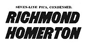 Italic capitals from the Caslon specimen of 1841
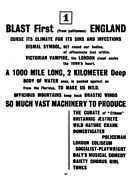 The first section of the avant-garde magazine Blast, published by Wyndham Lewis in 1914, used a condensed grotesque to give an impression of modernity and novelty.
 Sans-serif type in both upper- and lower-case on a 1914 poster


Twentieth-century sans-serifs

Throughout the nineteenth and early twentieth centuries sans-serif types were viewed with suspicion by many printers, especially those of fine book printing, as being fit only for advertisements (if that), and to this day[when?] most books remain printed in serif typefaces as body text.[76] This impression would not have been helped by the standard of common sans-serif types of the period, many of which now seem somewhat lumpy and eccentrically-shaped. In 1922, master printer Daniel Berkeley Updike described sans-serif typefaces as having "no place in any artistically respectable composing-room."[77] In 1937 he stated that he saw no need to change this opinion in general, though he felt that Gill Sans and Futura were the best choices if sans-serifs had to be used.[78]
Through the early twentieth century, an increase in popularity of sans-serif typefaces took place as more artistic sans-serif designs were released. While he disliked sans-serif typefaces in general, the American printer J. L. Frazier wrote of Copperplate Gothic in 1925 that "a certain dignity of effect accompanies ... due to the absence of anything in the way of frills", making it a popular choice for the stationery of professionals such as lawyers and doctors.[79] As Updike's comments suggest, the new, more constructed humanist and geometric sans-serif designs were viewed as increasingly respectable, and were shrewdly marketed in Europe and America as embodying classic proportions (with influences of Roman capitals) while presenting a spare, modern image.[80][81][82][83][84]
Futura in particular was extensively marketed by Bauer and its American distribution arm by brochure as capturing the spirit of modernity, using the German slogan "die Schrift unserer Zeit" ("the typeface of our time") and in English "the typeface of today and tomorrow"; many typefaces were released under its influence as direct clones, or at least offered with alternate characters allowing them to imitate it if desired.[85][86][87][88]
Grotesque sans-serif revival and the International Typographic Style

In the post-war period, an increase of interest took place in "grotesque" sans-serifs.[89][90][91] Writing in The Typography of Press Advertisement (1956), printer Kenneth Day commented that Stephenson Blake's eccentric Grotesque series had returned to popularity for having "a personality sometimes lacking in the condensed forms of the contemporary sans cuttings of the last thirty years."[22] Leading type designer Adrian Frutiger wrote in 1961 on designing a new face, Univers, on the nineteenth-century model: "Some of these old sans-serifs have had a real renaissance within the last twenty years, once the reaction of the 'New Objectivity' had been overcome. A purely geometrical form of type is unsustainable."[92]
Of this period in Britain, Mosley has commented that in 1960 "orders unexpectedly revived" for Monotype's eccentric Monotype Grotesque design: "[it] represents, even more evocatively than Univers, the fresh revolutionary breeze that began to blow through typography in the early sixties" and "its rather clumsy design seems to have been one of the chief attractions to iconoclastic designers tired of the ... prettiness of Gill Sans".[37][93]
By the 1960s, neo-grotesque typefaces such as Univers and Helvetica had become popular through reviving the nineteenth-century grotesques while offering a more unified range of styles than on previous designs, allowing a wider range of text to be set artistically through setting headings and body text in a single family.[5][94][95][96][97] The style of design using asymmetric layouts, Helvetica and a grid layout extensively has been called the Swiss or International Typographic Style.
Other names

Early
- "Egyptian": The name of Caslon's first general-purpose sans-serif printing type; also documented as being used by Joseph Farington to describe seeing the sans-serif inscription on John Flaxman's memorial to Isaac Hawkins Brown in 1805,[43] though today[when?] the term is commonly used to refer to slab serif, not sans-serif.
- "Antique": Particularly popular in France;[37] some families such as Antique Olive, still carry the name.
- "Grotesque": Popularised by William Thorowgood of Fann Street Foundry from around 1830.[7][59][69] The name came from the Italian word 'grottesco', meaning 'belonging to the cave'. In Germany, the name became Grotesk.
- "Doric": Used by the Caslon foundry in London
- "Gothic": Popular with American type founders. Perhaps the first use of the term was due to the Boston Type and Stereotype Foundry, which in 1837 published a set of sans-serif typefaces under that name. It is believed that those were the first sans-serif designs to be introduced in America.[98] The term may have derived from the architectural definition, which is neither Greek nor Roman,[99] and from the extended adjective term of "Germany", which was the place where sans-serif typefaces became popular in the 19th to 20th centuries.[100] Early adopters for the term includes Miller & Richard (1863),[citation needed] and J. R. M. Wood (1865).[citation needed] In China, Japan and Korea, East Asian gothic typefaces are a type style characterized by strokes of even thickness and lack of decorations, thus akin to sans-serif styles in Western type design.
Recents
- "Lineale", or "linear": The term lineale was defined by Maximilien Vox in the VOX-ATypI classification to describe sans-serif types. Later, in British Standards Classification of Typefaces (BS 2961:1967), lineale replaced sans-serif as classification name.
- "Simplices": In Jean Alessandrini's désignations préliminaires (preliminary designations), the term simplices (plain typefaces) is used to describe sans-serif on the basis that the name 'lineal' refers to lines, whereas, in reality, all typefaces are made of lines, including those that are not lineals.[101]
- "Swiss": It is used as a synonym to sans-serif, as opposed to "roman" (serif). The OpenDocument format (ISO/IEC 26300:2006) and Rich Text Format can use it to specify the sans-serif generic typeface ("font family") name for the font files used in a document.[102][103][104] Presumably refers to the popularity of sans-serif grotesque and neo-grotesque types in Switzerland.
- "Industrial": Used to refer to grotesque and neo-grotesque sans-serifs that are not based on "artistic" principles, as humanist, geometric and decorative designs normally are.[72][105]
Gallery
![Simple carving, Cornwall, 1689[106]](//upload.wikimedia.org/wikipedia/commons/thumb/b/b0/Old_Bridge_Marker_on_Quay_Road%2C_West_Looe_%28geograph_6945617_by_T_Jenkinson%29.jpg/120px-Old_Bridge_Marker_on_Quay_Road%2C_West_Looe_%28geograph_6945617_by_T_Jenkinson%29.jpg)
 Dublin 1848, caps-only heading with crossed V-form 'W'
 Corset advertisement using multiple grotesque typefaces, United States, 1886
 Light sans-serif being used for text, Germany, 1914
 Small art-nouveau flourishes on 'v' and 'w'. Ljubljana, 1916.
 Italic, Dublin, 1916
 Nearly monoline and stroke-modulated sans; Austrian war bond poster, 1916
 Broad block capitals. Hungarian film poster, 1918.
 Monoline sans-serif with art-nouveau influenced tilted 'e' and 'a'. Embedded umlaut at top left for tighter linespacing.
 Art Deco thick block inline sans-serif capitals, inner details kept very thin. France, 1920s.
 Berthold Block, a thick German sans-serif with shortened descenders, allowing tight linespacing. Switzerland, 1928.
 Artistic sans-serif keeping curves to a minimum (the line 'O Governo do Estado'), Brazil, 1930
 Lightly modulated sans-serif lettering on a 1930s poster, pointed stroke endings suggesting a brush
 Geometric sans-serif capitals, with sharp points on 'A' and 'N'. Australia, 1934.
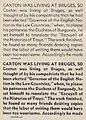 Dwiggins' Metrolite and Metroblack typefaces, geometric types of the style popular in the 1930s
 Stencilled lettering apparently based on Futura Black, 1937
 A 1940s American poster. The curve of the 'r' is a common feature in grotesque typefaces, but the 'single-storey' 'a' is a classic feature of geometric typefaces from the 1920s onwards.
 1952 Jersey holiday events brochure, using the popular Gill Sans-led British style of the period
 Swiss-style poster using Helvetica, 1964. Tight spacing characteristic of the period.
 Ultra-condensed industrial sans-serif in the style of the 1960s; Berlin, 1966
 Neo-grotesque type, Switzerland, 1972: Helvetica or a close copy. Irregular baseline may be due to using transfers.
 Tightly-spaced ITC Avant Garde; 1976
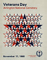 Governmental poster using Univers, 1980
 Anti-nuclear poster, 1982
 1997 film festival poster, Ankara
 Distorted sans-serif in the "grunge typography" style, Ankara, 2002
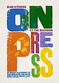 Letterpress poster by Alan Kitching, 2015
![Simple carving, Cornwall, 1689[106]](https://www.search.com.vn/wiki/en/File:Old_Bridge_Marker_on_Quay_Road,_West_Looe_(geograph_6945617_by_T_Jenkinson).jpg)
.jpg)


_Act_1916.jpg)
_Plakat_4._Kriegsanleihe_1916.jpg)


.jpg)


See also
- East Asian sans-serif typeface
- Emphasis (typography)
- List of sans serif typefaces
- San Serriffe, an April Fools' joke by the newspaper The Guardian
Explanatory notes
References
- Bringhurst, Robert (2004), The Elements of Typographic Style (3rd ed.), Hartley & Marks Publishers, ISBN 9780881792065
- Haralambous, Yannis (28 November 2007), Fonts & Encodings, O'Reilly Media, ISBN 9780596102425
- Lawson, Alexander (1990), Anatomy of a Typeface, David R. Godine, Publisher, ISBN 9780879233334
- Lyons, Martyn (2011), Books: A Living History (2nd ed.), Getty Publications, ISBN 9781606060834
- Meggs, Philip B.; Purvis, Alston (2011), Meggs' History of Graphic Design (5th ed.), Wiley, ISBN 9781118017760
- Tracy, Walter (1986), Letters of Credit: A View of Type Design, David R. Godine, Publisher, ISBN 9780879236366
- Kupferschmid, Indra (15 January 2016), Some Type Genres Explained
- Mosley, James (1999). The Nymph and the Grot: the revival of the sanserif letter. London: Friends of the St Bride Printing Library. ISBN 9780953520107.
External links
- The sanserif: the search for examples (lecture by James Mosley)
- The true source of the sans (lecture to ATypI by Jon Melton)
- The Sans Serif in France: The Early Years (1834–44) (lecture by fr:Sébastien Morlighem)
- Panorama: A reassesment [sic] of 19th century poster type (presentation by Pierre Pané-Farré to Ésad Amiens)
- Grotesque: The Birth of The Modern Sans Serif in The Types of The Nineteenth Century (Lecture at Cooper Union by Sara Soskolne)