A display typeface is a typeface that is intended for use in display type (display copy) at large sizes for titles, headings, pull quotes, and other eye-catching elements, rather than for extended passages of body text.[1]

Display typefaces will often have more eccentric and variable designs than the simple, relatively restrained typefaces generally used for body text.[2][3][4][5] They may take inspiration from other genres of lettering, such as handpainted signs, calligraphy or an aesthetic appropriate to their use, perhaps ornamented, exotic, abstracted or drawn in the style of a different writing system.[6][7][8]
Several genres of font are particularly associated with display setting, such as slab serif, script font, reverse-contrast and to a lesser extent sans serif.[9][10] Walter Tracy defines display typefaces in the metal type sense as "sizes of type over 14 point" and in design that "text types when enlarged can be used for headings, display types, if reduced, cannot be used for text setting."[11]
Titling fonts are a subset of display typefaces which are typically used for headlines and titles. They are often only uppercase, and have stroke widths optimized for large sizes.[12][13]
Historical background
For the first centuries of printing, display type generally did not exist. Printing was used primarily to print body text, although there might be use of some larger-sized letters for titling. Typefaces not intended for body text remained rooted in conventional letterforms: roman type, script typeface or blackletter. Signs were created as custom handlettering.[14]
The arrival of the poster and greater use of signage spurred the arrival of new kinds of letterform, both as lettering and in print.[14] Historian James Mosley has written that "big types had been cast in sand, using wooden patterns, for some centuries [by 1750] but there is evidence that English typefounders only began to make big letters for posters and other commercial printing towards 1770, when Thomas Cottrell made his 'Proscription or Posting letter of great bulk and dimension' and William Caslon II cast his 'Patagonian' or 'Proscription letters'."[15][16][17]
New technologies, notably riveted "sanspareil" matrices made printing at large sizes easier from the beginning of the nineteenth century.[18] At the same time, new designs of letter began to appear around the beginning of the nineteenth century, such as "fat face" typefaces (based on serif faces of the period, but much bolder),[19][20] slab serifs (first seen from Vincent Figgins around 1817),[21][22] sans-serifs (already used in custom lettering but effectively unused in printing before the 1830s)[23] and new blackletter faces.[24] Many nineteenth-century display typefaces were extremely, aggressively bold or condensed in order to attract attention. An important development that followed was pantograph-engraved wood type, which allowed cheap printing of large type on posters. Equally, some display typefaces such as Cochin and Koch-Antiqua have a particularly delicate build with a low x-height, and this style was very popular around the start of the twentieth century.[11]
In the past, almost all decorative lettering other than that on paper was created as custom or hand-painted lettering. The use of fonts in place of lettering has increased due to new printing methods, phototypesetting, and digital typesetting, which allow fonts to be printed at any desired size. This has made it possible to use fonts in situations where before hand-lettering would be most common, such as on business logos and metal fabricated lettering.[25][26][27][28] As a result, many modern digital typeface families such as Neutraface, Neue Haas Grotesk, and Arno include both text styles and display companion optical sizes with a more delicate design.[29][30][31][32] Walter Tracy comments that in adapting a text face to display use such as in a headline "a judicious closing-up of the letters" improves the appearance.[11]
Styles of display typeface
Common genres of display typeface include:
- Lettering with a design intended to seem hand-drawn, such as script fonts or designs with swashes[33]
- "Shadowed", "engraved", "inline" or "handtooled" lettering, with a blank space in the centre intended to suggest three-dimensional letters in relief. An early genre of display type, inline sans-serifs were also very popular in lettering of the inter-war period.[34] "Shaded" or hatched designs have also been made which appear grey when viewed at a distance.[35]
- Unusual or abstract redesigns of the alphabet, such as those drawn by the Bauhaus school of design, Milton Glaser's Baby Teeth or Indépendant.[36]
- "Distressed" lettering, intended to seem damaged or distorted, such as Shatter or Electric Circus[37]
- Ultra-light or ultra-bold adaptations of conventional letterforms, such as "fat face" types, Cooper Black or Gill Kayo
- Mixed case lettering that mixes upper- and lower-case letters in unexpected ways for an unconventional effect
- Reverse-contrast typefaces that invert the contrast of conventional writing, with the horizontals made thicker than the verticals.[38][39]
- Lettering made to suggest an aesthetic, such as modernism, the natural world, or another genre of lettering. Examples of the latter include use of stencil or embossing tape fonts to suggest an industrial aesthetic.
- "Mimicry" or "simulation" typefaces intended to suggest another writing system. These are often used by restaurants.[40][41]
A more prosaic genre of "display typefaces" is those intended for signage, such as Johnston, Highway Gothic, Transport and Clearview. These often have adaptations to increase legibility and make letters more distinct from each other. For example, Johnston and Transport have a curl on the lower-case 'L' to distinguish it from an upper-case 'i'.[42]
In German the term "Akzidenzschrift" is used for faces not intended for body text but for commercial or trade printing, without implying a specific size range, so including small-size sans-serifs in uses such as on forms or tickets. The famous sans-serif Akzidenz-Grotesk's name derives from this. Akzidenz means some occasion or event (in the sense of "something that happens", not in the sense of a high-class social event or occasion)[43] and was therefore used as a term for trade printing; Akzidenzschrift was by the 1870s a generic term meaning typefaces intended for these uses.[43][44] A modern German-language dictionary describes it as work such as advertisements and forms.[45][46] The origin of the word is Latin accidentia, defined by Lewis and Short as "that which happens, a casual event, a chance".[43][47]
Note that these genres may also be seen in custom lettering, with which this topic overlaps. Older examples of lettering are often custom-drawn, rather than fonts.[25][26][27]
Gallery
The following gallery shows the historical development of display type, from type similar to body text typefaces to the highly decorative types of the nineteenth century.
 1780 Norwegian notice using flourished blackletter type.
 Challenge to a game of fives, 1786. Type is similar to Baskerville.
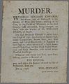 Murder poster 1796, using one inline initial.
 1797 notice of an opera by Méhul, Paris 1797.
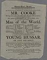 Theatre poster, 1808.
 Welsh-language poster, 1818, using a bold italic inline "fat face" type.
 An energetic bold and italic "fat face" type in an 1831 poster.
 Fat face, slab-serif and sans-serif type, 1837.


See also
- Computer font, also known as a screen font