In letterpress printing, wood type is movable type made out of wood. First used in China for printing body text, wood type became popular during the nineteenth century for making large display typefaces for printing posters, because it was lighter and cheaper than large sizes of metal type.[1]
.jpg)
Wood has been used since the earliest days of European printing for woodcut decorations and emblems, but it was not generally used for making typefaces due to the difficulty of reproducing the same shape many times for printing. In the 1820s, Darius Wells introduced mechanised wood type production using the powered router, and William Leavenworth in 1834 added a second major innovation of using a pantograph to cut a letter's shape from a pattern. This made it possible to mass-produce the same design in wood repeatedly.[2][3][4][5][6] Wood type was manufactured and used worldwide in the nineteenth century for display use.[5]

In the twentieth century lithography, phototypesetting and digital typesetting replaced it as a mass-market technology. It continues to be used by hobbyists and artistic printers.
Pre-industrial wood type

Both in China and Europe, printing from a woodblock preceded printing with movable type.[12]
Along with clay movable type, wooden movable type was invented in China by Bi Sheng in 1040s CE/AD, although he found clay type more satisfactory, and it was first formally used to print by Wang Zhen.[12][13] Wood type was hand-carved to make individual types for the very large character set of Chinese.[12][14] Clay type and metal type were also used in printing in China.[15] The problem with wood and clay types was that they could not be made to accurate dimensions, leading to metal type being adopted from the late fifteenth century.[14][12] Manufacturing, selecting and redistributing sorts for a large character set was cumbersome, and much printing in China continued to be made from custom-cut woodblocks of entire pages of text, rather than from movable type.[12]
In Europe, woodblock printing precedes European movable type printing, and the block book appeared in Europe around the same time as letterpress printing.[16] However, a major disadvantage of woodcut lettering is that once made by wood engraving, it could not be easily duplicated by casting, whereas metal casting could be used to quickly create many metal copies of the same letter, and with the smaller character set of European languages it was practical to cast type for every letter needed. European printing from the beginning used cast metal type.[17][a]

In European printed books, wood engraving was used for both decorations and for large lettering, like titles.[22] With care, it was possible to duplicate woodblocks by casting in sand, a technique known to have been used by Hendrik van den Keere to create his large types.[19] According to John A. Lane "the duplication of woodblocks by sandcasting is documented in 1575, probably goes back further, and ... duplicated decorated initials became common in the Netherlands around 1615."[23]
Large sandcast metal types for printed posters became popular in London around the mid-eighteenth century. James Mosley comments that "there is evidence that English typefounders only began to make big letters for posters and other commercial printing towards 1770, when Thomas Cottrell made his 'Proscription or Posting letter of great bulk and dimension' and William Caslon II cast his 'Patagonian' or 'Proscription letters'"[24] and that "there is probably a prehistory of wood types in big letters cut by hand, especially among provincial printers, but there is no evidence that wood letter was widely used until machine-cut types were introduced."[25]
In the early nineteenth century, London became a centre of development in bold display typefaces, the arrival of the printed poster spurring demand for bold new types of letter like the fat face and later the slab serif. However, these types were initially made in metal.[26] In 1810, William Caslon IV introduced "sanspareil" matrices, made like a stencil by cutting out the letter in sheet metal and riveting it to a backing plate. This produced much sharper type than sandcasting and was easier to use; it was quickly copied.[27] The large metal types produced were cast with hollows in them to reduce the weight.[28][29] Mosley and Justin Howes have documented some cases in the early nineteenth century where woodblock lettering was used shortly before metal type became available in the same styles; heavy roman types on lottery advertising before the arrival of fat face types,[26] and later a slab serif woodblock a few years before the first known printing type.[29]

At the start of the nineteenth century, complex decorated types and ornaments were cut in wood and metal and multiplied by methods including stereotyping and "dabbing", in which a woodcut was struck into molten metal on the verge of solidifying to form a mould.[31][32][33][34][35][36] One type foundry particularly known for decorated designs was the London foundry of Louis John Pouchée, active by 1818 to 1830;[37][35] many of the foundry's wooden patterns are preserved.[36][38][39][b] Modern printing historians Giles Bergel and Paul Nash have experimented with the technique; Bergel reports that "perhaps the most counter-intuitive feature of the process is the fact that wooden blocks can survive direct contact with molten metal. Apart from some scorching around the edges and some cracking (perhaps made when prising them loose rather than from the heat) the blocks were undamaged and could be dabbed over and over again."[40]
Machine-cut wood type

Modern wood type, mass-produced by machine cutting rather than hand-carved, was invented by Darius Wells (1800–1875), who published his first known catalogue in New York City in 1828.[1][42][43][44][45] He introduced the lateral router to cut out wood type more quickly than handcarving.[1][46][47]
William Leavenworth in 1834 introduced the pantograph, allowing the same form to be reproduced from a pattern, and manufactured wood type in Allentown, New Jersey.[48][49][50] A pantograph has remained a standard way of making wood type, although several other methods have been used such as die-cutting[51] and making the letter as a thin sheet glued to a backing material.[1][42][52]
Some pages from Leavenworth's only surviving specimen, now in the New York Public Library, are shown below.[49]
![Condensed Gothic (sans-serif)[c]](//upload.wikimedia.org/wikipedia/commons/thumb/4/48/Leavenworth_Sixteen_and_Twelve_Lines_Condensed_Gothic.jpg/112px-Leavenworth_Sixteen_and_Twelve_Lines_Condensed_Gothic.jpg) Condensed Gothic (sans-serif)[c]
Condensed Gothic (sans-serif)[c] Gothic (sans-serif) and chamfered Gothic types
 "Italian" (reverse contrast, see below)
![Condensed Gothic (sans-serif)[c]](https://www.search.com.vn/wiki/en/File:Leavenworth_Sixteen_and_Twelve_Lines_Condensed_Gothic.jpg)

_wood_type.jpg)
Manufacturers of wood type were also established in France, Germany,[5][54] Britain and other countries.[55]
Mature industry

In the mid-nineteenth century there were numerous wood type manufacturers in the United States. All the significant manufacturers were based in the Northeast and Midwest, many around New York City and in Connecticut.[56] The market for wood type was apparently limited and most businesses had side-lines as dealers in other printers' equipment, or making other wooden goods.[57] One of the larger firms until the 1880s was the company of William H. Page, near Norwich, Connecticut. Wood type competed with lithography and stencils in the market for display typography.[58][59][60]
Common type styles included the slab serif, fat face, sans-serif, reverse-contrast or "French Clarendon",[61] and other genres such as "Tuscan" (spikes on the letter), "Grecian" (chamfered)[62] and ornamented forms.[63][64] (The use of fictitious adjective names for newly invented type styles was common with wood type manufacturers but not invented by them, for example in London Vincent Figgins had called his first slab-serif "Antique" around 1817 and the Caslon foundry's first reverse contrast typeface around 1821 was given the probably fictitious name "Italian".[2][65]) Types were made in extreme proportions, such as ultra-bold and ultra-condensed.[66][67] For Bethany Heck, "wood type in the US was pioneered by mad scientists who strained good taste and legibility in an attempt to cover the broadest range of ornament, width and weight".[6] "Chromatic" types were also made for printing colour separation, showing the delicacy that could be achieved.[68]
 Ornamented types, 1859 specimen, Wm. H. Page and Co.
![Chromatic colour separation Pointed and Tuscan wood type, Wm. H. Page & Co., 1874 specimen[69]](//upload.wikimedia.org/wikipedia/commons/thumb/e/e7/Pointed_and_Tuscan_wood_type%2C_Wm._H._Page_%26_Co.%2C_1874_specimen.jpg/134px-Pointed_and_Tuscan_wood_type%2C_Wm._H._Page_%26_Co.%2C_1874_specimen.jpg) Chromatic colour separation Pointed and Tuscan wood type, Wm. H. Page & Co., 1874 specimen[69]
Chromatic colour separation Pointed and Tuscan wood type, Wm. H. Page & Co., 1874 specimen[69]
.jpg)
![Chromatic colour separation Pointed and Tuscan wood type, Wm. H. Page & Co., 1874 specimen[69]](https://www.search.com.vn/wiki/en/File:Pointed_and_Tuscan_wood_type,_Wm._H._Page_%26_Co.,_1874_specimen.jpg)
Wood type had distinctive characteristics compared to metal type. The demand for novelty led to an arms race of new styles of novelty type designs, and because each type was individually cut by pantograph from a pattern, types could be offered in a wide range of sizes.[70] Wood type styles were sold in a wide range of widths from condensed to ultra-wide, and Hamilton offered to supply at regular prices any width desired in between its standard widths.[71] Robert James DeLittle, the last owner of the DeLittle wood type cutters in York, England, explained in 2000 that sometimes very condensed letters were needed for theatre posters because "If you were more important than the other chap, your name had to be in larger letters. If you were unfortunate enough to have a long-winded name you had great difficulty in fitting it into those narrow theatrical bills."[72][67] As noted above, multiple types were often made for the multiple layers of a design to be printed using colour separation.[69] As wood type was made for large sizes, it was often made with very narrow sidebearings between letters, so spacing material had to be inserted to achieve the desired spacing between characters.[73] Digital typeface designer Anatole Couteau comments: "in wood type...due to how the wooden blocks are cut, spacing is typically so tight that you constantly have to do kerning."[74][75]
.jpg)
Although apparently diverse in appearance, nineteenth century wood types tended to be ornamented variations on the same basic modularised design principles, similar to nineteenth century Didone text typefaces.[76] Nineteenth-century types were based on a system of keeping the capitals very similar in width, seen for example in the "tucked-under" leg of the R.[77][78][d] This model was quite different from Roman square capitals, where the capitals are quite different in width.[79]
Wood type manufacture was particularly common in the United States, and its companies made type in other languages for export. By the 1870s, missionaries working in China had commissioned type for printing posters, and wood type was also made for Russian and Burmese for export.[80] Besides this, American manufacturers made German blackletter, Greek and Hebrew types catering to the large immigrant communities.[80][81][82]
In 1880, J. E. Hamilton founded the Hamilton Manufacturing Company in Two Rivers, Wisconsin. His company grew rapidly to take over the American industry. Hamilton gained its initial advantage by introducing a new method of making wood type very cheaply: the wood letter was cut out and then attached to a backing of a block of cheaper wood.[83] Around 1890, Hamilton switched to the standard router method of cutting wood type as a single block.[83] It also benefited from an effective distribution network and proximity to the growing western market.[84][85] From 1887 to 1909 it took over most of its competitors.[1][86][87] It continued to make wood type until 1985.[84] The surviving materials from the company are now preserved at the Hamilton Wood Type and Printing Museum, also in Two Rivers.[1][88][87][89]
Some types from Hamilton are shown below:
 Blackletter type
 Slab serif
 Condensed sans-serif
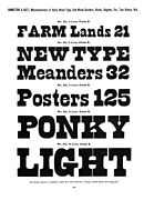 Slab serif with curving terminals
 "French Clarendon" (reverse-contrast)
 "Streamer" chromatic type, with type in front of a banner
 Tuscan French Clarendon type
 Grecian (chamfered) slab-serif type
.jpg)
.jpg)
.jpg)
.jpg)
.jpg)
.jpg)
.jpg)
.jpg)

According to S. L. Righyni, in the late inter-war period in Britain, the standard letterform on newsbills posted by newsagents was "the sans-serif wooden letter-form", especially bold condensed sans-serifs from Stephenson Blake, although the Daily Express used Winchester Bold and The Times had a custom design similar to Kabel Bold Condensed.[90] (Although wood type was used for news bills and posters, large newspaper headlines were rare in British newspaper printing until well into the twentieth century.[91])
Wood type sellers
United States
United Kingdom
.jpg)
- DeLittle[95][96]
- H. W. Caslon[97]
- H. M. Sellers[98]
- Stevens Shanks
- Day & Collins[99]
- Stephenson Blake[90][100]
Germany
France
Switzerland
- Roman Scherer[104]
Brazil
- Funtimod[105]
India
Legacy technology


During the post-war period, wood type poster printing was largely displaced by new technologies like offset lithography and phototypesetting. Reproductions of wood type with their resonance of times past were offered by phototypesetting companies such as Photo-Lettering Inc. and Haber Typographers, and used in the 1960s by designers such as Bob Cato and John Berg,[108] and later Paula Scher and Louise Fili.[109][110] Artistic printers like Jack Stauffacher and retro print shops such as Hatch Show Print carried on using wood type, finding that it was a cheap way to achieve creative effects.[111][112][113] (For wood type historian Rob Roy Kelly, the aesthetic quality of wood type manufacturers declined in the twentieth century; Nick Sherman and Frode Helland have commented on a staggeringly bad rendition of Futura in Hamilton's 1951 specimen that features inconsistent stroke weights, the dot on the i and j at different heights, and the 8 in the specimen printed upside down.[114][115][116][117])[e]
The use of wood type styles is commonly associated with the American Frontier or "Wild West". These typefaces are seen as classic western Americana. This is because of its cinematic and decorative appearance: wood type style-lettering was very popular in Westerns giving it an association with the American west, and are used frequently to depict that aesthetic, from theme parks to bars.[119][120]
In the 1950s, Rob Roy Kelly, an American graphic design teacher, became interested in the history of wood type and built up a large collection from sources like old print shops and printers' families.[103][121] He published a history of the industry, American Wood Type, 1828–1900 in 1969.[122][123][124] His collection, now at the University of Texas at Austin,[125] has been studied by other historians of wood type such as David Shields.[126][127][128][129][130]
Digital fonts
Many digital fonts based on wood type display faces have been published, benefiting from the plentiful source material and accessibility of images, for example Kelly's book.[6][109] For example, when Adobe were developing a line of original typefaces in the early 1990s they created a large number of digital fonts based on wood types using proofs supplied by Kelly, which were named after types of tree.[131][132]
Notes
References
Citations
Bibliography
- Enschedé, Charles (1978). Carter, Harry; Hellinga, Lotte (eds.). Typefoundries in the Netherlands, from the fifteenth to the nineteenth century: a history based mainly on material in the collection of Joh. Enschedé en Zonen at Haarlem (2nd ed.). Haarlem: Stichting Museum Enschedé. p. 33. ISBN 9789070024130.
- Gray, Nicolete (1977). Nineteenth Century Ornamented Typefaces.
- Kelly, Rob Roy (1963). "American Wood Type". Design Quarterly (56): 1–40. doi:10.2307/4047285. JSTOR 4047285.
- Kelly, Rob Roy (1969). American Wood Type, 1828–1900.
- Lewis, John (1962). Printed Ephemera: the changing uses of type and letterforms in English and American printing. Ipswich: W. S. Cowell.
- Mosley, James, ed. (1990). A Specimen of Printing Types & Various Ornaments 1796: Reproduced Together with the Sale Catalogue of the British Letter-Foundry 1797. Printing Historical Society. pp. 5–12. ISBN 9780900003103.
Big types had been cast in sand, using wooden patterns, for some centuries [by 1750] but there is evidence that English typefounders only began to make big letters for posters and other commercial printing towards 1770, when Thomas Cottrell made his 'Proscription or Posting letter of great bulk and dimension' and William Caslon II cast his 'Patagonian' or 'Proscription letters'.
- Mosley, James (1993). Ornamented types: twenty-three alphabets from the foundry of Louis John Poucheé. I.M. Imprimit in association with the St. Bride Printing Library.
- Mosley, James (2001). "Memories of an Apprentice Typefounder". Matrix. 21: 1–13.
- Mosley, James (2003). "Sanspareil Matrices". Matrix. 23: 104–114.
- Schneider, Daniel (2015). Wood Type Archaeology: an inquiry into worker skill in wood printing type manufacture (Thesis). Michigan Technological University. Retrieved 6 January 2024.
- Shaw, Paul (April 2017). Revival Type: Digital Typefaces Inspired by the Past. Yale University Press. pp. 132–155. ISBN 978-0-300-21929-6. Archived from the original on 23 December 2021. Retrieved 23 December 2021.
- Shields, David (2022). The Rob Roy Kelly American Wood Type Collection: A History and Catalog. University of Texas Press. ISBN 978-1-4773-2368-7.
- Vervliet, Hendrik D. L.; Carter, Harry, eds. (1972). Type Specimen Facsimiles II. University of Toronto Press. pp. 7–11.
External links
- Examples on Fonts In Use
- David Shields' list of wood type specimen catalog facsimiles and digital copies
- Ampersand Press collection of French wood type specimens on the Internet Archive
- Woodtyper, a wood type discussion site edited by Nick Sherman