Wikipedia:Featured picture candidates/March-2014
| Featured picture tools |
|---|
Please cut and paste new entries to the bottom of this page, creating a new monthly archive (by closing date) when necessary.
Gastric mucosa
Voting period is over. Please don't add any new votes. Voting period ends on 1 Mar 2014 at 03:47:58 (UTC)

- Reason
- A beautiful image, one of Wikipedia's best histological sections that does a wonderful job explaining the gastrointestinal wall, simple columnar epithelia, and stomach wall histology
- Articles in which this image appears
- Stomach#Histology, Gastrointestinal wall
- FP category for this image
- Anatomy
- Creator
- Nephron
- Support as nominator --LT910001 (talk) 03:47, 19 February 2014 (UTC)
- Support Excellent. File:Normal gastric mucosa low mag.jpg is also good, but the curve on that one might be misleading, since it curves the opposite way to the typical. Adam Cuerden (talk) 04:13, 19 February 2014 (UTC)
- Support There is also an artifact in the larger image at the right. This image is very good and takes quite a deal of skill and equipment to produce. CFCF (talk · contribs · email) 08:31, 19 February 2014 (UTC)
- Support - Okay, you've hooked me. — Crisco 1492 (talk) 11:28, 19 February 2014 (UTC)
- Support - Godhulii 1985 (talk) 11:48, 19 February 2014 (UTC)
- Comment Can you please make it clear in the caption that our gastric mucosa is not actually purple and fuschia? It should state explicitly that this tissue section was stained.-- mcshadypl TC 01:13, 20 February 2014 (UTC)
- Done, sometimes you get so used to seeing the stains that you don't even consider that most people wouldn't know that. CFCF (talk · contribs · email) 10:53, 20 February 2014 (UTC)
- What about after some red wine? And my brother once ate so much pickled beetroot that his... no, you don't want to know ;-) -- Colin°Talk 21:59, 21 February 2014 (UTC)
- Comment - As the creator of the image, it is a bonus to see that a bunch of you see it worthy of featured picture status. Approved or not, I'm just happy that my images are tolerated on the Commons... 'cause I get much benefit out of them myself. Nephron T|C 04:58, 21 February 2014 (UTC)
- Support -- Colin°Talk 21:59, 21 February 2014 (UTC)
- Regretful Oppose - This is a very important subject, but:
- Nearly 10% of the image is overexposed to pure white, and over 25% of the red channel is overexposed.
- Basic contrast correction on the red and blue (predominantly the eosin and hemalum signal respectively) would greatly improve overall colour contrast.
- There is no indication of scale (either on the image or in the description).
Promoted File:Normal gastric mucosa intermed mag.jpg --Armbrust The Homunculus 03:48, 1 March 2014 (UTC)
SMS Gefion
Voting period is over. Please don't add any new votes. Voting period ends on 1 Mar 2014 at 05:11:20 (UTC)

- Reason
- You'll probably have noticed there's a number of these. Well, if Parsecboy wants to get all of these articles up to FA, I think they deserve well-restored images, don't all of you? Slightly lower resolution on this one, don't know why - the scanner appears to have left Wikipedia. Book is quite rare, and it's still nearly 8000 pixels wide, so, I think we can deal.
Reluctantly spent an hour and a half cropping the border, because the painting had been glued to the border sheet off-centre. (People tend to think it's just a simple crop. Try that sometime with an image like this where significant image elements go right to the edge, but the edges - while quite straight - aren't laser straight. You will inevitably have to go in at about 400 to 800% zoom and fix up the tiny - but lengthy - bits of the border that you can't help but leave in, by hand.) Adam Cuerden (talk) 06:21, 19 February 2014 (UTC) - Articles in which this image appears
- SMS Gefion
- FP category for this image
- Wikipedia:Featured pictures/Vehicles/Water
- Creator
- Hugo Graf (1844-1914) [Scan by commons:User:Mr.Nostalgic, restoration by Adam Cuerden.]
- Support as nominator --Adam Cuerden (talk) 05:11, 19 February 2014 (UTC)
- Support of course. — Crisco 1492 (talk) 11:26, 19 February 2014 (UTC)
- Support — Much more viewable than SMS Kaiserin Augusta. Thanks for removing the ugly tan border. German caption identifies ship as a kleiner Kreuzer, which would be translated "light cruiser." (BTW, I'm getting a little concerned that we may be showing too many late-19th C. German warships — ??) Sca (talk) 16:09, 19 February 2014 (UTC)
- They'll be spaced out over years, if necessary. Parsecboy is working to get all the articles up to FA, after all, so it's not like it'll be for naught. I want to at least get one per class, and one for all the A-clss/FAs before taking a break. Adam Cuerden (talk) 16:14, 19 February 2014 (UTC)
- Precisely. Just like the birds. (Or rather, since this is more limited subject material, perhaps even more spaced out... every two or three weeks) — Crisco 1492 (talk) 23:31, 19 February 2014 (UTC)
- They'll be spaced out over years, if necessary. Parsecboy is working to get all the articles up to FA, after all, so it's not like it'll be for naught. I want to at least get one per class, and one for all the A-clss/FAs before taking a break. Adam Cuerden (talk) 16:14, 19 February 2014 (UTC)
- Perhaps we could alternate Asian birds and German ships. Sca (talk) 14:35, 20 February 2014 (UTC)
- Well, anyway, I just want to help out a prolific creator of featured articles. However the mainpage gets handled at the end, I don't mind. One possibility might be to group them by class, so SMS Odin and SMS Ägir would get one main page, as they're both Odin-class ships. But mainpage isn't the primary purpose of my FP efforts here; now, that said, it's good for the articles, so I shouldn't want to give it up completely, but I think we can work something out. =) Adam Cuerden (talk) 15:32, 20 February 2014 (UTC)
- Perhaps we could alternate Asian birds and German ships. Sca (talk) 14:35, 20 February 2014 (UTC)
- Support - Excellent work. Miyagawa (talk) 23:44, 21 February 2014 (UTC)
- Support - I have struggled with how to handle Adam Cuerden's latest batch of restorations because the texture of the sky in this series just bothers me (why does the sky appear to be made of dots?). Ultimately, however, this is likely more an issue of personal taste (which has no bearing here) than one of image/restoration quality, and I can find no objective reason why this one image should fail and the other three should be promoted, so I will be the fifth support on this and get it over the line. Sᴠᴇɴ Mᴀɴɢᴜᴀʀᴅ Wha? 22:03, 24 February 2014 (UTC)
- @Sven Manguard: That's the nature of lithographs, particularly when dealing with areas of subtle colour. Lithographs work by pitting stones (lithoi in Greek) - usually limestone - with acid, creating pits for the ink to fall into. The longer acid is applied, the more and deeper the pits. As paper is absorbent, if the ink is applied, any ink remaining on the surface is removed, then paper is pressed against the stone (with a lot of pressure) the ink is absorbed out of the pits and onto the paper. However, as you'd expect, pitting a stone with acid does not create continual gradiations of colour; it instead creates random distributions of colour that average out to the desired. One stone plate for each colour ink. There's a bit more to it than that, of course - the acid can be applied in a pattern to spread a too-dark colour out, for instance, as sometimes appears to happen with the yellow in these - it's easier than making an additional plate for a more dilute yellow if you don't need much. It's less noticeable in areas of dense colour - where several inks are overlaying each other, and the pits are deep and numerous, it tends to blend together better than in the lighter parts of the image. I hope that answers the question. Adam Cuerden (talk) 22:25, 24 February 2014 (UTC)
Promoted File:S.M. kleiner kreuzer Gefion - restoration, borderless.jpg --Armbrust The Homunculus 05:11, 1 March 2014 (UTC)
US Marshals with Young Ruby Bridges on School Steps
Voting period is over. Please don't add any new votes. Voting period ends on 1 Mar 2014 at 11:45:28 (UTC)

Photo appears to show Bridges and the Marshals leaving the school. She was escorted both to and from the school while segregationist protests continued.
- Reason
- Great encyclopedic value. It will encourage readers to read the article, to read the fight against racism by this little girl...
The picture is below resolution requirement but thumbnail looks good, and full resolution is not so bad considering the time when it was taken.
- Articles in which this image appears
- Ruby Bridges, William Frantz Elementary School
- FP category for this image
- People
- Creator
- Uncredited DOJ photographer
- Support as nominator --Godhulii 1985 (talk) 11:45, 19 February 2014 (UTC)
- Comment: This is way, way under the resolution requirement, and we haven't yet taken the steps that might justify waving it, like, for example, someone in America contacting the Marshalls, and trying, informally and/or through Freedom of Information Act request, to get a higher resolution copy. Adam Cuerden (talk) 16:22, 19 February 2014 (UTC)
- Response Valid point Adam, there is no proof that no other higher resolution exist and there are ways to ask for higher resolution. Since I'm not familiar with american laws, so do not know how to ask for higher resolution. Should I delete this nomination? Thanks. Godhulii 1985 (talk) 20:34, 19 February 2014 (UTC)
- Comment: Even if we did get a larger version, I am not of the opinion that its historic value trumps that it just isn't a particularly well composed or compelling photograph. File:Wallace at University of Alabama edit2.jpg, which is already an FP, is a much better image of forced school desegregation, because the tension of situation is actually conveyed in the photograph. That photograph also is, from a compositional standpoint, suboptimal, but is much more compelling than this one. Sᴠᴇɴ Mᴀɴɢᴜᴀʀᴅ Wha? 19:38, 19 February 2014 (UTC)
- Response Hi sven, we have several featured pic of neuschwanstein castle (and there'll be more in upcoming days), so it's my opinion that several photos from same theme can be judged. To me this pic is more compelling than that because here I see a little girl fighting instead of a grown up politician who is trying to win his white voter's heart. Godhulii 1985 (talk) 20:34, 19 February 2014 (UTC)
- My core argument is "this is not a well composed image", not "we can only have one image of school desegregation". I mentioned the other one as an example of a picture that was visually compelling enough that the FP voters overlooked its compositional issues. Maybe if we got a higher resolution version, and could get a proper view of her face, it would be more compelling, but I am not willing to read into the body language as much as Crisco 1492 does below (because I don't want to impose my own preconceptions into the situation). As is, I oppose the current image. Sᴠᴇɴ Mᴀɴɢᴜᴀʀᴅ Wha? 05:48, 20 February 2014 (UTC)
- fair enough sven Godhulii 1985 (talk) 19:27, 22 February 2014 (UTC)
- My core argument is "this is not a well composed image", not "we can only have one image of school desegregation". I mentioned the other one as an example of a picture that was visually compelling enough that the FP voters overlooked its compositional issues. Maybe if we got a higher resolution version, and could get a proper view of her face, it would be more compelling, but I am not willing to read into the body language as much as Crisco 1492 does below (because I don't want to impose my own preconceptions into the situation). As is, I oppose the current image. Sᴠᴇɴ Mᴀɴɢᴜᴀʀᴅ Wha? 05:48, 20 February 2014 (UTC)
- Response Hi sven, we have several featured pic of neuschwanstein castle (and there'll be more in upcoming days), so it's my opinion that several photos from same theme can be judged. To me this pic is more compelling than that because here I see a little girl fighting instead of a grown up politician who is trying to win his white voter's heart. Godhulii 1985 (talk) 20:34, 19 February 2014 (UTC)
- Neutral on resolution only. Although in terms of composition this is not a very good photograph, let's not forget that there is power at seeing the age of the children being protested. Bridges was six years old at the time, perhaps not realizing just how much of an impact walking up and down those steps would have, seeing a bunch of supposedly rational people protesting their heads off, getting threatened by poison... although her expression is not clear at this resolution (at least not to me), her body language is expressing this fear... yet also the determination. — Crisco 1492 (talk) 23:39, 19 February 2014 (UTC)
- Support per former United States Deputy Marshal Charles Burks ("She showed a lot of courage. She never cried. She didn't whimper. She just marched along like a little soldier, and we're all very very proud of her.") Jee 12:28, 20 February 2014 (UTC)
- Strong oppose Higher resolution images of this event exist - Wikipedia just doesn't have it. Find a free copy of the higher res image and then let's talk. smooth0707 (talk) 16:31, 20 February 2014 (UTC)
- Searched reverse-image-search in google images, couldn't find any. Help? Godhulii 1985 (talk) 19:27, 22 February 2014 (UTC)
- Oppose. Much too small. Not every valuable picture is featurable, just as not every article on a worthy topic would pass at FAC today. J Milburn (talk) 17:30, 20 February 2014 (UTC)
- Oppose very low resolution. A better one must exist, somewhere. Mattximus (talk) 21:27, 23 February 2014 (UTC)
Not Promoted --Armbrust The Homunculus 11:45, 1 March 2014 (UTC)
Theodore Roosevelt
Voting period is over. Please don't add any new votes. Voting period ends on 2 Mar 2014 at 19:06:50 (UTC)

- Reason
- High resolution, good quality, lede image in an important and well-developed article.
- Articles in which this image appears
- Theodore Roosevelt +10
- FP category for this image
- Wikipedia:Featured pictures/People/Political
- Creator
- Pach Brothers (restored by Crisco 1492
- Support as nominator -- — Crisco 1492 (talk) 19:06, 20 February 2014 (UTC)
- Support Solid. --///EuroCarGT 03:18, 21 February 2014 (UTC)
- Support--Theparties (talk) 10:23, 22 February 2014 (UTC)
- Support. Excellent quality image. --Carioca (talk) 20:32, 22 February 2014 (UTC)
- Comment Lots of chromatic fringing - where'd that come from? Adam Cuerden (talk) 20:41, 22 February 2014 (UTC)
- Perhaps it's because it is 6:20 a.m., but I'm not seeing it. — Crisco 1492 (talk) 23:22, 22 February 2014 (UTC)
- Support I like it. It's a nice photograph. --CyberXRef☎ 03:32, 1 March 2014 (UTC)
Promoted File:T Roosevelt.jpg --Armbrust The Homunculus 19:06, 2 March 2014 (UTC)
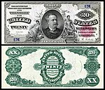
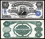
United States Silver Certificates (complete set)
Voting period is over. Please don't add any new votes. Voting period ends on 2 Mar 2014 at 20:28:14 (UTC)
- Reason
- High quality, very high EV. This is a complete typeset of United States Silver Certificates and served as the impetus to significantly rework and fully reference the article.
First issued in 1878, silver certificates were in use until 1968 but are still redeemable as legal tender. The nominated set contains an example of every type (design) issued. The 1878 $50 and $1,000 are represented by colored-seal proofs from a Bureau of Engraving and Printing specimen book presented to John Sherman during his tenure as Secretary of the Treasury. There are only two issued examples of the $50 known to exist and the $1,000 is unknown in issued form. The 1878 $500 is unique. Images of the 1878 $500 and $1,000 are missing from most major numismatic reference books.
Seven notes have already been featured individually as indicated by a . They have been included only for completeness and are not part of the present nomination.

Original – A complete typeset of United States silver certificates.
- Articles in which these images appear
- Silver certificate (United States) (all, stable), one or more images (stable and recent additions) in use on United States one-dollar bill, United States two-dollar bill, United States five-dollar bill, United States ten-dollar bill, United States one hundred-dollar bill, Educational Series, List of United States Presidents on currency, History of the United States dollar, Stephen Decatur, Edward Everett, Robert Fulton, Thomas A. Hendricks, Daniel Manning, William L. Marcy, James Monroe, Robert Morris, Running Antelope, Sioux, Martha Washington, William Windom.
- FP category for this image
- Currency
- Creator
- The Bureau of Engraving and Printing
From the National Numismatic Collection, NMAH, Smithsonian Institution.
Images created by Godot13 (from the original bank notes).
 $10 (Fr.285a)
Robert Morris $20 (Fr.307)
Stephen Decatur $50 (Fr.324)
Edward Everett


 $100 (Fr.337b)
James Monroe $500 (Fr.345a)
Charles Sumner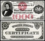 $1,000 (Fr.346a)
William Marcy


 $10 (Fr.287)
Robert Morris $20 (Fr.311)
Stephen Decatur $50 (Fr.327)
Edward Everett


 $100 (Fr.340)
James Monroe $500 (Fr.345c)
Charles Sumner $1,000 (Fr.346d)
William Marcy


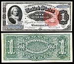 $1 (Fr.217)
Martha Washington $2 (Fr.242)
Winfield Scott Hancock $5 (Fr.264)
Ulysses Grant


 $10 (Fr.291)
Thomas Hendricks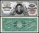 $20 (Fr.316)
Daniel Manning


 $1 (Fr.223)
Martha Washington $2 (Fr.246)
William Windom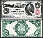 $5 (Fr.267)
Ulysses Grant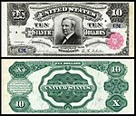 $10 (Fr.298)
Thomas Hendricks


 $20 (Fr.317)
Daniel Manning $50 (Fr.331)
Edward Everett $100 (Fr.344)
James Monroe $1000 (Fr.346e)
William Marcy


 $1 (Fr.224)
 $2 (Fr.247)
 $5 (Fr.270)
.jpg)


 $1 (Fr.226)
Abraham Lincoln & Ulysses Grant $2 (Fr.249)
George Washington


 $10 (Fr.302)
Thomas Hendricks

 $1 (Fr.239)
George Washington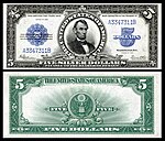 $5 (Fr.282)
Abraham Lincoln

.jpg)
 $1 (Fr.1600)
George Washington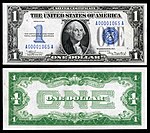 $1 (Fr.1606)
George Washington $1 (Fr.1607)
George Washington $1 (Fr.1619)
George Washington


 $5 (Fr.1650)
Abraham Lincoln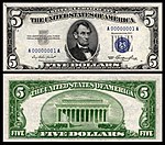 $5 (Fr.1655)
Abraham Lincoln


 $10 (Fr.1700)
Alexander Hamilton $10 (Fr.1701)
Alexander Hamilton $10 (Fr.1706)
Alexander Hamilton


 $1 (Fr.2306)
George Washington $5 (Fr.2307)
Abraham Lincoln $10 (Fr.2309)
Alexander Hamilton


- Support as nominator --Godot13 (talk) 20:28, 20 February 2014 (UTC)
- Do you thinkt he early ones would benefit from some light restoration? Just to remove the large rip lines? Adam Cuerden (talk) 02:41, 21 February 2014 (UTC)
- My concern with restoration is that the image will no longer be an exact representation of the actual note (i.e., condition) which is an important factor in numismatics (not to mention to the Smithsonian). These are also the images which will be entered into their archives for eventual use on their website; it would be problematic if the Wikipedia images don't match the Smithsonian images.
- Good reasons, then. Support Adam Cuerden (talk) 03:39, 21 February 2014 (UTC)
- My concern with restoration is that the image will no longer be an exact representation of the actual note (i.e., condition) which is an important factor in numismatics (not to mention to the Smithsonian). These are also the images which will be entered into their archives for eventual use on their website; it would be problematic if the Wikipedia images don't match the Smithsonian images.
- I've been mulling over this one for the better part of an hour. Large sets of images are, while not entirely uncharted territory, something that appears to be happening increasingly often. This is, I think, the largest set ever proposed (although I seem to remember having seen a nomination for a massive set of maps when I was going through the archives once). There are questions that this nomination brings up that I do not feel prepared to answer. Foremost among are "is there value to promoting a set so large that it can only ever be used as a gallery, wherein the individual impact of any one image is heavily diluted" and "if several of the images in the set, alone, don't have a high enough educational value that I would consider supporting them as featured pictures, how does that effect how I vote on the set as a whole. I haven't answered those questions yet (which means if you have a good argument for one of those questions, I'd like to hear it). Sᴠᴇɴ Mᴀɴɢᴜᴀʀᴅ Wha? 04:09, 21 February 2014 (UTC)
- This was the largest set I found in a cursory review of proposed or promoted sets. Promoting a set this size does not, IMHO, mean that it can only be reproduced en mass as a set. Any subdivision (Series) or single image could be used as needed for illustration. Each image in this set is intended to be an exemplar of its type (particular design). I did not attempt to include all varieties in the article (or this set) as that would have been unnecessary and not encyclopedic (and numbered well over 200). The vast majority of the images in this set are (with respect to condition) among the finest that exist, or they are the very first note issued by the Treasury, or they are so rare as to make condition irrelevant. Having been involved with numismatics for 20+ years, I am certain that many of these images will wind up on related websites or in future editions of reference books. I considered breaking this down into several nominations, but then it defeats the purpose of having every U.S. silver certificate design type represented in a single encyclopedic nomination. My plan is to do the same thing for all the major categories in U.S. numismatics (rework/improve or write list-articles and pair them with complete reference sets of images), though it may take a few years… I hope this answers some of your questions. --Godot13 (talk) 04:41, 21 February 2014 (UTC)
- Part of the value of featured sets is that they allow us to feature images which have EV that depends on other media. The adage that the sum of the parts is greater than the whole is the true importance of sets; not just expediency in nominating large volumes of similar media. The best example of that might be this plate. On its own, it is nearly worthless-a largely blank page. In the context of the other 7 illustrations, it forms an irreplaceable part. With currency, like this nomination, it important to remember that the notes were created as a series and are thus strongly related. The referenced set of maps makes sense as a set because the visual rendering of different projections allows for comparison between them, not merely demonstrating a single fact. In spite of all this, we do not have to ensure that every image makes the front page. It would be redundant and boring.
- Also, for the sake of curiosity, the gargantuan nomination of maps was 47 images, the same number as this one. But, 7 of these are already FPs. Count it as you may. — Preceding unsigned comment added by 24.222.132.240 (talk) 21:43, 21 February 2014 (UTC)
- Support - Knowing Godot, the article is likely to be an FL in a couple months, and that speaks mountains for having a solid set. Let me worry about the POTD run in a year and a half. That's not for FPC to grow grey hairs over. — Crisco 1492 (talk) 13:56, 21 February 2014 (UTC)
- Support Jee 07:42, 22 February 2014 (UTC)
- Support NiceCurrency (talk) 12:40, 24 February 2014 (UTC)
- Support Saffron Blaze (talk) 18:41, 25 February 2014 (UTC)
Promoted File:US-$10-SC-1878-Fr.285a.jpg --Armbrust The Homunculus 21:03, 2 March 2014 (UTC)
Promoted File:US-$20-SC-1878-Fr.307.jpg --Armbrust The Homunculus 21:03, 2 March 2014 (UTC)
Promoted File:US-$50-SC-1878-Fr.324-PROOF.jpg --Armbrust The Homunculus 21:03, 2 March 2014 (UTC)
Promoted File:US-$100-SC-1878-Fr.337b.jpg --Armbrust The Homunculus 21:03, 2 March 2014 (UTC)
Promoted File:US-$500-SC-1878-Fr-345a.jpg --Armbrust The Homunculus 21:03, 2 March 2014 (UTC)
Promoted File:US-$1000-SC-1878-FR-346a-PROOF.jpg --Armbrust The Homunculus 21:03, 2 March 2014 (UTC)
Promoted File:US-$10-SC-1880-Fr-287.jpg --Armbrust The Homunculus 21:03, 2 March 2014 (UTC)
Promoted File:US-$20-SC-1880-Fr.311.jpg --Armbrust The Homunculus 21:03, 2 March 2014 (UTC)
Promoted File:US-$50-SC-1880-Fr-327.jpg --Armbrust The Homunculus 21:03, 2 March 2014 (UTC)
Promoted File:US-$100-SC-1880-Fr-340.jpg --Armbrust The Homunculus 21:03, 2 March 2014 (UTC)
Promoted File:US-$500-SC-1880-Fr-345c.jpg --Armbrust The Homunculus 21:03, 2 March 2014 (UTC)
Promoted File:US-$1000-SC-1880-Fr-346d.jpg --Armbrust The Homunculus 21:03, 2 March 2014 (UTC)
Promoted File:US-$1-SC-1886-Fr-217.jpg --Armbrust The Homunculus 21:03, 2 March 2014 (UTC)
Promoted File:US-$2-SC-1886-Fr.242.jpg --Armbrust The Homunculus 21:03, 2 March 2014 (UTC)
Promoted File:US-$5-SC-1886-Fr.264.jpg --Armbrust The Homunculus 21:03, 2 March 2014 (UTC)
Promoted File:US-$10-SC-1886-Fr-291.jpg --Armbrust The Homunculus 21:03, 2 March 2014 (UTC)
Promoted File:US-$20-SC-1886-Fr-316.jpg --Armbrust The Homunculus 21:03, 2 March 2014 (UTC)
Promoted File:US-$2-SC-1891-Fr.246.jpg --Armbrust The Homunculus 21:03, 2 March 2014 (UTC)
Promoted File:US-$5-SC-1891-Fr-267.jpg --Armbrust The Homunculus 21:03, 2 March 2014 (UTC)
Promoted File:US-$10-SC-1891-FR-298.jpg --Armbrust The Homunculus 21:03, 2 March 2014 (UTC)
Promoted File:US-$20-SC-1891-Fr-317.jpg --Armbrust The Homunculus 21:03, 2 March 2014 (UTC)
Promoted File:US-$50-SC-1891-Fr.331.jpg --Armbrust The Homunculus 21:03, 2 March 2014 (UTC)
Promoted File:US-$100-SC-1891-Fr.344.jpg --Armbrust The Homunculus 21:03, 2 March 2014 (UTC)
Promoted File:US-$1000-SC-1891-Fr-346e.jpg --Armbrust The Homunculus 21:03, 2 March 2014 (UTC)
Promoted File:US-$1-SC-1896-Fr-224-(3923429).jpg --Armbrust The Homunculus 21:03, 2 March 2014 (UTC)
Promoted File:US-$5-SC-1896-Fr.270.jpg --Armbrust The Homunculus 21:03, 2 March 2014 (UTC)
Promoted File:US-$1-SC-1899-Fr-226.jpg --Armbrust The Homunculus 21:03, 2 March 2014 (UTC)
Promoted File:US-$2-SC-1899-Fr-249.jpg --Armbrust The Homunculus 21:03, 2 March 2014 (UTC)
Promoted File:US-$10-SC-1908-Fr-302.jpg --Armbrust The Homunculus 21:03, 2 March 2014 (UTC)
Promoted File:US-$1-SC-1923-Fr-239.jpg --Armbrust The Homunculus 21:03, 2 March 2014 (UTC)
Promoted File:US-$5-SC-1923-Fr-282-(A3347311B).jpg --Armbrust The Homunculus 21:03, 2 March 2014 (UTC)
Promoted File:US-$1-SC-1928-Fr.1600.jpg --Armbrust The Homunculus 21:03, 2 March 2014 (UTC)
Promoted File:US-$1-SC-1934-Fr.1606.jpg --Armbrust The Homunculus 21:03, 2 March 2014 (UTC)
Promoted File:US-$1-SC-1935-Fr-1607.jpg --Armbrust The Homunculus 21:03, 2 March 2014 (UTC)
Promoted File:US-$1-SC-1957-Fr.1619.jpg --Armbrust The Homunculus 21:03, 2 March 2014 (UTC)
Promoted File:US-$5-SC-1934-Fr.1650.jpg --Armbrust The Homunculus 21:03, 2 March 2014 (UTC)
Promoted File:US-$5-SC-1953-Fr.1655.jpg --Armbrust The Homunculus 21:03, 2 March 2014 (UTC)
Promoted File:US-$10-SC-1933-Fr.1700.jpg --Armbrust The Homunculus 21:03, 2 March 2014 (UTC)
Promoted File:US-$10-SC-1934-Fr.1701.jpg --Armbrust The Homunculus 21:03, 2 March 2014 (UTC)
Promoted File:US-$10-SC-1953-Fr.1706.jpg --Armbrust The Homunculus 21:03, 2 March 2014 (UTC)
- Additionally the following previously featured images are also part of this new set: File:US-$1-SC-1891-Fr.223.jpg, File:US-$2-SC-1896-Fr.247.jpg, File:US-$5-SC-1899-Fr.271.jpg, File:US-$1-SC-1935-A-Fr.2300.jpg, File:US-$1-SC-1935-A-Fr.2306.jpg, File:US-$5-SC-1934-A-Fr.2307.jpg, File:US-$10-SC-1934-A-Fr.2309.jpg. Armbrust The Homunculus 21:03, 2 March 2014 (UTC)
Set: Burning of the Euromaidan headquarters
Voting period is over. Please don't add any new votes. Voting period ends on 3 Mar 2014 at 17:50:27 (UTC)


- Reason
- We're lucky to have some excellent photojournalism coming out of the Ukraine just now. This deserves recognition, and, while there are numerous photographs deserving consideration, I think this would make a good start. Any imperfections can be waived as they're irreplaceable.
- Articles in which this image appears
- Both are in February 2014 Euromaidan riots. Image 1 additionally appears in 2014 in Ukraine and 2014 in Europe
- FP category for this image
- Not quite sure. One of the History subcategories, certainly, either Wikipedia:Featured_pictures/History/War or Wikipedia:Featured_pictures/History/Others
- Creator
- User:Amakuha
- Just a little background: this building witnessed all the recent major fights for independence of Ukraine: Revolution on Granite, Orange Revolution and Euromaidan. So seeing this building burnt down marks new age in history of Ukraine.
- The photos were shot when it was unclear whether there would be shooting on Maidan Nezalezhnosti. Luckily, it was mostly quiet at that time.
- On the other hand, I don't consider these pictures to be of high quality neither. But thanks for nomination! --ΑΜακυχα Θ 22:40, 21 February 2014 (UTC)
- Support both (set) as nominator --Adam Cuerden (talk) 17:50, 21 February 2014 (UTC)
- Support as timely & dramatic. Sca (talk) 18:34, 21 February 2014 (UTC)
- Support both - I have some reservations, of course, but unless something better comes out I doubt there's gonna be much we can do about the quality. — Crisco 1492 (talk) 23:51, 21 February 2014 (UTC)
- Weak support image 1, Oppose image 2 Both of them have quality issues, but while the first one has merits in depicting the event, the second one, I feel, does not. It's just a burning building, and there's not enough else in the image to serve as proper context. I will say that I wish File:Protesters throwing pieces of paving during and metal tubes at riot police during clashes at Bankova str, Kiev, Ukraine. December 1, 2013.jpg was of better quality, because as an image I feel it has impact. Sᴠᴇɴ Mᴀɴɢᴜᴀʀᴅ Wha? 01:03, 22 February 2014 (UTC)
- weak support both This is a bit recent so maybe we should wait for it to settle.--Theparties (talk) 10:25, 22 February 2014 (UTC)
- Support both as noted above, almost irreplaceable --Երևանցի talk 17:07, 23 February 2014 (UTC)
- Support top, Oppose bottom. The latter really doesn't add much and loses much of the context, would end up being rather confusing if separated from the first. Not a good standalone Featured picture. Mattximus (talk) 21:29, 23 February 2014 (UTC)
- Support both - I prefer the top one more. ///EuroCarGT 03:33, 24 February 2014 (UTC)
- Support Image 1, gives a wider perspective on what's going on and how it looks like. Brandmeistertalk 21:32, 26 February 2014 (UTC)
Promoted File:Euromaidan_in_Kiev_2014-02-19_12-06.jpg Armbrust The Homunculus 17:51, 3 March 2014 (UTC)
Promoted File:Euromaidan_in_Kiev_2014-02-19_10-22.jpg Armbrust The Homunculus 17:51, 3 March 2014 (UTC)
Adana massacre
Voting period is over. Please don't add any new votes. Voting period ends on 3 Mar 2014 at 23:33:44 (UTC)

- Reason
- A very nice .SVG showing a detailed map of the various districts in the city of Adana after the Adana massacre. Great EV.
- Articles in which this image appears
- Adana massacre
- FP category for this image
- Wikipedia:Featured_pictures/Diagrams,_drawings,_and_maps/Maps
- Creator
- Geagea
- Support as nominator --Étienne Dolet (talk) 23:33, 21 February 2014 (UTC)
- Oppose — Not to minimize the historical importance of the Armenian Genocide — but I suspect few readers/viewers will take interest in a map showing the localities of an atrocity that took place more than a century ago. Sca (talk) 16:53, 22 February 2014 (UTC)
- This is ridiculous. The Armenian Genocide remains a controversial, salient and interesting topic. Even if it weren't, the fact that there is an article discussing the events and locations on the map demonstrates that it has EV. It doesn't matter if you (or readers) find it difficult to take an interest. — Preceding unsigned comment added by 24.222.132.240 (talk) 22:07, 22 February 2014 (UTC)
- Whether you are interested in the topic or not is irrelevant to the FP criteria. Nick-D (talk) 22:44, 22 February 2014 (UTC)
- Comment - There's plenty of FP maps of cities and towns 200+ years old, why should this be an exception? Should we delist an FP of the Yosemite National Park in 1871 under the assumption that no one cares about how parks looked like 140+ years ago? Also, this massacre happened six years prior to the start of the Armenian Genocide and is not directly related to that event. However, it did bear fruit to a culture of massacres that culminated into a genocidal campaign. Étienne Dolet (talk) 18:15, 22 February 2014 (UTC)
- Oppose No source provided for the information presented on the map, and it's not a very good quality map at present: the stubs of railway tracks (not connected to the train station!) on the western half of the map seem unlikely to be accurate, the roads into town suddenly end when they hit the built-up area (with what I presume are the roads within the town being depicted as gaps of pretty much the same width between built-up areas), no explanation is provided for the localities marked with orange squares, and the map doesn't have a scale. Also, what's the story with the colour-coding of text: I can understand different colours being used to distinguish the Christian and Muslim sites, but why are the gardens and fields marked in Muslim green? I have to say that I'm getting pretty sick of the steady stream of low-quality FPC nominations on Armenian-related images: is there a campaign going on here or something? If so, please pay more attention to quality control. Nick-D (talk) 22:34, 22 February 2014 (UTC)
- Oppose per Nick. Sca... — Crisco 1492 (talk) 07:01, 23 February 2014 (UTC)
- Comment Sure, I'm never against improving a map of such high EV. In fact, I'm working on improving it now. I'll come back and renominate this map. Also, I find Nick-D's remarks towards "Armenian-related images" of WP:BADFAITH since Armenian related pictures aren't the only "low quality" FP candidates around here. There have been many success stories and many more to come. Étienne Dolet (talk) 09:19, 23 February 2014 (UTC)
- As I apparently failed to make clear above, my opposition to the FP has nothing to do with the intrinsic merit of the Armenian Genocide as an important chapter in the emotion-fraught topic of Ethnic cleansing — it has to do with lack of visual appeal in a very detailed map showing what for most English-speaking readers (our audience here) is a site, among others, of a historically remote event. Sca (talk) 17:04, 23 February 2014 (UTC)
- Oppose as per Nick-D. This is not a very high quality map. Why does the cemetery have 5 symbols and the mosques 1? What does that symbol even mean? Many other issues listed above. Mattximus (talk) 21:21, 23 February 2014 (UTC)
- Comment That is in order to differentiate cemeteries from mosques. The symbol is that of a Crescent of Islam, an essential symbol in the Islam. Étienne Dolet (talk) 21:29, 23 February 2014 (UTC)
- So just to be clear, one crescent means a mosque but 5 crescents means a cemetery? That is a very strange system and needs to be fixed. Mattximus (talk) 21:32, 25 February 2014 (UTC)
- I'm not the maker of the map but I presume that they are supposed to signify tombstones. They have religious symbols on them to differentiate the different religions of each cemetery. Étienne Dolet (talk) 06:59, 26 February 2014 (UTC)
- So just to be clear, one crescent means a mosque but 5 crescents means a cemetery? That is a very strange system and needs to be fixed. Mattximus (talk) 21:32, 25 February 2014 (UTC)
- Comment That is in order to differentiate cemeteries from mosques. The symbol is that of a Crescent of Islam, an essential symbol in the Islam. Étienne Dolet (talk) 21:29, 23 February 2014 (UTC)
- Oppose Irrational nationalism. Not suitable the criteria for FP per art. 6. Map doesn't contain any details and map source-based Armenian. Maurice07 (talk) 12:20, 28 February 2014 (UTC)
- Maurice07 What makes you think this map is "Irrational nationalism"? Just because the source for the map is "Armenian" doesn't really mean it's unreliable. Étienne Dolet (talk) 17:42, 28 February 2014 (UTC)
Not Promoted --Armbrust The Homunculus 03:57, 4 March 2014 (UTC)
Mary I of England
Voting period is over. Please don't add any new votes. Voting period ends on 4 Mar 2014 at 02:48:01 (UTC)

- Reason
- High resolution and quality, lede image in a GA on a significant historical figure.
- Articles in which this image appears
- Mary I of England +10
- FP category for this image
- Wikipedia:Featured pictures/People/Royalty and nobility
- Creator
- Antonis Mor
- Support as nominator -- — Crisco 1492 (talk) 02:48, 22 February 2014 (UTC)
- Support This is great!--Theparties (talk) 10:23, 22 February 2014 (UTC)
- Weak support. Looks a smidge dark, and its not quite as big as it could be, but bags of value. J Milburn (talk) 12:12, 23 February 2014 (UTC)
- The size cannot be helped (at least for versions already online; I am unaware of any larger) but the darkness is because this is "as is" from the Prado's website. There was an earlier version that lightened the Prado's, but I honestly doubt her vestaments are supposed to be grey. — Crisco 1492 (talk) 12:19, 23 February 2014 (UTC)
- Support Quite normal for paintings to darken over time. It's generally considered preferable to have the image look like the painting as it is now for these sorts of works. Adam Cuerden (talk) 23:10, 24 February 2014 (UTC)
- Support Looks good to me. The C of E God Save the Queen! (talk) 08:02, 25 February 2014 (UTC)
- Support Nev1 (talk) 12:06, 1 March 2014 (UTC)
Promoted File:Maria Tudor1.jpg --Armbrust The Homunculus 04:04, 4 March 2014 (UTC)
Beverley McLachlin
Voting period is over. Please don't add any new votes. Voting period ends on 4 Mar 2014 at 06:49:51 (UTC)
.jpg)
- Reason
- Good quality picture of Canadian Chief Justice Beverley McLachlin. An uncropped version is also available and used in some articles.
- Articles in which this image appears
- Including both the cropped and uncropped versions: Beverley McLachlin, Chief Justice of Canada, List of Justices of the Supreme Court of Canada, Reasons of the Supreme Court of Canada by Chief Justice McLachlin, List of University of British Columbia people, Section Six of the Canadian Charter of Rights and Freedoms, List of Governors General of Canada,
- FP category for this image
- Wikipedia:Featured pictures/People/Political
- Creator
- Dantadd, cropped by Skeezix1000
- Support as nominator --Pine✉ 06:49, 22 February 2014 (UTC)
- Oppose There's a really terrible attempt to remove a microphone that left a strange smudge behind. Original image is probably featureable, but a bad edit, not so much. Adam Cuerden (talk) 23:15, 24 February 2014 (UTC)
- Oppose I just have a problem with the fact that her right shoulder is missing. It looks strange. --CyberXRef☎ 23:46, 24 February 2014 (UTC)
Not Promoted --Armbrust The Homunculus 08:04, 4 March 2014 (UTC)
Panoramic shot of the great hypostyle hall in the temple at Karnak
Voting period is over. Please don't add any new votes. Voting period ends on 4 Mar 2014 at 07:08:41 (UTC)

- Reason
- It has been extensively used in a number of wikipedia pages, especially global sites.
- Articles in which this image appears
- History of construction , Karnak, Luxor
- FP category for this image
- Places/Architecture
- Creator
- Blalonde
- Support as nominator --Blalonde (talk) 07:08, 22 February 2014 (UTC)
Not Promoted --Armbrust The Homunculus 08:06, 4 March 2014 (UTC)
Battle of Mactan
Voting period is over. Please don't add any new votes. Voting period ends on 4 Mar 2014 at 10:37:48 (UTC)

- Reason
- Painting depicting a historic battle
- Articles in which this image appears
- Battle of Mactan, Lapu-Lapu
- FP category for this image
- Wikipedia:Featured pictures/History/War
- Creator
- Carl Frances Morano Diaman
- Support as nominator --Theparties (talk) 10:37, 22 February 2014 (UTC)
- Oppose - Unsharp and noisy. Also, the painting is not Diaman's work. — Crisco 1492 (talk) 10:50, 22 February 2014 (UTC)
- Oppose — Unsharp and noisy. Looks like an amateur colored-chalk drawing. Sca (talk) 16:41, 22 February 2014 (UTC)
- If this were better quality, I'd readily support it. As it is, I think we'd be wise to hold out for a better photograp of the image. Adam Cuerden (talk) 18:31, 22 February 2014 (UTC)
Not Promoted --Armbrust The Homunculus 10:37, 4 March 2014 (UTC)
Afghan schoolchildren
Voting period is over. Please don't add any new votes. Voting period ends on 4 Mar 2014 at 18:49:12 (UTC)

- Reason
- A vivid, unique, high resolution image which is featured on the Commons.
- Articles in which this image appears
- Education, Literacy, Pashtun culture
- FP category for this image
- Culture, entertainment, and lifestyle/Culture and lifestyle
- Creator
- Capt. John Severns, U.S. Air Force
- Support as nominator --JJARichardson (talk) 18:49, 22 February 2014 (UTC)
- Oppose The key feature this photo is illustrating is that these kids are attending an open-air school, but you can hardly tell from the image (it's a group of children with all their school equipment packed away in their bags sitting on the ground, not an image of them participating in school). The framing also seems a bit tight given that elements of the children and their bags are cut off, and I suspect that the colours are slightly over-saturated. I'm not sure how this passed a FP nomination at Commons to be honest. Nick-D (talk) 22:41, 22 February 2014 (UTC)
- Oppose as above. Also comes across as US military propaganda. J Milburn (talk) 12:07, 23 February 2014 (UTC)
- Oppose per Nick-D. Also, what's school without a schoolteacher? These kids could have been watching an open-air theater show for all we know. And, by the way, the caption talks about schoolgirls and girl's section while there are clearly three boys in the back row. --Ebertakis (talk) 14:21, 23 February 2014 (UTC)
- Question I don't want to oppose this nomination however I do have a problem regarding the description; it says schoolgirls sit in the girls' section of a school, however there are 6 boys in there, clearly 3 boys in the back and one in the first row (the ones that don't wear a hijab); Can this be clarified? --CyberXRef☎ 23:35, 24 February 2014 (UTC)
- Oppose over-saturated. Kaldari (talk) 07:35, 27 February 2014 (UTC)
- Support- Let me answer your objections one at a time:
- 1. Nick-D, the children are plainly participating. The expressions on their faces tell you that they are eager for whatever is being imparted to them. How do you know that it is "school"? The bags and papers indicate that. The close crop add to the intimacy. The children are in focus.
- Re saturation of the colours. The colour used in the dye of clothing is extremely intense, particularly the pinks and oranges. The colouring of the faces is not over-saturated.
- 2. J Milburn US military propaganda? What rot! The fact that the image was taken by a member of the US Military does not lessen its significance. Malala Yousafzai doesn't happen to be a member of the US Military. This is what she took a bullet in the head for.
- 3. Ebertakis, what is a school without a teacher? Where is the teacher in this picture? Right in front of the children, of course! The children's eyes tell you exactly where the teacher is. She is a real presence, although unseen in the image. No, they don't look as if they are watching an open-air show; they look like children who are paying attention to something that is not too easy to understand.
- 4. Boys in the back row? Yes, there are boys in the back row. Well spotted. But the picture is not of the boys. They are there, but are not the subject. They are engaged in an activity that is separate from the girls, and the focus of the image is not on them. The emphasis on "girls' is because this situation of girls being educated is a matter of intense opposition from the Taliban and other radicals both in Afghanistan and Pakistan.
- 5.CyberXRef, All the children in the two front rows are girls. Two of the smallest girls are not wearing hijabs because little girls are not obliged to. Notice that their hair is bobbed, not clipped like a boys. No boy would wear his hair like that little child in the front row. They are also wearing embroidered garments of a feminine type.
- I wholeheartedly support this as an image of education in a poor community, as an image of the education of girls, as an image representative of the rights of females.
- Moreover, the image contains much human appeal. The faces of the individual children tell their own individual stories, in the gaining of knowledge. Frankly, I find it hard to believe that such an excellent and telling picture could have so many knockers. Put it on the front page, and it will be a favourite.
- Amandajm (talk) 11:37, 4 March 2014 (UTC)
- 1. Nick-D, the children are plainly participating. The expressions on their faces tell you that they are eager for whatever is being imparted to them. How do you know that it is "school"? The bags and papers indicate that. The close crop add to the intimacy. The children are in focus.
- Support per Amanda's well-informed and well-argued position (though I admit that I do see the propagandic potential in an image such as this: "Of course we're better than the Taliban! We're letting these kids study.") I am not sure if the culture is the same in Afghanistan, but here in Indonesia Muslim it is most common for young women to start wearing the hijab (in the meaning of headscarf, not covering of the aurat) after puberty (in some children's books, it's said that it's required, but that's not actually based in the Quran... just social convention). The students not wearing the headscarves in the front two rows all appear to be girls to me. The one in yellow has an earring, and the cut of her clothes is quite feminine, and the facial structure is also feminine. The ones in the back row are both wearing dresses and other pieces of clothing traditionally considered to be feminine. — Crisco 1492 (talk) 12:54, 4 March 2014 (UTC)
Not Promoted --Armbrust The Homunculus 00:30, 5 March 2014 (UTC)
Balzhinima Tsyrempilov
Voting period is over. Please don't add any new votes. Voting period ends on 4 Mar 2014 at 18:44:24 (UTC)

- Reason
- High quality and high EV, very nice composition, Commons FP
- Articles in which this image appears
- Balzhinima Tsyrempilov
- FP category for this image
- Wikipedia:Featured pictures/People/Sport
- Creator
- Аркадий Зарубин
- Support as nominator --Tomer T (talk) 18:44, 22 February 2014 (UTC)
- Support Some noise; resolution mitigates this enough for my support. Adam Cuerden (talk) 23:17, 24 February 2014 (UTC)
- Support per Adam. 1/2000? No wonder the photographer used ISO 1000 (and no wonder there's noise). — Crisco 1492 (talk) 01:05, 25 February 2014 (UTC)
- Support. J Milburn (talk) 17:11, 25 February 2014 (UTC)
- Support I feel the composition is a little tight, but it gets the essentials. Mattximus (talk) 21:51, 25 February 2014 (UTC)
Promoted File:Стрельба из лука.jpg --Armbrust The Homunculus 00:41, 5 March 2014 (UTC)
Dominostein
Voting period is over. Please don't add any new votes. Voting period ends on 5 Mar 2014 at 00:28:42 (UTC)

- Reason
- High resolution and quality, good shot of the snack. Makes me hungry.
- Articles in which this image appears
- Dominostein +1
- FP category for this image
- Wikipedia:Featured pictures/Food and drink
- Creator
- Alchemist-hp
- Support as nominator -- — Crisco 1492 (talk) 00:28, 23 February 2014 (UTC)
- Support Yummy! I love food!--Theparties (talk) 10:00, 23 February 2014 (UTC)
- Support Gotta run to the supermarket... --Ebertakis (talk) 14:10, 23 February 2014 (UTC)
- Support 'Licking the screen' --///EuroCarGT 03:30, 24 February 2014 (UTC)
- Support per everyone above.--Godot13 (talk) 04:52, 24 February 2014 (UTC)
- Support I can't resist. Jee 12:26, 24 February 2014 (UTC)
- Support nice picture, makes you want some. It's too bad I don't think I've ever seen them here in the US. I have a small question, can this picture be licensed under NC-ND on commons? (in addition to GFDL-1.2) --CyberXRef☎ 06:37, 26 February 2014 (UTC)
- Short answer: yes, under current policy. Long answer: It's hotly debated. See this. — Crisco 1492 (talk) 07:05, 26 February 2014 (UTC)
- Oppose. Not freely licensed. I just ordered a box of them so I can shoot a better photo and release it under a legitimately free license. If you guys will give me a week, I'll offer an alternative (assuming they survive shipping). Kaldari (talk) 08:18, 28 February 2014 (UTC)
- I dread to rehash that lengthy discussion on Commons, but I note in protest (although I understand your position) that the English Wikipedia does not have any policies banning images with this license from FAC. — Crisco 1492 (talk) 08:34, 28 February 2014 (UTC)
- That is true, but in my view it is a loophole. The use of such licensing has long been deprecated on the en and de wikis. I'm surprised it's still allowed on Commons. Regardless, since I can't practically use this image anywhere besides Wikipedia without violating the licensing terms, I can't in good faith consider it one of our best works. I know this is a contentious opinion, and not strictly covered by the FPC criteria, but in this case I would prefer to ignore all rules :) If that means my opinion is disregarded, so be it. Kaldari (talk) 18:33, 28 February 2014 (UTC)
- I dread to rehash that lengthy discussion on Commons, but I note in protest (although I understand your position) that the English Wikipedia does not have any policies banning images with this license from FAC. — Crisco 1492 (talk) 08:34, 28 February 2014 (UTC)
Promoted File:Dominostein edelherb.jpg --Armbrust The Homunculus 00:46, 5 March 2014 (UTC)
Platoon Sergeant
Voting period is over. Please don't add any new votes. Voting period ends on 5 Mar 2014 at 10:41:57 (UTC)

- Reason
- A powerful (and quite scary) image.
- Articles in which this image appears
- Platoon Sergeant, Officer Candidates School (United States Marine Corps), Drill Instructor
- FP category for this image
- Wikipedia:Featured pictures/People/Military
- Creator
- United States Marine Corps
- Support as nominator --Theparties (talk) 10:41, 23 February 2014 (UTC)
- Support -- Reminds me of Full Metal Jacket. JJARichardson (talk) 20:18, 23 February 2014 (UTC)
- Comment I love how the
drillPlatoon Sargent is named angel, it seems wonderfully ironic. That being said, as well as the facial expressions are captured, I can't get over what I feel are wonky shadows enough to support. Sᴠᴇɴ Mᴀɴɢᴜᴀʀᴅ Wha? 22:19, 24 February 2014 (UTC) - Support It's track lighting down the middle of the room, that's going to cause some weird shadows, but they're inherent to the scene's location. Adam Cuerden (talk) 23:19, 24 February 2014 (UTC)
- Support - Useful. — Crisco 1492 (talk) 01:03, 25 February 2014 (UTC)
- Support Although, for EV, I wonder if that's how drill instructors actually are, or just how they are portrayed in movies. There are some wonky shadows but I like how they create anonymity in the drill instructor. Mattximus (talk) 21:49, 25 February 2014 (UTC)
- Support, amazing facial expressions. --CyberXRef☎ 06:29, 26 February 2014 (UTC)
- Comment: People/Military might be a more appropriate category. JJARichardson (talk) 18:40, 27 February 2014 (UTC)
- Support - Per CyberXRef...-Godot13 (talk) 07:12, 1 March 2014 (UTC)
- Comment Concerned this is a fiction. Some years ago I went through Officer Candidate School (in polite Canada mind you) and if my Sergeant Major had done that to me the outcome might have been rather tragic for his career and possibly his face. Saffron Blaze (talk) 17:53, 1 March 2014 (UTC)
- It would still be useful for a section of the article discussing the popular image of drill instructors, n'est pas? — Crisco 1492 (talk) 00:29, 2 March 2014 (UTC)
- Indeed it would. Saffron Blaze (talk) 02:16, 2 March 2014 (UTC)
- It would still be useful for a section of the article discussing the popular image of drill instructors, n'est pas? — Crisco 1492 (talk) 00:29, 2 March 2014 (UTC)
- Comment- The file is wrongly named. This is not an image of "a drill instructor". This is an image of a situation, an activity, a process or some such. It is essentially an image of an interaction between two people, not an image of a person doing a job. The file needs to be renamed and re-captioned with a name that reflects the activity that is taking place in the picture. The title of the file needs a verb such as "training", "teaching", "verbally abusing", "instructing", "testing" or some such to reflect what is taking place. The present caption indicates that what is happening here is an essential to the job of drill instructor. The caption treats the image as if it was a very neutral picture, and it isn't. Amandajm (talk) 11:57, 4 March 2014 (UTC)
- You can propose a move on Commons. There is a little arrow at the top-right of the screen, which will present a drop down menu. That being said, I generally prefer titles to be descriptive and neutral, so I'd avoid "verbally abusing". Testing, training, etc. would work much better. Sadly, the source link seems to be down, so we can't get more info, maybe the US Army's original title. Does anyone know of an archived version? — Crisco 1492 (talk) 12:45, 4 March 2014 (UTC)
Promoted File:Drill instructor at the Officer Candidate School.jpg --Armbrust The Homunculus 10:47, 5 March 2014 (UTC)
Benjamin Compaoré
Voting period is over. Please don't add any new votes. Voting period ends on 5 Mar 2014 at 11:06:17 (UTC)

- Reason
- High quality and good EV
- Articles in which this image appears
- Benjamin Compaoré
- FP category for this image
- Wikipedia:Featured pictures/People/Sport
- Creator
- Marie-Lan Nguyen
- Support as nominator --Nikhil (talk) 11:06, 23 February 2014 (UTC)
- Comment - For this event, I'd expect a side view to have more EV. — Crisco 1492 (talk) 01:01, 25 February 2014 (UTC)
Not Promoted --Armbrust The Homunculus 11:06, 5 March 2014 (UTC)
Leonard Wood
Voting period is over. Please don't add any new votes. Voting period ends on 5 Mar 2014 at 11:24:25 (UTC)

- Reason
- A really old photo of someone who did something really important.
- Articles in which this image appears
- Leonard Wood, Governor-General of the Philippines
- FP category for this image
- Wikipedia:Featured pictures/People/Military
- Creator
- Bibliothèque nationale de France?
- Support as nominator --Theparties (talk) 11:24, 23 February 2014 (UTC)
- Comment - Quality looks a little rough for 1919. — Crisco 1492 (talk) 12:05, 23 February 2014 (UTC)
- Comment — Quite grainy. Sca (talk) 16:43, 23 February 2014 (UTC)
- Comment – Half of the face seems overexposed. – Editør (talk) 13:08, 24 February 2014 (UTC)
- Oppose - Per quality issues pointed out by above commenters. We have higher quality photos from the American Civil War, so age is not an excuse. Sᴠᴇɴ Mᴀɴɢᴜᴀʀᴅ Wha? 20:04, 24 February 2014 (UTC)
- @Sven Manguard: Well, do note that the good images from the American Civil War required back braces and the like to keep people still. There is a drop in quality around 1900 when things got good enough that that was no longer necessary, but things weren't quite so good that they equalled a photo taken in perfect conditions, as was done with the older technology. Don't get me wrong: this is still a bit mediocre, and there's some restoration artefacts on the hat brim, but it's worth noting that for future images. Adam Cuerden (talk) 23:41, 24 February 2014 (UTC)
Not Promoted --Armbrust The Homunculus 11:26, 5 March 2014 (UTC)
Putra Mosque dome
Voting period is over. Please don't add any new votes. Voting period ends on 5 Mar 2014 at 18:31:24 (UTC)

- Reason
- High quality and high EV
- Articles in which this image appears
- Putra Mosque
- FP category for this image
- Wikipedia:Featured pictures/Places/Interiors
- Creator
- CEphoto, Uwe Aranas
- Support as nominator --Tomer T (talk) 18:31, 23 February 2014 (UTC)
- Oppose I'm having trouble with the EV on this one. Is the dome notable? Better yet, the mosque itself doesn't even appear to be notable under Wikipedia guidelines. The article contains no sources and needs a major fix up. I suggest fixing up the article to help support EV on this photograph and renominating it. Étienne Dolet (talk) 05:28, 27 February 2014 (UTC)
- On notability, as the central mosque in the middle of a country's capital obviously is going to be notable. Note that article content does not determine notability under Wikipedia guidelines. My problem with the image is however that it does not really convey the scale of the building, although at fault here is the architecture itself as well. --ELEKHHT 02:51, 1 March 2014 (UTC)
Not Promoted --Armbrust The Homunculus 18:39, 5 March 2014 (UTC)
USB flash drive
Voting period is over. Please don't add any new votes. Voting period ends on 15 Mar 2014 at 06:45:10 (UTC)

- Reason
- Good picture of a generic USB flash drive
- Articles in which this image appears
- USB flash drive
- FP category for this image
- Wikipedia:Featured pictures/Engineering and technology/Electronics
- Creator
- Kaldari
- Support as nominator --Kaldari (talk) 06:45, 5 March 2014 (UTC)
- Support Definitely --Theparties (talk) 07:22, 5 March 2014 (UTC)
- Oppose - 500px below the minimum resolution in height. This flash drive may be overly generic (i.e. dull) — Crisco 1492 (talk) 08:39, 5 March 2014 (UTC)
- Comment I've seen a photo of a 1 TB portable disk, perhaps that would more interesting. Brandmeistertalk 13:13, 5 March 2014 (UTC)
- This kind of subject might be better illustrated with an array of objects in one image that shows the variation between them (metal, plastic, long, short, novelty etc.). Maybe something like this 24.222.132.240 (talk) 22:21, 5 March 2014 (UTC)
Not Promoted -- — Crisco 1492 (talk) 02:43, 6 March 2014 (UTC)
- Withdrawn. The IP raises a good point about a possible way to retake this image (we all know how easy flash drives are to come across) — Crisco 1492 (talk) 02:43, 6 March 2014 (UTC)
1956 Texas Official Travel Map
Voting period is over. Please don't add any new votes. Voting period ends on 5 Mar 2014 at 21:11:49 (UTC)

- Reason
- Large scan, good quality, decent EV, PD kinda-recent road map which can be cropped and used in dozens of articles when I finally get around to making them
- Articles in which this image appears
- Texas Department of Transportation, Texas state highways
- FP category for this image
- Wikipedia:Featured pictures/Diagrams, drawings, and maps/Maps
- Creator
- Texas Department of Transportation, minor corrections by Awardgive

- Support as nominator --Awardgive. Help out with Project Fillmore County 21:11, 23 February 2014 (UTC)
- Comment The author and CC license on the file information page is erroneous. Also, can you document what "minor corrections" you made to the image? As a resident, the map was very interesting :) Jujutacular (talk) 22:50, 23 February 2014 (UTC)
- Sorry, I'm not exactly sure what you mean. Is it about the links being dead or that the CC license is just irrelevant? Also, I removed a couple small smudges (fingerprints?) from Chihuahua and Nuevo Leon. Thanks, - Awardgive. Help out with Project Fillmore County 02:09, 24 February 2014 (UTC)
- The CC license is irrelevant. Presumably the uploader on Flickr marked it as CC, but they (most likely) had no power to actually release it under a CC license, since they don't represent TxDOT. Jujutacular (talk) 06:26, 24 February 2014 (UTC)
- Okay, thanks for clarifying. I have removed it. Thanks, - Awardgive. Help out with Project Fillmore County 15:06, 24 February 2014 (UTC)
- Comment I wonder if this would benefit from a restoration. Some of the creases show heavier age discoloration than others, and the one that cuts right through the index on the right is particularly bad looking. Sᴠᴇɴ Mᴀɴɢᴜᴀʀᴅ Wha? 22:16, 24 February 2014 (UTC)
- I'd probably say, yes, but have a somewhat full queue, so would rather it not be me. Adam Cuerden (talk) 23:49, 24 February 2014 (UTC)
Not Promoted -- — Crisco 1492 (talk) 02:47, 6 March 2014 (UTC)
Goliath windmill
Voting period is over. Please don't add any new votes. Voting period ends on 6 Mar 2014 at 13:06:07 (UTC)

- Reason
- Good composition, bright colors, and high encyclopedic value showing both old and new windmills.
- Articles in which this image appears
- Windmill, Eemshaven, Groningen (province), List of windmills in Groningen
- FP category for this image
- Engineering and technology
- Creator
- Uberprutser
- Support as nominator --Editør (talk) 13:06, 24 February 2014 (UTC)
- Support — Interesting juxtaposition of old & new. (Foreground and left side could be cropped a bit.) Sca (talk) 15:27, 24 February 2014 (UTC)
- Support - Angle creates an cool view. ///EuroCarGT 02:03, 26 February 2014 (UTC)
- Support --Theparties (talk) 05:02, 2 March 2014 (UTC)
- Support -- Bellus Delphina talk 17:38, 3 March 2014 (UTC)
Promoted File:Goliath Poldermolen.jpg --Armbrust The Homunculus 13:49, 6 March 2014 (UTC)
Neil deGrasse Tyson (2009)
Voting period is over. Please don't add any new votes. Voting period ends on 6 Mar 2014 at 17:47:27 (UTC)

- Reason
- A high resolution portrait which shows the subject in his element as an educator.
- Articles in which this image appears
- Neil deGrasse Tyson, Physicist
- FP category for this image
- People/science and engineering
- Creator
- Bill Ingalls
- Support as nominator --JJARichardson (talk) 17:47, 24 February 2014 (UTC)
- Support Sure! This is a good photo, and he's certainly been moving up there into the ranks of the most prominent scientist-educators of late. When you're taking on Sagan's old role, you've proven yourself. Adam Cuerden (talk) 23:53, 24 February 2014 (UTC)
- Oppose Is there a photo of him not gesturing? His hand is bothering me a bit.--Theparties (talk) 05:00, 2 March 2014 (UTC)
- Oppose There's nothing remarkable about this photo and to make matters worse, this person isn't even important in his department of studies according to the wikiprojects that are interested in him. Khazar (talk) 23:31, 5 March 2014 (UTC)
Not Promoted --Armbrust The Homunculus 17:53, 6 March 2014 (UTC)
Saint Isaac's Cathedral
Voting period is over. Please don't add any new votes. Voting period ends on 6 Mar 2014 at 22:25:28 (UTC)

- Articles in which this image appears
- Saint Isaac's Cathedral
- Reason
- High quality and high EV — Preceding unsigned comment added by ArionEstar (talk • contribs) 23:29, 24 February 2014 (UTC)
- FP category for this image
- Wikipedia:Featured pictures/Places/Architecture
- Creator
- Florstein
- Support as nominator --ArionEstar (talk) 22:25, 24 February 2014 (UTC)
- Oppose - Crop's too tight, not enough foreground. — Crisco 1492 (talk) 01:00, 25 February 2014 (UTC)
- Oppose — Too front-and-center, straight-on for my taste. Sca (talk) 23:16, 2 March 2014 (UTC)
- Support - I am supporting this on the grounds the "Encyclopedic Value"
- Here is a truly "encyclopedic" image of a building. It is not an "artistic" image, and it isn't pretending to be. It is an absolutely dead-centre, close crop of the sort which has real value in any architectural article where the writer wants to compare styles and forms of buildings. This is a "photographic elevation" of the building. A really useful image for displaying its architecture. I'll almost certainly find a use for it. Amandajm (talk) 10:45, 4 March 2014 (UTC)
- Amandajm, I understand your logic, but it seems based on the dubious assumption that "encyclopedic" photos should be straight-on compositions akin to line drawings or blueprints in structure. Are encyclopedias written for architects? No. What's wrong with an artful angle that pulls the reader into the text? Nothing, IMO — as long as it's not distorting the subject. Sca (talk) 14:34, 5 March 2014 (UTC)
- Response Sca, I frequently read comments on the Featured picture candidates page that assess images on some quality of "educational value" or "encyclopedic value" that I find extremely "dubious". What I am telling you here is that from a purely encyclopedic (not artistic) point of view, this is an extremely useful photograph for articles about architecture. It is the ideal image for making a comaparison between the styles (and the facades) of 19th century Revival churches, for example. It is exactly the type of image which I (as the major Wikipedia author of large articles on historic architectural style) use all the time, specifically for comparison, and in order to describe structural elements, proportion, decoration and style. While you may be thinking about it as an image at the top of the page for that particular cathedral, I am thinking of it juxtaposed alongside an equally straight-on image in a section about Renaissance Revival architecture in the main article on Renaissance architecture. I am planning on cropping it further and using it in Architecture of cathedrals and great churches. I am wondering how I am going to include it in the article called Renaissance Revival architecture, which is currently a mess of badly-sized images. When I tell you it's useful, then I am telling you, in this case, as the major potential user. It will go in at last one of these three articles, simply because its straight-on, close-cropped view makes it ideal in that Wikipedia context. Amandajm (talk) 03:41, 6 March 2014 (UTC)
- Amandajm, I understand your logic, but it seems based on the dubious assumption that "encyclopedic" photos should be straight-on compositions akin to line drawings or blueprints in structure. Are encyclopedias written for architects? No. What's wrong with an artful angle that pulls the reader into the text? Nothing, IMO — as long as it's not distorting the subject. Sca (talk) 14:34, 5 March 2014 (UTC)
Not Promoted --Armbrust The Homunculus 23:32, 6 March 2014 (UTC)
SMS Seeadler
Voting period is over. Please don't add any new votes. Voting period ends on 6 Mar 2014 at 23:04:48 (UTC)

- Reason
- Another ship Parsecboy is working on getting up to FA. He asked if I could do anything to get a good illustration for it; I think I managed rather well. That said, this is a crop from a larger image, which may or may not be a problem, hence why I... er... put it at the line of the song that I could most easily skip past if this was clearly going to fail, because I'm a bit crazy that way.
- Articles in which this image appears
- SMS Seeadler
- FP category for this image
- Wikipedia:Featured pictures/Vehicles/Water
- Creator
- Detroit Photographic Co., restoration by Adam Cuerden
- Support as nominator --Adam Cuerden (talk) 23:04, 24 February 2014 (UTC)
- Support - Attractive ship, I should think. — Crisco 1492 (talk) 00:56, 25 February 2014 (UTC)
- Comment — Half the pic is water or smoke. Sca (talk) 16:43, 25 February 2014 (UTC)
- @Sca: I didn't want to crop the smoke - it tells a bit about the amound of fuel being used to power the ship, and so on. And, as such, I needed enough water to balance. Adam Cuerden (talk) 16:54, 25 February 2014 (UTC)
- oppose The right size of the photo has suffered from irreparable damage that impacts the appearance of the stern of the ship.©Geni (talk) 02:12, 27 February 2014 (UTC)
- I'm sorry, I honestly have no idea what you mean. Adam Cuerden (talk) 03:05, 27 February 2014 (UTC)
- The stern of the ship is much less sharp than than the bow. The highlights in the water also look to be somewhat out of focus despite other areas of the image showing they should be in focus. I would suspect it was due to the quality of 19th century lenses except the opposite area of the original image has no sharpness problems and the depth of field suggests the lens of stopped down somewhat.©Geni (talk) 13:50, 27 February 2014 (UTC)
- So, you're opposing because an unretakeable shot is slightly out of focus? Adam Cuerden (talk) 00:02, 28 February 2014 (UTC)
- For a late 19th century warship? Yes. Remember people loved these warships and there was a whole cottage industry in providing images of them (the British had a habit of photographing every new bit of royal navy tech in front of HMS victory). Better pics will exist. I don't think it is a focus issue though. Note that the buildings behind the ships don't appear to be suffering from the same problem.©Geni (talk) 05:16, 28 February 2014 (UTC)
- I'm sorry, I honestly have no idea what you mean. Adam Cuerden (talk) 03:05, 27 February 2014 (UTC)
Not Promoted --Armbrust The Homunculus 23:32, 6 March 2014 (UTC)
SMS Kaiser Wilhelm II
Voting period is over. Please don't add any new votes. Voting period ends on 6 Mar 2014 at 22:40:42 (UTC)

- Reason
- Current Featured Article candiate, I don't think I need to defend a decision to help out feature article image work. =)
- Articles in which this image appears
- SMS Kaiser Wilhelm II, Kaiser Friedrich III-class battleship
- FP category for this image
- Wikipedia:Featured pictures/Vehicles/Water
- Creator
- Hugo Graf (1844-1914) [Scan by commons:User:Mr.Nostalgic, restoration by Adam Cuerden.]
- Support as nominator --Adam Cuerden (talk) 22:40, 24 February 2014 (UTC)
- Support - Dramatic. — Crisco 1492 (talk) 00:59, 25 February 2014 (UTC)
- Support — Arguably the best in this series so far. Good work re border. Sca (talk) 16:48, 25 February 2014 (UTC)
- Thanks! It's a little finicky, but I'm developing some techniques for it that help. Adam Cuerden (talk) 17:18, 25 February 2014 (UTC)
- Support --Yep, a deserving one.Herald talk with me 07:33, 5 March 2014 (UTC)
- Support like it. Godhulii 1985 (talk) 19:36, 5 March 2014 (UTC)
- Support vote perhaps not needed now, but indeed nice. Saffron Blaze (talk) 19:38, 5 March 2014 (UTC)
Promoted File:S.M. Linienschiff Kaiser Wilhelm II - restoration, borderless.jpg --Armbrust The Homunculus 23:35, 6 March 2014 (UTC)
Perseus
Voting period is over. Please don't add any new votes. Voting period ends on 7 Mar 2014 at 04:05:12 (UTC)

- Reason
- Part of a set of illustrations, of which at least one is already featured, showing the mythological representations of the constellations. I actually have a few more of these prepared, but apparently never nominated them. I have no clue why. Never mind.
- Articles in which this image appears
- Perseus (constellation) +1
- FP category for this image
- No clue. The one featured is in WP:Featured pictures/Artwork/Others which seems... strange.
- Creator
- Sidney Hall, restoration by Adam Cuerden
- Support as nominator --Adam Cuerden (talk) 04:05, 25 February 2014 (UTC)
- Support - Getting bored of ships, are we? — Crisco 1492 (talk) 10:26, 25 February 2014 (UTC)
- Oppose Urania's Mirror actually copies the constellation figures from A Celestial Atlas, which in my opinion has more beautiful plates. Some time ago I was digging for a featurable atlas of constellations and tentatively chose three: A Celestial Atlas, Globi coelestis in tabulas planas redacti descriptio and Atlas, Designed to Illustrate the Geography of the Heavens by Elijah Burritt. Brandmeistertalk 14:32, 25 February 2014 (UTC)
- @Brandmeister: I've tried to make use of your suggestion, but don't think very many of them are going to work out as suitable for general display on Wikipedia (as opposed to on the A Celestial Atlas page, since they will not thumbnail well, due to fading and very delicate lines. Compare:


While the art is certainly better, the useablity is minimal without taking steps well beyond what are generally considered acceptable. The Urania's Mirror may be less carefully drawn, with thicker lines - but they will thumbnail clearly. Adam Cuerden (talk) 06:18, 26 February 2014 (UTC)- If it's indeed fading and not the original colors, I think it's possible to just increase the saturation and/or add contrast. I haven't done it myself since I'm unsure. Brandmeistertalk 08:53, 26 February 2014 (UTC)
- The restored version is with the saturation raised as far as I could possibly justify - and possibly slightly beyond. Inks fade at different rates, so it can be very, very hard to get good results with this sort of thing. Of course, the biggest problem is likely to be the erratic colouring - in the best case scenario, a restored Jamieson one might be great at Boötes, but no Jamieson image colours Quadrans Muralis or Coma Berenices, so those would always default to the Sidney Hall. Also, while the illustrations are clearly based on the Jamieson images, Hall crops them differently from the celestial globe on some plates, sometimes to his advantage - compare, for example, the Perseus seen here with Jamieson's one-footed Perseus to the one being voted on here. Adam Cuerden (talk) 09:19, 26 February 2014 (UTC)
- If it's indeed fading and not the original colors, I think it's possible to just increase the saturation and/or add contrast. I haven't done it myself since I'm unsure. Brandmeistertalk 08:53, 26 February 2014 (UTC)
- @Brandmeister: I've tried to make use of your suggestion, but don't think very many of them are going to work out as suitable for general display on Wikipedia (as opposed to on the A Celestial Atlas page, since they will not thumbnail well, due to fading and very delicate lines. Compare:

Not Promoted --Armbrust The Homunculus 04:32, 7 March 2014 (UTC)
Armenian illuminated manuscript
Voting period is over. Please don't add any new votes. Voting period ends on 7 Mar 2014 at 04:49:35 (UTC)
_-_Canon_Table_Page_-_Google_Art_Project_(6915047).jpg)
- Reason
- Solid scan of an illuminated manuscript by Toros Roslin. Great EV.
- Articles in which this image appears
- Armenian illuminated manuscripts, Toros Roslin
- FP category for this image
- Wikipedia:Featured_pictures/Artwork/Others
- Creator
- Uploaded by DcoetzeeBot Painted by Toros Roslin
- Support as nominator --Étienne Dolet (talk) 04:49, 25 February 2014 (UTC)
- Comment Appears to be skewed (particularly, the horizontal lines). Brandmeistertalk 14:44, 25 February 2014 (UTC)
- Comment Well, that may be true. However, I don't think that's from the scan and is likely from the painting itself. For example, it appears skewed in some places but not in other places. Nevertheless, the scan itself is of exceptional quality which is what matters in terms of FP criteria. Étienne Dolet (talk) 19:05, 25 February 2014 (UTC)
- Things can warp with age. I'm guessing this'll be on vellum, so... Support, anyway. Adam Cuerden (talk) 13:11, 26 February 2014 (UTC)
- Comment Well, that may be true. However, I don't think that's from the scan and is likely from the painting itself. For example, it appears skewed in some places but not in other places. Nevertheless, the scan itself is of exceptional quality which is what matters in terms of FP criteria. Étienne Dolet (talk) 19:05, 25 February 2014 (UTC)
- Comment I think this is a very good scan, but my problem is with the EV. The manuscript itself does not have an page and it appears somewhere buried in the first and in a gallery of the second. So the EV at the moment is very minimal. Would support if the manuscript in question had a wiki page. Mattximus (talk) 18:08, 2 March 2014 (UTC)
- Support Adam Cuerden is correct. It is on vellum. Being a naturl organic material of varying thickness, it shrinks in an irregular manner, causing warping and buckling. It is an excellent scan. Regarding the educational value, it's presence in two articles ought to suffice. However, it has just been upped in importance because I took the liberty of putting it as the lead picture in n Armenian illuminated manuscripts where it replaces a similar image , which was of low resolution and over-intense colouring. Amandajm (talk) 08:52, 4 March 2014 (UTC)
- Comment - This is a very nice illustration, useful in the articles, but I question the value of the crop. Yes, the focus is on the illustration, but this become misrepresentative of the shape of the actual manuscript itself and this illustration. The illustrator considered it better to leave a fairly large margin, and that margin (though empty of additions) shows the wear and tear the vellum has undergone through the ages. My (admittedly very shallow) understanding of philology is that this change has severely damaged the value of the digitization for further study. I think the crop should be reverted. — Crisco 1492 (talk) 12:42, 4 March 2014 (UTC)
- I second Crisco. Adam Cuerden (talk) 12:52, 4 March 2014 (UTC)
- I've reverted the crop. — Crisco 1492 (talk) 13:00, 4 March 2014 (UTC)
- I second Crisco. Adam Cuerden (talk) 12:52, 4 March 2014 (UTC)
- Support uncropped version only per my above comment. — Crisco 1492 (talk) 13:00, 4 March 2014 (UTC)
- Support In full res it is really quite a delight to see the detail. Saffron Blaze (talk) 22:35, 6 March 2014 (UTC)
Promoted File:T'oros Roslin (Armenian, active 1256 - 1268) - Canon Table Page - Google Art Project (6915047).jpg --Armbrust The Homunculus 04:50, 7 March 2014 (UTC)
1883 eruption of Krakatoa
Voting period is over. Please don't add any new votes. Voting period ends on 6 Mar 2014 at 11:17:39 (UTC)

- Reason
- high quality lithograph about a historically significant event, high EV
- Articles in which this image appears
- 1883 eruption of Krakatoa (most EV), 1883, Krakatoa, Drama dari Krakatau, Karang Bolong
- FP category for this image
- Wikipedia:Featured pictures/History/Others
- Creator
- Parker & Coward
- Support as nominator --Armbrust The Homunculus 11:17, 24 February 2014 (UTC)
- I do wish the crop hadn't mangled it: While you go get lithographs that go to the edge of the paper, this is never the case with book plates. Weak support, but solely due to the book's rarity making it very hard to get an acceptable copy. I'm a bit worried this is a bad, bad precedent, though. Adam Cuerden (talk) 17:29, 24 February 2014 (UTC)
- Support - Per Adam, although I note that we can D&R if Adam finds a copy in, say, London. I've considered nominating this before, but... — Crisco 1492 (talk) 10:28, 25 February 2014 (UTC)
- I live in Scotland, London's most of a day's journey away, and noted for the expense of the hotels there, making it impractical at best to do research there. Maybe if I can go to this year's Wikicup, but unless it has a meeting at the British Library or Royal Society, I doubt much'll come of it. Adam Cuerden (talk) 05:19, 26 February 2014 (UTC)
- Fair enough (though I envy that Wikimania is so close to you!) — Crisco 1492 (talk) 23:44, 26 February 2014 (UTC)
- If I get to go to it: August is going to be an interesting month, and I might not have the days free. Adam Cuerden (talk) 08:18, 27 February 2014 (UTC)
- Fair enough (though I envy that Wikimania is so close to you!) — Crisco 1492 (talk) 23:44, 26 February 2014 (UTC)
- I live in Scotland, London's most of a day's journey away, and noted for the expense of the hotels there, making it impractical at best to do research there. Maybe if I can go to this year's Wikicup, but unless it has a meeting at the British Library or Royal Society, I doubt much'll come of it. Adam Cuerden (talk) 05:19, 26 February 2014 (UTC)
Not Promoted --Julia\talk 05:01, 7 March 2014 (UTC)
Chechen rebels down an Mi-8 helicopter
Voting period is over. Please don't add any new votes. Voting period ends on 7 Mar 2014 at 05:44:15 (UTC)

- Reason
- As the rebels endure a cold December, they were able to down an iconic Russian Mi-8 helicopter further defying their enemy in their homeland. No other picture can speak as much volume about the Chechen conflict as this one. Please keep in mind that although the image is rather small (being less than 1500x1500 pixels), it hold historical significance in the Chechen wars.
- Articles in which this image appears
- First Chechen War, History of Chechnya, Second Chechen War, List of conflicts in Europe, List of revolutions and rebellions
- FP category for this image
- Wikipedia:Featured pictures/History/War
- Creator
- User:Evstafiev
- Support as nominator --Khazar (talk) 05:44, 25 February 2014 (UTC)
- Oppose This is a valuable photo, but it doesn't really depict anything which grabs viewers' attention (it's a bunch of guys jogging away from a helicopter with no obvious context for what it's stated to depict), and what's the source for the image having historical significance? The First Chechen War features a number of superior images, with File:Evstafiev-chechnya-palace-gunman.jpg being excellent and probably FP-worthy (though it's also rather on the small side). Nick-D (talk) 07:58, 25 February 2014 (UTC)
- Oppose — Agree with Nick-D, and pic is 20 years old. Fog doesn't help. Sca (talk) 16:41, 25 February 2014 (UTC)
- Oppose. I'd actually be open to supporting this one if it was a little larger. I'd like to add that the obviously partisan tone of the nomination puts me off somewhat. J Milburn (talk) 17:04, 25 February 2014 (UTC)
- Oppose - solely on the grounds that it is a small image. Other than that, this is a picture that has everything that it takes to make a truly great record of a notable military incident. The atmosphere provided by the weather, (yes, the fog commented on above) contributes to the starkness of the image and gives a sense of the privations of war. The composition is excellent, with the foreground figures making a perfect arc, which was captured at the instant that it happened. If you compare the colour and composition, you will find it very similar (mirror image) to the iconic (Featured) painting Paris Street; Rainy Day by Gustave Caillebotte.
- In terms of human interest, "bunch of guys jogging away from a helicopter with no obvious context" are amazingly expressive, everyone relating through his actions and the turn of his head the intensity and fear of the moment. The helicopter itself takes on the appearance of an object of menace. I is clear to anyone who looks for more than two seconds that these guys are not merely getting clear of the rotor. This photo is full of narrative content.
- With regards to the patriotic sentiment with which it was presented here, yes, the picture does express all that. Amandajm (talk) 08:06, 4 March 2014 (UTC)
- Thank you for the feedback everyone. I wasn't actually expecting this picture to become featured because of the size. The reason I nominated it was because it was very appealing and spoke magnitudes of narrative on many grounds. I'm glad to see that others here agree with me on that but alas, the diminutive resolution is too problematic to support my nomination. Khazar (talk) 04:17, 5 March 2014 (UTC)
Not Promoted --Armbrust The Homunculus 05:44, 7 March 2014 (UTC)
Monoceros, Canis Minor, and Atelier Typographique
Voting period is over. Please don't add any new votes. Voting period ends on 7 Mar 2014 at 06:32:07 (UTC)

- Reason
- Besides being the only image we have that gives a good idea what stars were in Officina Typographica / Atelier Typographique (the Bode one is really low resolution and heavily cropped), it's out best image for the traditional image of Monoceros. Plus, doing restoration helps keep me calm when I'm worried about something.
- Articles in which this image appears
- Atelier Typographique, Monoceros, Canis Minor
- FP category for this image
- As before, we don't have that good of one to choose from.
- Creator
- Sidney Hall, restoration by Adam Cuerden
- Support as nominator --Adam Cuerden (talk) 06:32, 25 February 2014 (UTC)
- Comment: Why don't you collect/restore them all, and nominate them as a set? --Janke | Talk 08:04, 25 February 2014 (UTC)
- The Library of Congress does not actually have the complete set of 32 images, and a 30-or-so image set of restorations is likely excessively large, isn't it? Maybe I'm wrong. Adam Cuerden (talk) 08:10, 25 February 2014 (UTC)
- I was thinking about nominating all constellations from A Celestial Atlas (a total of 26 plates) instead, which is one of the finest and potentially featurable star atlases in my view. However, some plates there currently need tilt correction. Brandmeistertalk 14:07, 25 February 2014 (UTC)
- I agree those are very pretty, but they're also very, very faded and light, which means they're unlikely to show up very well for most thumbnail uses. I'll try restoring one and see if it helps. Adam Cuerden (talk) 17:06, 25 February 2014 (UTC)
- I was thinking about nominating all constellations from A Celestial Atlas (a total of 26 plates) instead, which is one of the finest and potentially featurable star atlases in my view. However, some plates there currently need tilt correction. Brandmeistertalk 14:07, 25 February 2014 (UTC)
- The Library of Congress does not actually have the complete set of 32 images, and a 30-or-so image set of restorations is likely excessively large, isn't it? Maybe I'm wrong. Adam Cuerden (talk) 08:10, 25 February 2014 (UTC)
- Support - 20 images didn't hold you back for Puck of Pook's Hill, did it? That being said, these have value individually as well. — Crisco 1492 (talk) 10:26, 25 February 2014 (UTC)
- Support - Nice restoration.-Godot13 (talk) 03:44, 28 February 2014 (UTC)
- Support Per Godot13..Herald talk with me 07:34, 5 March 2014 (UTC)
- Support: Julia\talk 01:28, 7 March 2014 (UTC)
Promoted File:Sidney Hall - Urania's Mirror - Monoceros, Canis Minor, and Atelier Typographique.jpg --Armbrust The Homunculus 06:39, 7 March 2014 (UTC)
Centre Block
Voting period is over. Please don't add any new votes. Voting period ends on 7 Mar 2014 at 10:24:16 (UTC)

- Reason
- I'm feeling patriotic. Two hockey gold medals, eh?
- Articles in which this image appears
- Centre Block +4
- FP category for this image
- Wikipedia:Featured pictures/Places/Architecture
- Creator
- Saffron Blaze
- Support as nominator -- — Crisco 1492 (talk) 10:24, 25 February 2014 (UTC)
- Support I am patriotic as well. Next could be Library of Parliament! ///EuroCarGT 02:01, 26 February 2014 (UTC)
- Support This very clear image of this building has strong EV and good technical standards Nick-D (talk) 07:27, 26 February 2014 (UTC)
- Support Nice.--Theparties (talk) 01:12, 28 February 2014 (UTC)
- Support -- Beautiful effort -- Bellus Delphina talk 17:15, 1 March 2014 (UTC)
- Support Assuming it is still kosher to support one's own work. Saffron Blaze (talk) 02:42, 4 March 2014 (UTC)
Promoted File:Centre Block - Parliament Hill.jpg --Armbrust The Homunculus 10:24, 7 March 2014 (UTC)
TAAR1–Dopamine neuron pharmacodynamics diagram
Voting period is over. Please don't add any new votes. Voting period ends on 7 Mar 2014 at 16:32:34 (UTC)

- Reason
- It's a helpful visual aid for explaining a very technical concept – the pharmacodynamics or "mechanism of action" of TAAR1 agonists in dopamine neurons – where there are several paths associated with each compound as well as the signal transduction pathway from TAAR1. The diagram is an svg image with applicability to at least a dozen articles.
- Articles in which this image appears
- Currently: Amphetamine, Adderall, Dextroamphetamine, Phenethylamine, TAAR1, and Autoreceptor – (the first 5 are transcluded via {{amphetamine pharmacodynamics}} - this template displays the intended image size).
- FP category for this image
- Wikipedia:Featured pictures/Diagrams, drawings, and maps/Diagrams
- Creator
- Seppi333
- Support as nominator --Seppi333 (Insert 2¢ | Maintained) 16:32, 25 February 2014 (UTC)
Oppose for nowI'm sorry, I love to see these diagrams, but I'm having a hard time following. And coincidentally, I've published papers on dopamine D2 receptors, and had to make diagrams (though simpler). As for specific suggestions: if your interest is amphetamine, then why have it come from both the bottom left and bottom right? Why not one area with 2 different pathways it can take? Does the black arrow pointing down mean N-phenylalanine reduces the charge, or does it mean it's entering from outside of the synapse or from the axon? It's even hard to tell from a layman's perspective what part of the neuron you've zoomed in on. I think it needs re-imagining for clarity. This is all in the visualization, and not content. You've provided refs (thanks!) so I'll trust you that you've selected the pertinent components to show. Mattximus (talk) 21:42, 25 February 2014 (UTC)
- I wouldn't mind reworking the image if you can give me some more pointers for improving clarity; that was actually the main reason I nominated this. ;) The model I was originally working with was from the Miller paper below - this figure.
- The black arrow was meant to show it's entering from that direction (the axon). The bottom left/right was mostly just a result of the remaining space I had when designing it. If you can give me a rough sketch or specific points on how to improve the clarity, I'd be happy to redesign it. Seppi333 (Insert 2¢ | Maintained) 22:00, 25 February 2014 (UTC)
- Edit/add: for reference, the location is the presynaptic neuron cutout from this diagram - {{Synapse map}}. I used that design since I linked to that page in several of the articles. Seppi333 (Insert 2¢ | Maintained) 22:03, 25 February 2014 (UTC)
- If I have some time I would love to go over it. The Miller diagram, although not the prettiest picture, is pretty easy to follow and actually quite good. To start, would it be hard to give the axon a little lead room so we can see clearly it's an axon terminal? Maybe get rid of the black line and leave it open like in the article you sent? Mellow out the harsh yellow (I like just white but I can see value in distinguishing intra vs extra cellular space). If you do this you don't need to write "presynaptic neuron" because that doesn't really make sense (the whole thing really is the presynaptic neuron, not just the top) and cleans up the diagram a bit. You also should clarify the legend, it seems like the down arrow means reduces charge, not "coming from axon" as you have it. Does that make sense? I'll add more when time permitsMattximus (talk) 02:30, 26 February 2014 (UTC)
- @Mattximus: I tried to address your comments in my recent revisions. The image insertion template which I linked above clarifies the L-phenylalanine -> Phenethylamine step by annotating "Via AADC". Should I just incorporate that text into this image and then make a duplicate image without that text for this template? My other question is the color - the yellow-orange area looks (very) bad if I fade it, but I need that region color-coded so that I can refer to the cytosol/intracellular area in captions. Do you have any suggestions for an alternate contrasting color? Seppi333 (Insert 2¢ | Maintained) 02:11, 1 March 2014 (UTC)
- Much improved! I unfortunately do not have time at the moment to go into detail (moving house), but I might have time later to go over it again. Removed my oppose, but to support I have to make sure it's all in order. Great work! Mattximus (talk) 21:27, 4 March 2014 (UTC)
- * Would it be easy to move the amphetamine which is diffusing across the membrane (I did not know that!) from the lower left to the right of the axon terminal. The reason is that all points of entry for amphetamine should be together and there is already a second entry point on the bottom right. Presumably this diffused amphetamine could also go to the TAAR1, but you would need to confirm that. Mattximus (talk) 19:50, 7 March 2014 (UTC)
- @Mattximus: I tried to address your comments in my recent revisions. The image insertion template which I linked above clarifies the L-phenylalanine -> Phenethylamine step by annotating "Via AADC". Should I just incorporate that text into this image and then make a duplicate image without that text for this template? My other question is the color - the yellow-orange area looks (very) bad if I fade it, but I need that region color-coded so that I can refer to the cytosol/intracellular area in captions. Do you have any suggestions for an alternate contrasting color? Seppi333 (Insert 2¢ | Maintained) 02:11, 1 March 2014 (UTC)
- This figure from the Miller paper covers/cites about 2⁄3 of the content in the diagram above (VMAT2 not included).
- The references listed below can be viewed or downloaded on this page. Seppi333 (Insert 2¢ | Maintained)
Not Promoted --Armbrust The Homunculus 03:36, 8 March 2014 (UTC)
Cooch Behar Palace
Voting period is over. Please don't add any new votes. Voting period ends on 8 Mar 2014 at 07:03:25 (UTC)

- Reason
- It is of a high resolution, visually appealing and illustrate the building.
- Articles in which this image appears
- Cooch Behar Palace, Cooch Behar, Tourist attractions in West Bengal, List of palaces
- FP category for this image
- Wikipedia:Featured pictures/Places/Architecture
- Creator
- Amartyabag
- Support as nominator --Amartyabag TALK2ME 07:03, 26 February 2014 (UTC)
- Oppose -- low quality image resulting from a small image sensor.Sanyambahga (talk) 10:06, 2 March 2014 (UTC)
- Comment - I would support if you can give a higher resolution pic probably above 3000 X 1500 pixels...Herald talk with me 07:36, 5 March 2014 (UTC)
- But the FP requirement says, it should be more than 1500 pixels, which the image is. The highest resolution of the image is "2,048 × 1,536 pixels". I don't have a higher resolution more than this, took the image with a basic point and shoot camera, no editing has been done on it. Amartyabag TALK2ME 10:23, 5 March 2014 (UTC)
- Oppose for now per Herald. Although the minimum resolution is 1500 px, that does not mean that everything which is 1500 px on both sides is automatically big enough. This building is 395 feet (120 m) in length. That's roughly 1 metre = 12 px. Not much detail available, now, is there? — Crisco 1492 (talk)15:12, 5 March 2014 (UTC)
Not Promoted --Armbrust The Homunculus 07:03, 8 March 2014 (UTC)
Meerkat, Suricata suricatta, stare
Voting period is over. Please don't add any new votes. Voting period ends on 8 Mar 2014 at 12:36:05 (UTC)

- Reason
- High res image with shallow DoF emphasising the watchful stare. Eye-catching (no pun) in an article at small or large size.
- Articles in which this image appears
- Meerkat
- FP category for this image
- Suricata suricatta
- Creator
- Baresi franco
- Support as nominator --Baresi franco (talk) 12:36, 26 February 2014 (UTC)
- Comment — The sand or whatever on its nose is distracting. Sca (talk) 14:41, 6 March 2014 (UTC)
- Oppose: I think the sand adds EV. The bigger issue for me is that DOF is just way too shallow. Julia\talk 05:06, 7 March 2014 (UTC)
Not Promoted --Armbrust The Homunculus 12:36, 8 March 2014 (UTC)
Wells Cathedral in the reflecting pool in the grounds of the Bishops Palace
Voting period is over. Please don't add any new votes. Voting period ends on 9 Mar 2014 at 08:25:52 (UTC)


- Reason
- Following the previous nomination (Wikipedia:Featured picture candidates/Wells Cathedral reflecting pool) of a picture from
the same position, which said it had high EV, but colour was poor, I have returned to the same spot on a sunnier day.
- Articles in which this image appears
- Wells Cathedral
- FP category for this image
- Architecture
- Creator
- Rodw
- Support as nominator --— Rod talk 08:25, 27 February 2014 (UTC)
- Support — Very nice. (Not sure we need the grassy bank in the extreme foreground, or quite so much sky at top.) Sca (talk) 15:06, 27 February 2014 (UTC)
- Comment - I rather agree with Sca on this one. — Crisco 1492 (talk) 07:56, 28 February 2014 (UTC)
- Comment — Hate to be picky, but Alt. 1, while preferable, takes out rather too much of the reflection, IMPO (in my picky opinion). Suggest cropping bottom from just above grassy bank at left straight across, leaving in most of bell tower reflection.Sca (talk) 16:14, 28 February 2014 (UTC)
- Comment I've recropped to leave in some more of the reflection & uploaded as crop 2 (Alt 2).— Rod talk 16:53, 28 February 2014 (UTC)
- I hate to do this, but Alt 2, while the crop is good at the bottom, now feels constrained at the top. Can we have a little more sky? Support original in the meantime. Adam Cuerden (talk) 20:52, 28 February 2014 (UTC)
- We'll get this right! Will add some sky. — Crisco 1492 (talk) 03:18, 1 March 2014 (UTC)
- I've uploaded over ALT1 — Crisco 1492 (talk) 03:29, 1 March 2014 (UTC)
Support Alt. 2— Looks just right to me. Thanks. Sca (talk) 22:16, 28 February 2014 (UTC)- Support either Alt. 1 or Alt. 2 Sca (talk) 14:29, 1 March 2014 (UTC)
- Support ALT1, as the sky gives a bit better balance. — Crisco 1492 (talk) 14:34, 1 March 2014 (UTC)
- Support Whichever gets the most support, but prefer original. Saffron Blaze (talk) 17:47, 1 March 2014 (UTC)
- Support original or Alt 1, oppose Alt 2. (prefer original) Adam Cuerden (talk) 18:35, 2 March 2014 (UTC)
- @Adam Cuerden: you voted earlier. Which vote do you want to keep? --Pine✉ 07:28, 7 March 2014 (UTC)
- This replaces the old one. Adam Cuerden (talk) 07:31, 7 March 2014 (UTC)
- Support. Beautiful pic. Worth the effort. LIked the misty one better though! Amandajm (talk) 07:44, 4 March 2014 (UTC)
- Support original or alt 1, prefer original, oppose alt 2 I like the sense of scale in the original best. --Pine✉ 07:28, 7 March 2014 (UTC)
Promoted File:Wells Cathedral in the reflecting pool in the grounds of the Bishops Palace.jpg --Herald talk with me 14:06, 9 March 2014 (UTC)
- Herald, could you explain your rationale for choosing this particular one? How's the !vote? — Crisco 1492 (talk) 14:09, 9 March 2014 (UTC)
- @Crisco 1492, 6 votes to original...Herald talk with me 14:12, 9 March 2014 (UTC)
- Herald, I count six for ALT1, plus 2 !votes which make no distinction. Three !votes for the original, plus 2 !votes which make no distinction. You may be counting Adam Cuerden's !vote twice, and based on Sca's later !vote I don't think his/her support for the original still stands (although Sca may want to clarify a bit). — Crisco 1492 (talk) 14:16, 9 March 2014 (UTC)
- Crisco 1492,We can count for Rod, Amandajm, Adam Cuerden, Pine and at last Sca crossing the threshold. When they say support, they do it for the original like Amandajm...Herald talk with me 14:23, 9 March 2014 (UTC)
- The issues are 1) I am not sure Sca's older vote still stands and 2) the ALT may have (has, IMHO) more supports. I would appreciate it if Armbrust or Julia W (both well-versed in closing FPCs, and neither with an interest in this nomination) would have a look to double check the count. To avoid issues later on it's better to double check the close, especially as the !voting for this one is all kinds of messed up (just look at Wikipedia:Featured picture candidates/delist/Alitta succinea (epitoke form) for an example of how issues with the tallying can sully a nomination). — Crisco 1492 (talk) 14:29, 9 March 2014 (UTC)
- Also, Herald, and just a note in case you choose to close nominations later on down the road: in the case of a close !vote, it is best to provide explicit counts, or mention how you came to an understanding of what the consensus is. We haven't had a really close !vote in a couple months, at least, so I can't give you an example off the top of my head. — Crisco 1492 (talk) 14:34, 9 March 2014 (UTC)
- Clarification — My support was for either Alt. 1 or Alt. 2 — in other words, whichever one of the two garnered the most support. Thus it's correct to infer that I oppose original, since better (and very similar) versions became available later. Does that help? Sorry to be prolix.Sca (talk) 16:15, 9 March 2014 (UTC)
- @The Herald: By my count edit 1 has 7 supports, and that should have been promoted. Armbrust The Homunculus 17:03, 9 March 2014 (UTC)
- I far prefer the original. I'll withdraw my support for the alt, to simplify? Adam Cuerden (talk) 19:50, 9 March 2014 (UTC)
- This would seem to promote Alt. 1, yes? Sca (talk) 22:07, 9 March 2014 (UTC)
- Could an uninvolved person make a list of Supports and Opposes for this, so that we can see where everything is. — Crisco 1492 (talk) 00:02, 10 March 2014 (UTC)
- This would seem to promote Alt. 1, yes? Sca (talk) 22:07, 9 March 2014 (UTC)
- I far prefer the original. I'll withdraw my support for the alt, to simplify? Adam Cuerden (talk) 19:50, 9 March 2014 (UTC)
- Crisco 1492,We can count for Rod, Amandajm, Adam Cuerden, Pine and at last Sca crossing the threshold. When they say support, they do it for the original like Amandajm...Herald talk with me 14:23, 9 March 2014 (UTC)
Okay, so original has 5 explicit supports (Rodw, Saffron Blaze, Adam Cuerden, Pine, Amandajm) and 2 implied opposes (Sca and Crisco 1492).
Alt 1 has 6 explicit supports (Crisco 1492, Saffron Blaze, Adam Cuerden, Pine, Amandajm, Sca) and here we must presume that, as Rod has said nothing, he is at best ambivalent about the Alts but not necessarily supporting.
The difficulty with this approach is that of the six explicitly stated supports for the Alt, three prefer the original. If we apply arbitrary weighting, +1 for each support, -1 for each oppose, and +0.5 and -0.5 respectively for preferences, both the original and Alt 1 have a cumulative score of 4.5. Adam's subsequent clarification that he withdraws support for Alt1 swings this to the original for sure. It's up to you guys whether you accept this last minute change or prefer to perhaps ask Rod for his preference as the creator of the image in question. Hope that helps (but it probably doesn't!) Julia\talk 01:30, 10 March 2014 (UTC)
- Crisco has never stated he opposes the original. Unless explicitly said, we can, at most, presume neutrality. Adam Cuerden (talk) 01:36, 10 March 2014 (UTC)
- Is it time for mediation? Sca (talk) 02:23, 10 March 2014 (UTC)
- I'm neutral on the original. It's a nice picture, but I'm not a big fan of the distracting foliage at the top. — Crisco 1492 (talk) 07:36, 10 March 2014 (UTC)
- I'm new to featured pictures so not really sure of the procedures etc. I like the original, which is why I took it and nominated it, but understand the comments about the need for the crop so although I would still support the original in a vote I would not be upset if it was the Alt.— Rod talk 07:58, 10 March 2014 (UTC)
- If Rod prefers the original, and Adam has withdrawn his support from ALT1, then I guess that pretty much settles it. — Crisco 1492 (talk) 08:02, 10 March 2014 (UTC)
- Well anyway, I was right..was I???Herald talk with me 15:44, 10 March 2014 (UTC)
- I'm confused. Sca (talk) 17:55, 10 March 2014 (UTC)
- @Herald: The same decision was made, yes, though with a bit more clarification than you had to work with. — Crisco 1492 (talk) 06:00, 11 March 2014 (UTC)
- I'm confused. Sca (talk) 17:55, 10 March 2014 (UTC)
- Is it time for mediation? Sca (talk) 02:23, 10 March 2014 (UTC)
- Sca this is one of our more difficult closes at FPC. I think Julia made the right decision after this discussion. --Pine✉ 05:47, 11 March 2014 (UTC)
- Yep,...thanks Julia Herald talk with me 13:17, 11 March 2014 (UTC)
- Agree; this has to be the closest close I've seen in a while. Thanks Julia. — Crisco 1492 (talk) 15:16, 11 March 2014 (UTC)
- Crisco has never stated he opposes the original. Unless explicitly said, we can, at most, presume neutrality. Adam Cuerden (talk) 01:36, 10 March 2014 (UTC)
Graffiti in Olinda, Pernambuco, Brazil
Voting period is over. Please don't add any new votes. Voting period ends on 9 Mar 2014 at 18:51:35 (UTC)

- Reason
- Graffiti is public art, making it in most cases free use (copyright only eligible for photographers), something I think we should definitely take greater advantage of. This is an extremely vivid and original example.
- Articles in which this image appears
- Graffiti
- FP category for this image
- Culture, entertainment, and lifestyle/Culture and lifestyle
- Creator
- User:Uspn
- Support as nominator --JJARichardson (talk) 18:51, 27 February 2014 (UTC)
- Comment: What you say is not true in all cases, though it is here. In this case, freedom of panorama applies; I've added a template to the image page. J Milburn (talk) 21:52, 27 February 2014 (UTC)
- Oppose - Freedom of panorama may apply to the host country but not for use on Wikipedia which must adhere to US freedom of panorama. In the US this is covered by copyright of the original artist. This isn't Wikimedia Commons.--Mark Miller (talk) 07:06, 1 March 2014 (UTC)
- Support very interesting. I checked this situation and agree with J Milburn that the Freedom of Panorama in Brazil makes the file license legal. We're both Commons admins. Royalbroil 22:18, 1 March 2014 (UTC)
- The Commons admins might want to read this: https://commons.wikimedia.org/wiki/Commons:Lex_loci_protectionis and https://commons.wikimedia.org/wiki/Commons:Freedom_of_panorama#Choice_of_law as well as https://commons.wikimedia.org/w/index.php?title=Commons:Village_pump&diff=prev&oldid=82669339 Saffron Blaze (talk) 05:03, 2 March 2014 (UTC)
- Comment (vaguely in reply to the above): Commons has a vaguely coherent policy on FOP (of course, coherency does not entail soundness), the English Wikipedia does not. I've said this at FPC before and people have gotten very angry with me, but it's just the way that it is. That said, I'm not a lawyer, and I'm not going to pretend to be one; I simply don't know where images like this stand, legally. J Milburn (talk) 17:24, 2 March 2014 (UTC)
- Comment Wikipedia applies US copyright law for image use. In the US, the freedom of panorama is very simple. Just buildings, not artwork, sculpture or even murals. Commons hosts images for other Wikipedias that need not apply US copyright standards. This is why you may see images of the Academy Award on Commons, but they are removed on Wikipedia for violating the copyright unless they are secondary in the image. We don't need to be lawyers to understand the artist's right or respect them...so please do.--Mark Miller (talk) 22:02, 2 March 2014 (UTC)
- So, for example, you believe that images of (for instance) The Angel of the North should not be considered free for Wikipedia purposes? If so, that's great, but you're surely in something of a minority. This isn't as simple as you make out. J Milburn (talk) 22:17, 2 March 2014 (UTC)
- With respect to FOP, Commons uses the most lenient law of any jurisdictions implicated to determine if a file can be hosted. It then relies on re-users to determine if their use is legal. As highlighted by the statement from WMF, if push comes to shove (e.g DMCA takedown) US law will take precedence. Drawing a distinction between en:WP and Commons for this issue seems to hold little merit. Saffron Blaze (talk) 23:24, 2 March 2014 (UTC)
- FOP is but one argument against this image. Odd that the uploader claims the work is in the public domain but then claims the copyright as his own to release. Sorry, but there is a lot wrong with this...and you cannot possible think of raising an image to feature status that can't even attribute the work to the actual artist, disregards US FOP and copyright law and has another claiming the work as their own. The image should be not be used on the English Wikipedia and is not of FA standard.--Mark Miller (talk) 00:45, 3 March 2014 (UTC)
- NO, FOP is the very issue. Brazilian law makes it clear the graffiti is free to be represented photographically. As with almost any photo, the photographer is imbued with the copyright of that capture. There is nothing illogical or immoral about these separate issues. WMF has not directed Commons or en:WP to change hosting policy, but has shown it will respect copyright based on US law if that is the wish of the copyright holder. Saffron Blaze (talk) 02:34, 3 March 2014 (UTC)
- Nope. you have that wrong. Brazilian Law is not the standard here. It isn't. US law is and the foundation has supported that. And your interpretation of " As with almost any photo, the photographer is imbued with the copyright of that capture"...that is absolute bullcrap. I don't care that you don't know it. In the US if it is in the Public Domain the country cannot claim otherwise and if it is the copyright of the artist (which it is, the photographer here has made a faithful reproduction of the art work and the US does not allow FOB of art) then they again cannot claim other wise here on Wikipedia. Sorry, but the mere fact that this uploader is claiming the work as there own if utterly unacceptable.. I do not know why you are confused here Saffron Blaze, but you are.-- Mark Miller (talk) 08:15, 4 March 2014 (UTC)
- The template used says "permanently"... is graffiti permanent? — Crisco 1492 (talk) 10:15, 3 March 2014 (UTC)
- Permanent, in the sense of the life of the work. That is the threshold we use and why we can often host ephemeral art such as sandcastles and ice sculptures under this same FOP provision. In this case the graffiti is likely to survive until destroyed one way or another. Saffron Blaze (talk) 02:40, 4 March 2014 (UTC)
- Fair enough, although if something were written with that definition it would be a helpful link to have.
- Here you go: https://commons.wikimedia.org/wiki/Commons:Freedom_of_panorama#Permanent_vs_temporary Saffron Blaze (talk) 23:13, 4 March 2014 (UTC)
- 'Support - Attractive example. I think that this is PD in Brazil based on Saffron's post, so copyright is not an issue. — Crisco 1492 (talk) 05:08, 4 March 2014 (UTC)
- Oppose Great pic. I think it is certainly of FA standard. But I am not happy about the license. If the image itself is copyright free, then on what grounds are there some rights reserved to the uploader? Amandajm (talk) 07:36, 4 March 2014 (UTC)
- Yep, and that is but one issue with the image.--Mark Miller (talk) 08:17, 4 March 2014 (UTC)
- @Amandajm: This is a reproduction of a work on a three-dimensional surface (check out the window panes, among others), and thus something such as PD-ART would not apply (as that is only for 2D works; 3D elements, the most common being frames and sculptures, are not covered). I don't find any issues with that. Now, this should have a note regarding the photograph's copyright as separate than that of the underlying work, but that's easily rectified. — Crisco 1492 (talk) 10:55, 4 March 2014 (UTC)
- Crisco 1492, Yes, thank you for pointing that out. This can be a problem. The image itself is essentially conceived as a two-dimensional image, yet it utilises the three-dimensional aspects of the building to some degree. It's a two dimensional work on a three dimensional surface. The Sistine Chapel ceiling and many other such artworks fall into this category, but are treated as two-dimensional works of art. I think it has to be considered as "art" first and foremost. Amandajm (talk) 12:07, 4 March 2014 (UTC)
- Amandajm: Are those Sistine Chapel images being treated as {{PD-ART}}, or being licensed (CC license or PD, whatever) freely by the photographer? There's a big difference between the two. If it's being treated as PD-ART, then that means people are uploading pictures they did not take themselves of this 3D object and thus violating the photographer's copyright. If it is being licensed freely by the photographer, the artwork itself is being treated as PD by the photographer, but the photographer's copyright is still being respected. Photographs of 3D works of art such as David, for instance, would attract a new copyright for the photographer (the same as if one were photographing a person or other subject which cannot be copyrighted). Photographs of works of art with 3D elements likewise attract a new copyright, owing to the 3D-ness of certain elements (a frame, for instance). Admittedly here the 3D-ness is incidental, but the photographer can still claim copyright over the reproduction under US law (or at least as I understand US law). — Crisco 1492 (talk) 12:15, 4 March 2014 (UTC)
- The Sistine Chapel images are treated as 2-D. Some are completely flat. Some are on slightly curved surfaces and some are on more curved surfaces. Each image within the overall scheme is treated (by the artist) as a 2-D image, into which he paints his own perspective. In other words, the artist is painting a surface, not a "solid object". It is the surface, not the shape, that is significant. The concept is of "pictures" not of a "decorated object". For this reason frescos are always treated as 2-D even if they are slightly curved rather than uniformly flat. In many frescos you see architectural elements that are not real. They are painted on the surface. Almost all the visible architecture here is "fictive" i.e. a fiction. Totally brilliant. This was the first ceiling to achieve this effect really well. It led to this sort of thing. In both cases, the actual surface is slightly curved, but real curve is completely overshadowed by the illusion of 3-dimensionality created by the artist.
- If the idea of 2-D an 3-D becomes too nit-picky, then the weave on the canvas or the thickness of the paint might become an issue. And that is ridiculous for a artwork that is essentially on a surface and therefore works as a 2-dimensional rather than three dimensional work of art. You could have a situation where an image (the Mona Lisa, for example) was on a wooden panel that had warped over the centuries and was not longer completely flat. Treating it as an object because of the warp would be to defy the intentions of the artist. Amandajm (talk) 13:07, 4 March 2014 (UTC)
- That's an interesting take on it, although I don't think the template {{PD-art}} is intended for works on a curved surface such as a dome. That may be worth taking somewhere, but where? — Crisco 1492 (talk) 13:24, 4 March 2014 (UTC)
- Yep, and that is but one issue with the image.--Mark Miller (talk) 08:17, 4 March 2014 (UTC)
- Support Just so it is clear this image is hosted on Commons because of a FoP exemption in the country of origin. It has nothing to do with the copyright status of the work being photographed. Where the freedom of panorama exemption exists a derivative work is not created by photographing the graffiti and the only copyright on the photo is that assigned to the photographer. The issue raised by Mark Miller has nothing to do with this being used on en:WP but has everything to do with whether the files should be hosted on US based WMF servers (where there is no FoP exemption for works like graffiti). Despite the previously mentioned DMCA takedown, WMF has not directed a change to the hosting and usage policy for any Wikimedia project. If Mark Miller doesn't want this file hosted he should talk to WMF. Saffron Blaze (talk) 23:03, 4 March 2014 (UTC)
- Comment Saffron seems very confused about what is being stated here. I shall repeat it. Wikimedia Commons may host the image. There is absolutely no argument coming from me on that point. I have point blanks stated that. However...its use on Wikipedia is not allowed as on Wikipedia we must adhere to US FOP. Point blank..the uploader is claiming the work as their own, has not attributed the artist and the original art that was photographed was done so in a faithful reproduction of the 2 dimensional artwork. The photo should not be used on Wikipedia, let alone made a feature image. This is an old policy and has not changed.--Mark Miller (talk) 23:12, 4 March 2014 (UTC)
- How you draw a distinction between Commons and Wikimedia since the servers for both are in the US is confusing. If you could point me to this WP policy that indicates WP must adhere to US FoP policy I'd welcome it.
- If you are claiming that PD-Art should apply here that is a whole other kettle of fish. I would offer you are wrong given it is unlikely the graffiti is in the public domain and more importantly this is not a mechanical reproduction of a 2-D work. Arguing this graffiti is 2-D is also bankrupt as even at reasonable viewing distances once could see the 3-D aspects of the work. Saffron Blaze (talk) 23:29, 4 March 2014 (UTC)
- No, sorry but the artist himself did not create the 3D aspects...he painted on them thus it is still a 2 D work. But that doesn't mean much here as the same is true whether this is 2D or 3D art. The only FOP recognized by the US are buildings.--Mark Miller (talk) 23:42, 4 March 2014 (UTC)
- Even if we bought that argument, FoP in Brazil extends to 2-D works. Regardless, where is this WP policy you keep addressing? BTW, you are aware there are literally thousands of images under a FoP exemption used in WP articles where that exemption would not exist in the US? Saffron Blaze (talk) 23:55, 4 March 2014 (UTC)
- No, sorry but the artist himself did not create the 3D aspects...he painted on them thus it is still a 2 D work. But that doesn't mean much here as the same is true whether this is 2D or 3D art. The only FOP recognized by the US are buildings.--Mark Miller (talk) 23:42, 4 March 2014 (UTC)
- I don't think you know what you are talking about at all.
- Per Wikipedia:Non-U.S. copyrights:
The Wikimedia Foundation that supports Wikipedia is located in California and the servers that host Wikipedia are located in Virginia, so Wikipedia is bound to comply with United States copyright law. However, it is an international project, and many of our users and contributors are outside the United States. The project's aim is to produce and maintain a free encyclopedia, which can be used in any way that doesn't reduce that freedom. Most of Wikipedia's material is original, licensed by contributors under the Creative Commons Attribution-Sharealike (CC-BY-SA) and GNU Free Documentation (GFDL) licenses; some of Wikipedia's material, especially images, comes from third-party sources, and some of those third-party sources are outside the United States.
While Wikipedia prefers content that is free anywhere in the world, it accepts content that is free in the United States even if it may be under copyright in some other countries.
- Per Wikipedia:Image use policy:
Public domain images are not copyrighted, and copyright law does not restrict their use in any way. Wikipedia pages, including non-English language pages, are hosted on a server in the United States, so U.S. law governs whether a Wikipedia image is in the public domain.
Images may be placed into the public domain by their creators, or they may be public domain because they are ineligible for copyright or because their copyright expired. In the U.S., copyright has expired on any work published anywhere before January 1, 1923. Although U.S. copyrights have also expired for many works published since then, the rules for determining expiration are complex; see When does copyright expire? for details.
In the U.S., reproductions of two-dimensional public domain artwork do not generate a new copyright; see Bridgeman v. Corel. Scans of images alone do not generate new copyrights—they merely inherit the copyright status of the image they are reproducing. For example, a straight-on photograph of the Mona Lisa is ineligible for copyright.
If you strongly suspect an image is a copyright infringement you should list it for deletion; see Deleting images below. For example, an image with no copyright status on its file page and published elsewhere with a copyright notice should be listed for deletion.
- There are multiple issues with this image.--Mark Miller (talk) 00:02, 5 March 2014 (UTC)
- First of all we have NOT established that this is in the public domain even in the host country. The uploader is claiming the copyright and this is not a sculpture, it is a painting on a building. That does not make it a 3 D work.--Mark Miller (talk) 00:20, 5 March 2014 (UTC)
- I think you don't understand FoP and how it is applied to image hosting and use amongst Wikimedia projects. Regardless whether the graffiti is 2-D, 3-D, in the public domain, or fully copyrighted by the original artist(s) there is an exemption in Brazilian copyright law that allows its photographic capture. The effect of which is the only copyright implicated in the capture is that of the photographer. We accept this exemption for hosting such images on WMF's US servers and they are free to be used in any WM project. However, WMF has also made it clear they will defer to US copyright laws in these cases only when it is explicitly exercised by the copyright holder. Saffron Blaze (talk) 00:44, 5 March 2014 (UTC)
- I understand FOP. It is for buildings ONLY in the US. Hosting on Commons has been and still is acceptable. Use on Wikipedia is not. period. I am very sorry that this has been such a contentious nomination but as I stated...the uploader has failed to actually show even the host country claims this as PD. This may well be a piece of private art commissioned for the building. And Saffron, I really do think you are simply ignoring the guidelines you requested I present here. If the mural were only secondary in nature in the image there would be no real issue. but it isn't. This is a faithful reproduction of a work of art not proven to be PD either in the host country or the US.--Mark Miller (talk) 01:02, 5 March 2014 (UTC)
- Not sure why you started calling this a mural. Nevertheless, even if it were, this is a somewhat faithful reproduction (likely contentious) of a work of art (not clear if it a work of copyright though) given a FoP exemption in the country of origin. That is all that has ever been required to host or use any such image here at Wikimedia. Have a look at Modern Sculpture or Graffiti articles on WP and you will find them populated with similar images that are exempt in the country of origin but not in the US. If you are right them Lucy we gots lots of deleting to do. Saffron Blaze (talk) 01:35, 5 March 2014 (UTC)
- Yes...we do Ethel, and there is no FOP exemption for this. Look at at other articles? That proves nothing but that this has slipped past too many editors in the past.--Mark Miller (talk) 02:20, 5 March 2014 (UTC)
- ...and it is a mural, that's why I called it that.--Mark Miller (talk) 02:24, 5 March 2014 (UTC)
- Not that it matters, but I suspect you are right about it being a mural or that is one stealthy graffiti ninja. When you say there is no FoP exemption for this are you talking about in Brazil or the US? To me it is absolutely clear it exists in the former and would not in the latter. If you are at the point where you have a personal beef with the practice of accepting and using FoP exempted files on Wikimedia projects then this certainly isn't the place to address it. You could address it to Geoff Bringham at Meta.Saffron Blaze (talk) 04:32, 5 March 2014 (UTC)
- Saffron, please understand, I have absolutely no issue with Wikimedia or our policies, just your understanding of them. Happy editing!--Mark Miller (talk) 09:20, 5 March 2014 (UTC)
- Our policy is to host and use FoP exempted files. The mural in this work is subject to a FoP exemption. That this policy conflicts with US Copyright Law is something for the WMF to address. Deal with it. Saffron Blaze (talk) 14:01, 5 March 2014 (UTC)
- Nope. Our policy is to use US copyright law. There is absolutely no conflict. And I am dealing with it right where it needs to be dealt with. The mural does not have a FOP exemption.--Mark Miller (talk) 22:05, 5 March 2014 (UTC)
- Saffron, please understand, I have absolutely no issue with Wikimedia or our policies, just your understanding of them. Happy editing!--Mark Miller (talk) 09:20, 5 March 2014 (UTC)
- There are multiple issues with this image.--Mark Miller (talk) 00:02, 5 March 2014 (UTC)
- Weak Oppose, as it seems there are legitimate copyright concerns in the US (yes, I read all of the discussion). Kaldari (talk) 07:05, 5 March 2014 (UTC)
- Support Godhulii 1985 (talk) 19:43, 5 March 2014 (UTC)
- Comment @Mark Miller: "Commons hosts images for other Wikipedias that need not apply US copyright standards": not quite, see Commons:Licensing: "Wikimedia Commons only accepts media that are in the public domain in at least the United States and in the source country of the work." Either US FoP applies and the image can be featured on Wikipedia (barring other issues unrelated to licensing) or it doesn't and it needs to be deleted from Commons, where it is currently hosted.--eh bien mon prince (talk) 16:40, 6 March 2014 (UTC)
- Comment With regard to FOP, there are three problems:
- Does US law accept non-US FOP for non-US photographs? Looking at Article 5 (1) and (2) of the Berne Convention, it would appear to be against the international obligations of the United States to apply non-US FOP in any situation. On the other hand, US courts sometimes claim that they ignore what the international obligations of the United States are; the only thing which matters is what the US government decided to write in the U.S. copyright law. I think that there for example was a recent court ruling about statutory damages and copyright registration on this matter. Also, in the case Itar-Tass Russian News Agency v. Russian Kurier, Inc. a US court suggested that the copyright holder should be determined according to the laws of the country of origin (which contradicts a French court ruling where the French supreme court concluded that using foreign law is against the Berne Convention). People might argue that the photographer is the copyright holder under Brazilian law. These issues make the situation a bit unclear, and Commons has decided to accept these images until better information is available. The Wikimedia Foundation decided to take down a small number of images some time ago after receiving a DMCA request from a sculptor; see wmf:DMCA Oldenburg.
- Is the photograph covered by standard US FOP laws? In the case Leicester v. Warner Brothers (232 F.3d 1212 (9th Cir. 2000)), it was discovered that the US FOP provision for architectural works include the right to take photographs of artworks (such as statues) if the artwork isn't separable from the building. I'm guessing that this artwork isn't separable from the building, although I may be wrong. Note that the s:Architectural Works Copyright Protection Act (which provides copyright protection for architecture and FOP for copyrighted architecture) only applies to buildings completed on 1 December 1990 or later. The loophole where an artwork is part of a building might therefore not work if the building was completed before 1 December 1990. When was this building completed? The building in the Leicester v. Warner Brothers case appears to be from 1992, so it doesn't help us.
- Is this covered by Brazilian FOP? According to the law, the artwork must be permanently installed. According to Commons:COM:FOP#Permanent vs temporary (which is not based on Brazilian law but on German law), this seems to be permanent. Unless Brazilian law defines permanent in some other way, this would appear to be covered by Brazilian FOP. --Stefan2 (talk) 21:38, 6 March 2014 (UTC)
- A very similar issue regarding freedom of panorama has been discussed on Commons here: Requests for comment/Non-US Freedom of Panorama under US copyright law. There is no need to have the same discussion again on Wikipedia.--eh bien mon prince (talk) 13:50, 7 March 2014 (UTC)
- Direct link regarding the RFC: https://commons.wikimedia.org/wiki/Commons:Requests_for_comment/Non-US_Freedom_of_Panorama_under_US_copyright_law Saffron Blaze (talk) 19:06, 7 March 2014 (UTC)
Wikipedia and Wikimedia Commons are two different entities. Any deletion discussion for the image would take place on Commons not Wikipedia. Any use on Wikipedia would be discussed on Wikipedia and not on Commons. The issue here is simply, does this image comply with Wikipedia image use policy in order to be chosen as a Feature image? Wikipedia standards above clearly show that on Wikipedia we comply with US law in regards to image licensing. An image may be public domain in its host country, but not in the US. An Image may be copyrighted in its host country but not in the US. First, the image is not simple graffiti so that much seems to be an issue of whether the image has a correct description to begin with and is being used properly. If the image is in the public domain in the US, then why is the image being licensed more strictly? How can the uploader claim a license beyond PD for a faithful reproduction of a 2 dimensional image they claim is in the public domain?. If this is considered 3 dimensional then the question, again, is whether the image is being used properly as graffiti is not 3 dimensional. Then we go back to the question of licensing and FOP again. On Wikipedia there is no FOP exemption for artwork or anything other than buildings unless the work is only secondary in nature in the photo. Clearly this work is the main and only subject of the photo. Again, I Oppose this image for Feature status based on the licensing for Wikipedia...NOT for licensing on Commons. I also Oppose due the nature of the work and feel it is not graffiti but a mural, which most likely has an attributable author not being given proper attribution.
So my next question is this...on Commons if we are to be going by the host country and not US copyright...please explain why the National Portrait Gallery images which are the copyright of the NPG (as recognized by UK law of "Sweat of the Brow") are allowed to remain even with the attached letter from the NPG lawyers requesting they be removed? Are we going by US or UK law in regards to keeping those images hosted on Commons. There is no question that they are PD Old in the US but they retain the copyright of the gallery in the UK. Commons simply has a great deal of images that may or may not be suitable for hosting depending on the proper standard. Saffron stated that if true we have a lot of deletions to make. That is actually true. Not everything hosted at commons should be there and I have often had images (as recently as three of four nights ago) speedy deleted for clear copyright issues, but this doesn't seem to be a clear issue on Commons and have not taken even a slight step towards a discussion of this image on Commons. Wikipedia is another subject entirely. There are too many issues for this image to be promoted to feature status in my opinion.--Mark Miller (talk) 19:50, 7 March 2014 (UTC)
- Who claimed the work is PD? The only claim I see is a FoP exception. Saffron Blaze (talk) 20:08, 7 March 2014 (UTC)
- Mark, you based your opposition on a mistaken assumption, namely that Commons hosts images for other Wikipedias that do not apply US copyright. This is not the case: while there are files which are accepted on Wikipedia but not on Commons, there are no files for which the opposite is true, at least for the English Wikipedia.--eh bien mon prince (talk) 21:23, 7 March 2014 (UTC)
- No. I did not "Base my opposition on a mistaken assumption".--Mark Miller (talk) 01:55, 8 March 2014 (UTC)
- Still strongly oppose Wow....are you guys serious...and do you even read what is being stated here?--Mark Miller (talk) 01:34, 8 March 2014 (UTC)
- This is mostly for the benefit of other readers, since you are unwilling to admit your mistake: despite what is claimed here, Commons *does not* accept any files which are not free under US copyright law. This is stated unambiguously in this official policy page.--eh bien mon prince (talk) 02:25, 8 March 2014 (UTC)
- And this is also for readers: I have not made a mistakes as I have not made any "claims" about commons policy NOT being under US law. The only statement I made was that commons hosts a number of images being claimed under other countries copyright...as this nomination is claiming. Whether that is true or not seems to be the point of contention. Clearly you did not see my question in regards to US law and the NPG and its claim under US law to be perfectly acceptable while this claim is that under Brazilian Law it is as well. You cannot have your cake and eat it too. This is not about Commons. If any mistakes in regards to commons have been made it is by those making claims about commons policy. This is not about commons, this is about Wikipedia and its policies. As I have stated, this image is not FOP exempted under US copyright, which is all we are concerned with here. Is this image subject to copyright under Wikipedia policy? Yes...it is. Why? Because nothing has been demonstrated to say otherwise. the OP nominated the image because of their belief that the image was free from copyright under Brazilian law. Since we have CLEARLY established that is not the standard here, the only outcome for which could be possible is to decline this image as Feature status. Thank you for everyone's input but it seems the discussion has become very clouded and I feel the best thing to do at this time is decline feature status as an image with an ambiguous license.--Mark Miller (talk) 04:22, 8 March 2014 (UTC)
- Policy may be that the copyright in the source country and the US are to be considered and must be free in both. This so called policy has not been in contention (here nor on Commons). However it is also fact that Commons does an IAR when it comes to FoP source country exceptions, as it did here. If WP is going to stop accepting these files... then as I said you have many deletions to do from articles that feature such images. Saffron Blaze (talk) 04:40, 8 March 2014 (UTC)
- Wikipedia is not in the practice of "accepting" these files as they are simply links from commons and not uploads to Wikipedia itself. As I said, the amount of deletions needed on Commons is NOT the issue here. You have not demonstrated your position as accurate. You requested Wikipedia image use policy on this and it was linked. You chose to ignore it completely.--Mark Miller (talk) 05:49, 8 March 2014 (UTC)
- Commons "does an IAR" because there is no clear-cut rule in similar cases: "The question of what country's law applies in a freedom of panorama case is an unsettled issue. There are several potentially conflicting legal principles, any of which might be used to determine the applicable law" (quote from Commons). In any case, both en.wiki and commons are subject to US copyright laws, so it makes no sense to reach two different conclusions on the copyright status of the same image which involves the same law. It would not just be illogical but also pointless: if the Commons community decides to delete it, it could not be linked from Wikipedia (obviously) and if the English Wikipedia community decides to remove it, it deprives itself of a valuable image without diminishing the risk of legal action against the WMF.--eh bien mon prince (talk) 07:03, 8 March 2014 (UTC)
- I fully concur with that assessment and is what I have been saying all along. I will add I doubt Commons will change its practice of accepting images with source country FoP exceptions. The "infringement" risk is exceedingly small and is resolvable on a case by case basis as it was in the DMCA takedown incident. Saffron Blaze (talk) 17:20, 8 March 2014 (UTC)
- You might want to have that discussion on Commons. For this discussion clearly there are enough copyright concerns that I still oppose this image for feature status as do others. Much of what was just stated above actually supports that.--Mark Miller (talk) 21:03, 8 March 2014 (UTC)
- For the zillionth time Mark, there is no need to have any discussion on Commons. Under Commons policy this image is clearly allowed, and anything that is acceptable on Commons is acceptable here.--eh bien mon prince (talk) 23:36, 8 March 2014 (UTC)
- And this is also for readers: I have not made a mistakes as I have not made any "claims" about commons policy NOT being under US law. The only statement I made was that commons hosts a number of images being claimed under other countries copyright...as this nomination is claiming. Whether that is true or not seems to be the point of contention. Clearly you did not see my question in regards to US law and the NPG and its claim under US law to be perfectly acceptable while this claim is that under Brazilian Law it is as well. You cannot have your cake and eat it too. This is not about Commons. If any mistakes in regards to commons have been made it is by those making claims about commons policy. This is not about commons, this is about Wikipedia and its policies. As I have stated, this image is not FOP exempted under US copyright, which is all we are concerned with here. Is this image subject to copyright under Wikipedia policy? Yes...it is. Why? Because nothing has been demonstrated to say otherwise. the OP nominated the image because of their belief that the image was free from copyright under Brazilian law. Since we have CLEARLY established that is not the standard here, the only outcome for which could be possible is to decline this image as Feature status. Thank you for everyone's input but it seems the discussion has become very clouded and I feel the best thing to do at this time is decline feature status as an image with an ambiguous license.--Mark Miller (talk) 04:22, 8 March 2014 (UTC)
- This is mostly for the benefit of other readers, since you are unwilling to admit your mistake: despite what is claimed here, Commons *does not* accept any files which are not free under US copyright law. This is stated unambiguously in this official policy page.--eh bien mon prince (talk) 02:25, 8 March 2014 (UTC)
- Oppose. The mere fact that the copyright status has caused such an argument here is indicative of the problem. That said, I'm not convinced that the EV that's high anyway. J Milburn (talk) 14:45, 9 March 2014 (UTC)
Not Promoted --Armbrust The Homunculus 19:02, 9 March 2014 (UTC)
- The nomination received 5 supports and 3.5 opposed, which makes a 58.82% support for promotion, which isn't enough. Armbrust The Homunculus 19:02, 9 March 2014 (UTC)
Jack London
Voting period is over. Please don't add any new votes. Voting period ends on 10 Mar 2014 at 10:54:53 (UTC)

- Reason
I like this author.Renowned writer.- Articles in which this image appears
- Jack London, Demographics of California, List of atheist authors
- FP category for this image
- Wikipedia:Featured pictures/People/Artists and writers
- Creator
- L C Page and Company Boston 1903
- Support as nominator --Theparties (talk) 10:54, 28 February 2014 (UTC)
- Oppose very visible halftoning issues, as well as compression. — Crisco 1492 (talk) 03:17, 1 March 2014 (UTC)
- Oppose too much noise. Far better images of the subject. this is not feature quality.--Mark Miller (talk) 07:01, 1 March 2014 (UTC)
Not Promoted --Armbrust The Homunculus 10:59, 10 March 2014 (UTC)
Lorde
Voting period is over. Please don't add any new votes. Voting period ends on 10 Mar 2014 at 13:59:02 (UTC)

- Reason
- She's amazing
- Articles in which this image appears
- Lorde, The Love Club EP, Lorde discography, Pure Heroine
- FP category for this image
- Wikipedia:Featured pictures/People/Entertainment
- Creator
- (Kirk Stauffer)
- Support as nominator --Theparties (talk) 13:59, 28 February 2014 (UTC)
- Comment Both images should have a personality rights template. I guess that's a Commons issue. That aside, why 2 images? Saffron Blaze (talk) 17:45, 1 March 2014 (UTC)
- I think it's so that we can choose which we like. That being said, I'm not a fan of either, at least for encyclopedic writing. — Crisco 1492 (talk) 00:25, 2 March 2014 (UTC)
- As to choice, that much I understood :-) Not a practice I would care to see on every nom. That aside, what's wrong with a performer performing as a FP? Seems rather appropriate to me, as opposed to some static portrait. Saffron Blaze (talk) 02:14, 2 March 2014 (UTC)
- She doesn't have her eyes open in either. The top image is better than the bottom one (IMHO), but it doesn't say "FP" to me. — Crisco 1492 (talk) 08:00, 2 March 2014 (UTC)
- That's kinda her signature look, she closes her eyes when she performs. You should have watch her at the Grammy's.--Theparties (talk) 11:07, 2 March 2014 (UTC)
- Only way I could have done that would have been to hook up satellite TV. — Crisco 1492 (talk) 00:31, 3 March 2014 (UTC)
- You could always use Youtube.--Theparties (talk) 00:42, 6 March 2014 (UTC)
- Only way I could have done that would have been to hook up satellite TV. — Crisco 1492 (talk) 00:31, 3 March 2014 (UTC)
- That's kinda her signature look, she closes her eyes when she performs. You should have watch her at the Grammy's.--Theparties (talk) 11:07, 2 March 2014 (UTC)
- She doesn't have her eyes open in either. The top image is better than the bottom one (IMHO), but it doesn't say "FP" to me. — Crisco 1492 (talk) 08:00, 2 March 2014 (UTC)
- As to choice, that much I understood :-) Not a practice I would care to see on every nom. That aside, what's wrong with a performer performing as a FP? Seems rather appropriate to me, as opposed to some static portrait. Saffron Blaze (talk) 02:14, 2 March 2014 (UTC)
- I think it's so that we can choose which we like. That being said, I'm not a fan of either, at least for encyclopedic writing. — Crisco 1492 (talk) 00:25, 2 March 2014 (UTC)
- Oppose I was going to support the "original", since a signature look captured on camera is great for illustration purposes until I viewed at full size. Both images are severely artifacted, probably due to noise in combination with oversharpening. --Ebertakis (talk) 23:04, 2 March 2014 (UTC)
- Oppose — Glitzy. Sca (talk) 23:11, 2 March 2014 (UTC)
- Support provided the copyright issues are OK. I find the comment "I'm not a fan of either, at least for encyclopedic writing" to be just plain ridiculous. A photograph of a performer performing is entirely suitable. Let me put it to you that if this was a late 19th century poster showing an actor playing Sherlock Holmes, you would be finding some "encyclopedic" justification for it that was entirely content-based. Well, the content here is a performing artist doing what she does. The image is indeed "glitz", and so it should be. The top photo is beautifully composed, focussed where it needs to be, artistically conceived, full of the soul of the performance. I find the light in the lower on a distraction. Amandajm (talk) 07:27, 4 March 2014 (UTC)
- I explained that comment in more detail later on. I never said I don't think a performer performing has no encyclopedic value. I said I'm not sure about these images owing to her eyes being closed. Since that has been addressed, I have not !voted. — Crisco 1492 (talk) 12:37, 4 March 2014 (UTC)
- Oppose. The original has a decent composition but image quality is lacking. Image noise, if preserved, might have been tolerable (f/2.8, 1/200th and ISO 4000 are pushing the limits of quality low light photography) but the detail is ruined by JPEG compression. Ðiliff «» (Talk) 08:39, 4 March 2014 (UTC)
- Comment Shame about the quality of that first one. Quintessential Lorde, iconic even. Saffron Blaze (talk) 04:35, 5 March 2014 (UTC)
- Weak oppose. I love the first picture, but I'm not convinced that the quality is great. J Milburn (talk) 14:53, 9 March 2014 (UTC)
Not Promoted --Armbrust The Homunculus 14:13, 10 March 2014 (UTC)
Auriga and Aquarius
Voting period is over. Please don't add any new votes. Voting period ends on 10 Mar 2014 at 19:23:26 (UTC)


- Reason
- Not exactly a set, but I think these two are likely amongst the best cards in Sidney Hall's Urania's Mirror, and certainly similar enough to be judged as a group. These are attractive, very useful, thumbnail well, and are important to their articles. I've had half-finished cards from this set in my to-do list for ages, so I wanted to work through them.
- Articles in which this image appears
- Both: Urania's Mirror; #1: Auriga (constellation), Sidney Hall; #2: Aquarius (constellation), Piscis Australis, Ballon Aerostatique.
- FP category for this image
- Unsure
- Creator
- Sidney Hall and Richard Rouse Bloxam, restoration by Adam Cuerden.
- Support both as nominator --Adam Cuerden (talk) 19:23, 28 February 2014 (UTC)
- Support both individually, not as a set. They have the most EV separately. — Crisco 1492 (talk) 03:17, 1 March 2014 (UTC)
- Comment
The best EV would be in Urania's Mirror, but since we don't have that article yet,other images can compete with those cards in the articles on corresponding constellations. I also noticed some unsharpness at full size. Brandmeistertalk 17:23, 1 March 2014 (UTC)
- According to WorldCat, the original work was 24 x 17 cm, and thus these scans are about 378 ppi. Printing this at 300 ppi would give a 30.21 x 21.15 cm print. I think a bit of blurriness is to be expected when we are making a print bigger than it actually is. — Crisco 1492 (talk) 00:24, 2 March 2014 (UTC)
- Also, a version of Auriga has been stable in the article for, as near as I can tell, about four and a half years; Aquarius lacked any traditional illustration whatsoever. If other images can compete, they aren't doing so very well. Adam Cuerden (talk) 03:30, 2 March 2014 (UTC)
- Support with the comment that, as usual, the artist has been down-played to the extent that although these images were both used in articles in order to show how the constellations were depicted i.e. visually represented in graphic form, the artist had not been acknowledged in either case.
- Let me state here that the images have no "encyclopedic value" in the representation of the constellations in any scientific or practical sense. Both are useful only in demonstating the History of human understanding of the constellations and the way they were perceived, named and depicted. They are images of a human construct. I am writing this because there appears to be considerable confusion as to when an image has "educational value" and when it doesn't. It would be very easy to label such "non-scientific" images as "of little educational value". However, the history of human understanding and depiction of the constellations is a valid encyclopedic subject in itself, just as book illustration is a valuable encyclopedic subject, in itself. In each case, the creator of the image must be properly acknowledged. This is not the constellation itself; it is Sidney Hall's depiction of the traditional concept. As such, Sidney Hall needed to be acknowledged in the captions of both articles, and any subsequent articles where his work is used. Amandajm (talk) 10:11, 4 March 2014 (UTC)
- This should be fixed now. Adam Cuerden (talk) 05:04, 8 March 2014 (UTC)
- Ok, support them in Urania's Mirror (despite the 7-day requirement). Brandmeistertalk 07:53, 8 March 2014 (UTC)
- This should be fixed now. Adam Cuerden (talk) 05:04, 8 March 2014 (UTC)
Promoted File:Sidney Hall - Urania's Mirror - Auriga.jpg Armbrust The Homunculus 19:30, 10 March 2014 (UTC)
Promoted File:Sidney Hall - Urania's Mirror - Aquarius, Piscis Australis & Ballon Aerostatique.jpg Armbrust The Homunculus 19:30, 10 March 2014 (UTC)
Dawn of a new age: SpaceShipOne, taxi's into the history books, the first of two flights, 16P.
Voting period is over. Please don't add any new votes. Voting period ends on 10 Mar 2014 at 21:39:06 (UTC)

- Reason
- Mike Melvill waves to the crowd in a moment that will forever be remembered as one of the first private manned mission's into Space flight 16P. It was the first competitive flight in the Ansari X PRIZE competition.
- Articles in which this image appears
- SpaceShipOne & SpaceShipOne flight 16P.
- FP category for this image
- Wikipedia:Featured_pictures/Vehicles/Air
- Creator
- WPPilot
- Support as nominator --WPPilot 21:39, 28 February 2014 (UTC)
- Oppose Subject of the photo is obscured by the signage at the side of the runway. Nick-D (talk) 22:34, 28 February 2014 (UTC)
- Oppose - The sign cacs it up. - hahnchen 02:01, 1 March 2014 (UTC)
- Oppose: I have to agree as well, the airfield guidance sign is really annoying. --CyberXRef☎ 03:10, 1 March 2014 (UTC)
- Support - The sign doesn't bother me at all.--Mark Miller (talk) 06:58, 1 March 2014 (UTC)
- Oppose. Composition and image blur. Ðiliff «» (Talk) 08:28, 4 March 2014 (UTC)
- Comment — The verb would be taxis — "taxi's" being the possessive form of the noun. Sca (talk) 16:01, 9 March 2014 (UTC)
Not Promoted -- — Crisco 1492 (talk) 23:29, 10 March 2014 (UTC)
An Norwegian Officer inspects the arms of the Royal Norwegian Guards at the Royal palace in Oslo Norway
Voting period is over. Please don't add any new votes. Voting period ends on 11 Mar 2014 at 06:49:56 (UTC)


- Reason
- unique photo
- Articles in which this image appears
- Royal Palace, Oslo
- FP category for this image
- Creator
- WPPilot
- Support as nominator --WPPilot (talk) 06:49, 1 March 2014 (UTC)
- Oppose - Too dark. Needs some photo shop work.--Mark Miller (talk) 06:56, 1 March 2014 (UTC)
- Oppose - Per Mark Miller, it's too dark, specifically on the left side of the photo. --///EuroCarGT 17:07, 1 March 2014 (UTC)
- Oppose — None of the guards' faces is very visible, thus pic. lacks visual interest. I say this despite the fact that I am of half-Norwegian descent! Sca (talk) 15:48, 2 March 2014 (UTC)
- Comment - Wow that is a random comment. While I am biased, and part Norwegian, I would have to disagree. The Sargent of arms inspects the rifle of the guard, as the next guard readies his rifle for inspection. Also of note is the geometrical balance of the guards. The main subjects faces are visible and clear, with only the yet to be inspected guards faces obscured by his rifle. This is not a mug shot that's for sure...... WPPilot (talk) 16:50, 2 March 2014 (UTC)
- Comment I would actually suggest that we ignore that comment as it appears to be inaccurate, at least as far as the statement about "None of the guards' faces is very visible". They are indeed visible.--Mark Miller (talk) 21:34, 2 March 2014 (UTC)
- Sorry, WPPilot, but also I don't like the angle. Photog shudda been farther left, at an oblique angle to front line, IMO. It's just one person's opinion, so let the chips fall where they may. (What's "mug shot" got to do with it?) Sca (talk) 19:09, 2 March 2014 (UTC)
- No need to apologize, to each his own my friend. My mug shot comment was in reply to the face comment, in these are profiles of faces and not frontal views, said in jest. Ien skol mean skol! WPPilot (talk) 19:27, 2 March 2014 (UTC)
- Fram, fram!

- Sca (talk) 23:02, 2 March 2014 (UTC)
- I like this picture. I do, but the issue seems to be the exposure. The ground was too dark, along with the uniforms, but when brighting up the image the sky becomes overly white. If the sky could be less overexposed to show more detail I would be more supportive. I tried some photo shop myself but the sky is very difficult to get balanced with the rest of the image. That is my only issue. The composition is fine, the faces are fine. This is a great shot.--Mark Miller (talk) 21:46, 2 March 2014 (UTC)
- Fram, fram!
- No need to apologize, to each his own my friend. My mug shot comment was in reply to the face comment, in these are profiles of faces and not frontal views, said in jest. Ien skol mean skol! WPPilot (talk) 19:27, 2 March 2014 (UTC)
- Sorry, WPPilot, but also I don't like the angle. Photog shudda been farther left, at an oblique angle to front line, IMO. It's just one person's opinion, so let the chips fall where they may. (What's "mug shot" got to do with it?) Sca (talk) 19:09, 2 March 2014 (UTC)
- Comment I would actually suggest that we ignore that comment as it appears to be inaccurate, at least as far as the statement about "None of the guards' faces is very visible". They are indeed visible.--Mark Miller (talk) 21:34, 2 March 2014 (UTC)
- Comment - Wow that is a random comment. While I am biased, and part Norwegian, I would have to disagree. The Sargent of arms inspects the rifle of the guard, as the next guard readies his rifle for inspection. Also of note is the geometrical balance of the guards. The main subjects faces are visible and clear, with only the yet to be inspected guards faces obscured by his rifle. This is not a mug shot that's for sure...... WPPilot (talk) 16:50, 2 March 2014 (UTC)
- Oppose The low lighting means that the subject is not revealed as well as it should be. In terms of human interest, it is a wonderful photo. Amandajm (talk) 07:09, 4 March 2014 (UTC)

Not Promoted --Armbrust The Homunculus 06:56, 11 March 2014 (UTC)
Kelly Clarkson
Voting period is over. Please don't add any new votes. Voting period ends on 12 Mar 2014 at 04:41:41 (UTC)

- Reason
- I love her because she is awesome
- Articles in which this image appears
- Kelly Clarkson, American Idol (season 1)
- FP category for this image
- Wikipedia:Featured pictures/People/Entertainment
- Creator
- Kathy Reesey
- Support as nominator --Theparties (talk) 04:41, 2 March 2014 (UTC)
- Oppose - Composition issues: two cut-off people are quite distracting. — Crisco 1492 (talk) 07:59, 2 March 2014 (UTC)
- Oppose — Another entertainer. Hohum. Sca (talk) 15:44, 2 March 2014 (UTC)
- Oppose Focus issues. Disembodied head look from dim lighting. Distracting shadow.--Mark Miller (talk) 21:29, 2 March 2014 (UTC)
- Oppose While cropping might fix the shadow and extraneous arms in the frame, it wouldn't help the focus or softness of the image, and the almost slack-jawed look of the subject's mouth hanging open is particularly unnerving. I'm not opposed to shots of people whose mouths are open, but this particular image catches her mouth in a bad configuration. —/Mendaliv/2¢/Δ's/ 09:43, 4 March 2014 (UTC)
- Oppose per Crisco and suggest speedy close. Composition is weak, with the arms holding her and the shadow on the wall making it look like a KGB scene. Btw "I love her because she is awesome" is surely not demonstrating that it fits the FP criteria.--ELEKHHT 12:32, 6 March 2014 (UTC)
- And I thought "awesome" was the highest accolade known to humankind ... no? Sca (talk) 15:06, 7 March 2014 (UTC)
- Yep, but has to refer to the photo, not the subject, and has to be objective rather than subjective. :) -ELEKHHT 12:52, 9 March 2014 (UTC)
- I've heard it said that Ivan the Terrible (Ива́н Гро́зный) should properly be known in English as Ivan the Awesome, i.e. inspiring fear, dread, respect, subservience, etc. Sca (talk) 15:36, 9 March 2014 (UTC)
- Yep, but has to refer to the photo, not the subject, and has to be objective rather than subjective. :) -ELEKHHT 12:52, 9 March 2014 (UTC)
- And I thought "awesome" was the highest accolade known to humankind ... no? Sca (talk) 15:06, 7 March 2014 (UTC)
Not Promoted --Armbrust The Homunculus 04:59, 12 March 2014 (UTC)
Manila (1898)
Voting period is over. Please don't add any new votes. Voting period ends on 12 Mar 2014 at 04:52:38 (UTC)

- Reason
- Good image of an old map.
- Articles in which this image appears
- History of Manila, Spanish influence on Filipino culture, History of the Philippines (1521–1898)
- FP category for this image
- Wikipedia:Featured pictures/Diagrams, drawings, and maps/Maps
- Creator
- Franciso J. de Gamoneda
- Support as nominator --Theparties (talk) 04:52, 2 March 2014 (UTC)
- Oppose - the sticker in the lower left is both really ugly and covers text, making it really difficult to restore away - though at least it's pretty obvious what the text is. Stamps everywhere. A thoroughly vandalised map. Might try and restore this, but anything I touch doesn't pass of late. Adam Cuerden (talk) 06:05, 3 March 2014 (UTC)
- Oppose — I don't see any aesthetic or historical point in running this. Sca (talk) 14:52, 3 March 2014 (UTC)
- Approve - historically relevant: the map shows Manila as it was left by the Spaniards (1898) after 330 years of colonialism. Its a very important marker withing the Philippines history.Paolobon140 (talk) 14:48, 4 March 2014 (UTC)
Not Promoted --Armbrust The Homunculus 05:00, 12 March 2014 (UTC)
Singapore City Skyline
Voting period is over. Please don't add any new votes. Voting period ends on 12 Mar 2014 at 05:42:19 (UTC)

- Reason
- Large photo with a nice scenic view of Singapore City.
- Articles in which this image appears
- Asia, Free trade, Globalization, Outline of globalization
- FP category for this image
- Wikipedia:Featured pictures/Places/Urban
- Creator
- Chensiyuan
- Support as nominator --///EuroCarGT 05:42, 2 March 2014 (UTC)
- Note -- there exists previous nomination. dllu (t,c) 19:08, 2 March 2014 (UTC)
- Oh, I never knew that, thanks for commenting. ///EuroCarGT 19:30, 2 March 2014 (UTC)
- Oppose. As per previous opposes in the last nomination, the HDR effects (haloes, and muddy skies) don't look good. Ðiliff «» (Talk) 08:25, 4 March 2014 (UTC)
- Oppose per prior FPC and Diliff above. The HDR side-effects make this image particularly unattractive in thumbnail format (halos around the buildings). They aren't as pronounced at 100%, but there, you have the blown out/poorly recovered highlights of the streetlights and headlights, as well as the building signage (here and here as just a couple examples). The five second exposure used here provides some short headlight streaks, but a lot of stopped cars; I think all streaks or all stopped cars would provide a better image, and the former would be keeping with the theme of depicting the city's architecture (though the ships might look odd in that case, and the highlights would probably be even more blown out). Moving to the architecture, I'd rather see this image shot with a low-distortion lens, or possibly have the distortion present corrected: it's markedly visible in the lower right hand corner. Finally, I'm not a big fan of the composition. If the focus is supposed to be a cityscape or skyline, a full half of the image is taken up by dark, wispy clouds that don't do much for the image. I'd suggest cropping, but not without addressing the other problems. —/Mendaliv/2¢/Δ's/ 09:37, 4 March 2014 (UTC)
Not Promoted --Armbrust The Homunculus 05:42, 12 March 2014 (UTC)
Battle of Manila Bay (1898)
Voting period is over. Please don't add any new votes. Voting period ends on 12 Mar 2014 at 11:18:10 (UTC)

- Reason
- Dramatic sketch of the event
- Articles in which this image appears
- History of Manila,Battle of Manila Bay
- FP category for this image
- Wikipedia:Featured pictures/History/War
- Creator
- E.T. Mitchell
- Support as nominator --Theparties (talk) 11:18, 2 March 2014 (UTC)
- Oppose - Whoever decided to go "threshold" on this did a big disservice to Wikipedia. — Crisco 1492 (talk) 00:27, 3 March 2014 (UTC)
- Crisco 1492 I don't understand your comment. Can you please explain it to me? Sᴠᴇɴ Mᴀɴɢᴜᴀʀᴅ Wha? 04:11, 11 March 2014 (UTC)
- Do you have access to Photoshop or GIMP? Try using the threshold tool... if done poorly, it looks terrible. On etchings it usually ends up worse (like this). — Crisco 1492 (talk) 04:17, 11 March 2014 (UTC)
- Ah. I use Paint.NET, and not for restorations. I still don't really know what you're talking about (i.e. what the tool does), but at least I know the context. Sᴠᴇɴ Mᴀɴɢᴜᴀʀᴅ Wha? 06:19, 11 March 2014 (UTC)
- A (decent) example: http://www.youtube.com/watch?v=RvnwzZlWF48. Looks very different with etchings. — Crisco 1492 (talk) 08:49, 11 March 2014 (UTC)
- Ah. I use Paint.NET, and not for restorations. I still don't really know what you're talking about (i.e. what the tool does), but at least I know the context. Sᴠᴇɴ Mᴀɴɢᴜᴀʀᴅ Wha? 06:19, 11 March 2014 (UTC)
- Do you have access to Photoshop or GIMP? Try using the threshold tool... if done poorly, it looks terrible. On etchings it usually ends up worse (like this). — Crisco 1492 (talk) 04:17, 11 March 2014 (UTC)
- Crisco 1492 I don't understand your comment. Can you please explain it to me? Sᴠᴇɴ Mᴀɴɢᴜᴀʀᴅ Wha? 04:11, 11 March 2014 (UTC)
- Oppose Of all the illustrations on the Battle of Manila Bay page it has the least encyclopaedic value. What exactly is this picture showing? Mattximus (talk) 21:20, 4 March 2014 (UTC)
- Oppose — Amateurish and imprecise. Sca (talk) 02:27, 5 March 2014 (UTC)
Not Promoted --Armbrust The Homunculus 11:36, 12 March 2014 (UTC)
Philippines (War with Spain Vol. II)
Voting period is over. Please don't add any new votes. Voting period ends on 13 Mar 2014 at 00:25:43 (UTC)

- Reason
- There has yet to be a map of the Philippines featured.
- Articles in which this image appears
- Philippine Revolution, Template:Former and present states in the Philippines, Template:Philippines former state
- FP category for this image
- Wikipedia:Featured pictures/Diagrams, drawings, and maps/Maps
- Creator
- Harper's Pictorial History of the War with Spain, Vol. II, published by Harper and Brothers
- Support as nominator --Theparties (talk) 00:25, 3 March 2014 (UTC)
- Oppose I don't see any EV for this image. It's an out of date map. If there was an article about this particular map, detailing why this particular map is important, then that would make sense, otherwise I really don't see the value. Mattximus (talk) 21:17, 4 March 2014 (UTC)
- Oppose — What's the point? Sca (talk) 02:25, 5 March 2014 (UTC)
Not promoted --Sᴠᴇɴ Mᴀɴɢᴜᴀʀᴅ Wha? 01:46, 13 March 2014 (UTC)
Daedongyeojido
Voting period is over. Please don't add any new votes. Voting period ends on 13 Mar 2014 at 09:47:16 (UTC)

- Reason
- Absolutely massive, and featured on Commons. Called the first map of Korea, the Daedongyeojido (1861) consists of 22 separate, foldable booklets, each covering approximately 47 kilometres (29 mi) (north-south) by 31.5 kilometres (19.6 mi) (east-west). Combined, they form an map of Korea that is wide 3.8 metres (12 ft) and 6.7 metres (22 ft) long.
- Articles in which this image appears
- Daedongyeojido, Kim Jeong-ho
- FP category for this image
- Wikipedia:Featured pictures/Diagrams, drawings, and maps/Maps
- Creator
- Kim Jeong-ho
- Support as nominator -- — Crisco 1492 (talk) 09:47, 3 March 2014 (UTC)
- Support I just nominated a map below so it would be ironic of me not to support this.--Theparties (talk) 01:13, 4 March 2014 (UTC)
- Support The map itself actually has an article, so the EV is there. Scan is great. Mattximus (talk) 21:15, 4 March 2014 (UTC)
- Comment There are some red Korean stamps/labels, currently there's no translation of them. Brandmeistertalk 13:18, 5 March 2014 (UTC)
- I'll see if we can get someone to translate the stamps into the image description. — Crisco 1492 (talk) 13:25, 5 March 2014 (UTC)
- I've asked at the Reference Desk. — Crisco 1492 (talk) 13:31, 5 March 2014 (UTC)
- They mostly appear to be labels. — Crisco 1492 (talk) 09:47, 9 March 2014 (UTC)
- Support per above. Adam Cuerden (talk) 15:45, 11 March 2014 (UTC)
- Support per above. 16:06, 11 March 2014 (UTC) — Preceding unsigned comment added by The Herald (talk • contribs)
Promoted File:Daedongyeojido-full.jpg --Armbrust The Homunculus 09:50, 13 March 2014 (UTC)
Kulintang gongs
Voting period is over. Please don't add any new votes. Voting period ends on 21 Mar 2014 at 12:50:42 (UTC)

- Reason
- High quality image of a traditional instrument
- Articles in which this image appears
- kulintang, Maguindanao
- FP category for this image
- Wikipedia:Featured pictures/Culture, entertainment, and lifestyle/Culture and lifestyle
- Creator
- PhilipDM
- Support as nominator --♥ 12:50, 11 March 2014 (UTC)
- Oppose — Poor lighting. Sca (talk) 15:09, 11 March 2014 (UTC)
- Oppose per Sca and the uninspiring composition. J Milburn (talk) 20:28, 11 March 2014 (UTC)
- Speedy close - Lighting is terrible. — Crisco 1492 (talk) 22:54, 11 March 2014 (UTC)
- Speedy close very poor lighting and composition. Excessively tight crop and no point of showing two identical objects from similar angels. --ELEKHHT 09:48, 12 March 2014 (UTC)
Not promoted --Sᴠᴇɴ Mᴀɴɢᴜᴀʀᴅ Wha? 17:43, 13 March 2014 (UTC)
- Speedy closed. Sᴠᴇɴ Mᴀɴɢᴜᴀʀᴅ Wha? 17:43, 13 March 2014 (UTC)
Carina Nebula
Voting period is over. Please don't add any new votes. Voting period ends on 14 Mar 2014 at 15:03:29 (UTC)

- Reason
- High quality
- Articles in which this image appears
- Carina Nebula, Nebula
- FP category for this image
- Wikipedia:Featured pictures/Space/Looking out
- Creator
- ESO
- Support as nominator --Herald talk with me 15:03, 4 March 2014 (UTC)
- Question This nebula already has a featured picture, and the current nomination is relegated to a gallery of sorts. Is there any reason to have this one as well? Mattximus (talk) 21:12, 4 March 2014 (UTC)
- @Mattximus:, yep..the current fp is showing an entire nebula field but this one is just focusing on the nebula better than that and hence a deserving candidate. The description in that itself says it is a panorama of the nebula.Herald talk with me 07:30, 5 March 2014 (UTC)
- @Mattximus:..Hope that now you have got it all cleared and will hit a support for the nomination..Herald talk with me 14:10, 11 March 2014 (UTC)
- @Mattximus:, yep..the current fp is showing an entire nebula field but this one is just focusing on the nebula better than that and hence a deserving candidate. The description in that itself says it is a panorama of the nebula.Herald talk with me 07:30, 5 March 2014 (UTC)
- Support we have had multiple FPs for a single biological species showing different behaviors or parts of the species and the same reasoning should apply here. --Pine✉ 08:04, 7 March 2014 (UTC)
- Support for use in Nebula. Would suggest emphasizing that angle if this fails and you renom, it has very good EV there, but Carina Nebula's image use is a mess. Adam Cuerden (talk) 03:20, 14 March 2014 (UTC)
Not Promoted --Armbrust The Homunculus 15:03, 14 March 2014 (UTC)
Bucket-wheel excavator
Voting period is over. Please don't add any new votes. Voting period ends on 14 Mar 2014 at 16:14:08 (UTC)

- Reason
- High EV and good quality. Commons FP.
- Articles in which this image appears
- Bucket-wheel excavator, Garzweiler surface mine
- FP category for this image
- Wikipedia:Featured pictures/Engineering and technology/Machinery
- Creator
- Raimond Spekking
- Support as nominator --Tomer T (talk) 16:14, 4 March 2014 (UTC)
- Support - I feel my testosterone levels rising... — Crisco 1492 (talk) 16:20, 4 March 2014 (UTC)
- BTW: Note the bulldozer there, giving it scale. Yes, that's a real bulldozer, and yes, these things are huge! — Crisco 1492 (talk) 16:21, 4 March 2014 (UTC)
- You mean the front-end loader at left foreground? Sca (talk) 22:10, 4 March 2014 (UTC)
- Yeah, that thing. I'm a literary critic, not a construction engineer. — Crisco 1492 (talk) 00:02, 5 March 2014 (UTC)
- Well, bottom-left is a front-end loader, but there is also a bulldozer at upper-left, near the other digger Chris857 (talk) 02:14, 5 March 2014 (UTC)
- Wow. It looks like those Hot Wheels I used to play with next to this excavator. — Crisco 1492 (talk) 02:31, 5 March 2014 (UTC)
- Yeah, that thing. I'm a literary critic, not a construction engineer. — Crisco 1492 (talk) 00:02, 5 March 2014 (UTC)
- You mean the front-end loader at left foreground? Sca (talk) 22:10, 4 March 2014 (UTC)
- Support - packs a lot of wow, good EV for excavator article and the mine, decent focus at all depths (tough given how big they are). Chris857 (talk) 16:32, 4 March 2014 (UTC)
- Support — For immensity, magnitude. Sca (talk) 22:10, 4 March 2014 (UTC)
- Support great shot of a great subject --Ebertakis (talk) 22:42, 4 March 2014 (UTC)
- Support. High EV and a good illustration of their size. —Bruce1eetalk 05:23, 5 March 2014 (UTC)
- Support several times I was advised to visit this, it's really enormous and wow :-) Godhulii 1985 (talk) 19:32, 5 March 2014 (UTC)
- Support High quality and much EV. Take look at little bulldozer at left blow! Alborzagros (talk) 08:06, 6 March 2014 (UTC)
- Front loader, apparently. Yes, we're revisiting this. — Crisco 1492 (talk) 13:00, 6 March 2014 (UTC)
- Support - Cool! ///EuroCarGT 03:13, 7 March 2014 (UTC)
- Support great EV; these things are crazy big, look at the tractor down there for prospective! I wonder if the author could make an ogg video of this thing in action. That would be amazing. --CyberXRef☎ 20:14, 8 March 2014 (UTC)
- An older, low bandwidth video: File:Tagebau Garzweiler bei Otzerath Schaufelradbagger Januar2008.ogv taken by a friend
- Video of a stacker: File:Tagebau Garzweiler - Absetzer Nr. 755 in Betrieb.webm, taken by me. Next time I visit the open pit mine I will try to take more videos. Raymond (talk) 20:52, 8 March 2014 (UTC)
Promoted File:Garzweiler Tagebau-1230.jpg --Armbrust The Homunculus 16:26, 14 March 2014 (UTC)
Alpenglow in Coloarado
Voting period is over. Please don't add any new votes. Voting period ends on 23 Mar 2014 at 21:55:00 (UTC)

- Reason
- Large and wide (16 mm), high resolution shot
- Articles in which this image appears
- Maroon Bells, Alpenglow
- FP category for this image
- Wikipedia:Featured pictures/Places/Landscapes
- Creator
- John Fowler on Flickr uploaded by: Tillman
- Support as nominator --///EuroCarGT 21:55, 13 March 2014 (UTC)
- Oppose until too obvious editing/HDR is fixed. --Janke | Talk 05:54, 14 March 2014 (UTC)
- Oppose per User:Janke. Looks artificial. Sca (talk) 14:23, 14 March 2014 (UTC)
- Oppose. As per Janke, and the image quality is appalling. Also, welcome back Janke. Few of us would remember you were once a regular. ;-) Ðiliff «» (Talk) 15:03, 14 March 2014 (UTC)
- Speedy close and oppose... just no. — Crisco 1492 (talk) 16:06, 14 March 2014 (UTC)
Not promoted --///EuroCarGT 02:07, 15 March 2014 (UTC)
A New Map of the East India Isles
Voting period is over. Please don't add any new votes. Voting period ends on 15 Mar 2014 at 04:31:33 (UTC)
_-_Geographicus_-_EastIndies-cary-1801.jpg)
- Reason
- "An exceptionally beautiful example of John Cary’s important 1801 Map of the East Indies. Covers all of Southeast Asia and the Malay Peninsula, including Singapore, as well as the Philippines, Borneo, Sumatra, java, the Celebes, and parts of Papua New Guinea. One of the few maps of this region to label the volcanic island of Krakatoa between Java and Sumatra, which famously erupted, obliterating the entire island in 1883. Notes the Straits of Singapore at the southern tip of the Malay Peninsula. Offers wonderful detail regarding the mountain ranges of the region. Also shows some off shore details, especially the shoals near Borneo and the Philippines. In Southeast Asia this map notes the kingdoms of Siam (Thailand), Tonkin (North Vietnam), Cochin (South Vietnam), Cambodia, and Pegu (Burma). Includes part of the Island of Formosa. All in all, one of the most interesting and attractive atlas maps of the East Indies to appear in first years of the 19th century."
- Articles in which this image appears
- Indies, John Cary, History of Southeast Asia, Spratly Islands, Spratly Islands dispute
- FP category for this image
- Wikipedia:Featured pictures/Diagrams, drawings, and maps/Maps
- Creator
- Cary, John, Cary's New Universal Atlas, containing distinct maps of all the principal states and kingdoms throughout the World. From the latest and best authorities extant. London: Printed for J. Cary, Engraver and Map-seller, No. 181, near Norfolk Street, Strand, 1808.
- Support as nominator --Theparties (talk) 04:31, 5 March 2014 (UTC)
- Question - what's with the warping? — Crisco 1492 (talk) 08:41, 5 March 2014 (UTC)
- I'd probably say it's another artwork on vellum. Texture looks about right. Though it's not uncommon to see strangely unsquare borders even on well-kept paper. I see no evidence of stitching errors, or of the map not lying flat, and, as such, I see no reason not to believe this is an accurate representation, so, Support. Adam Cuerden (talk) 10:08, 5 March 2014 (UTC)
- Support per Adam. Not sure if I agree that this was vellum, but it does appear accurate. — Crisco 1492 (talk) 15:07, 5 March 2014 (UTC)
- Support very valued map. — Alborzagros (talk) 12:05, 9 March 2014 (UTC)
- Support High EV, high quality, visually compelling. Sᴠᴇɴ Mᴀɴɢᴜᴀʀᴅ Wha? 01:44, 13 March 2014 (UTC)
Promoted File:1801 Cary Map of the East Indies and Southeast Asia ( Singapore, Borneo, Sumatra, Java, Philippines) - Geographicus - EastIndies-cary-1801.jpg --Armbrust The Homunculus 04:31, 15 March 2014 (UTC)
1947 Nanhai Zhudao
Voting period is over. Please don't add any new votes. Voting period ends on 15 Mar 2014 at 04:31:31 (UTC)

- Reason
- High EV and it has it's own article
- Articles in which this image appears
- Nine-dotted line, Philippines v. China, Scarborough Shoal, Spratly Islands dispute
- FP category for this image
- Wikipedia:Featured pictures/Diagrams, drawings, and maps/Maps
- Creator
- Ministry of the Interior of the Republic of China
- Support as nominator --Theparties (talk) 04:31, 5 March 2014 (UTC)
- A map in Chinese is pretty useless on the English Wiki.
- To be clear as well: This map itself does not have an article, the line does. — Preceding unsigned comment added by 24.222.132.240 (talk) 18:18, 5 March 2014 (UTC)
- Who are you?--Theparties (talk) 22:16, 5 March 2014 (UTC)
- Your worst nightmare? ;). I'm an individual who chooses to edit without an account and as an IP. I accept this means that I cannot vote, but votes aren't what I aim to contribute-ideas, feedback and discussion are. 24.222.132.240 (talk) 22:24, 5 March 2014 (UTC)
- I'd note that the URL on the bottom left corner of the map probably shouldn't be there if WP is using it-FP or otherwise.24.222.132.240 (talk) 22:29, 5 March 2014 (UTC)
- Wow, I'm soooooooo scared!!! Zzzzzzzzzzzz...... Better lock myself in the basement. Oh, wait. I'm already there.--Theparties (talk) 00:41, 6 March 2014 (UTC)
- So am I ;). 24.222.132.240 (talk) 01:38, 6 March 2014 (UTC)
- Not sure if this is the same individual as a few months ago (or has it been a year already?) If so, welcome back. If not, welcome to FPC. (I'd yadda yadda yadda about the benefits of registering, but I don't doubt you've heard the spiel before). — Crisco 1492 (talk) 02:45, 6 March 2014 (UTC)
- Oppose — Blah. Sca (talk) 01:22, 6 March 2014 (UTC)
- How so?--Theparties (talk) 03:27, 6 March 2014 (UTC)
- Monochromatic, faint, not timely (1947), not accessible to English readers. Sca (talk) 18:04, 6 March 2014 (UTC)
- Timely is not part of the criteria, and "not accessible to English readers" is not really, either. This is like our FP of the Declaration of Independence: a historical document as a historical document. That being said, I don't think this is up to par either. — Crisco 1492 (talk) 03:12, 7 March 2014 (UTC)
- Monochromatic, faint, not timely (1947), not accessible to English readers. Sca (talk) 18:04, 6 March 2014 (UTC)
- Comment: The arguments against language/EV don't hold. We have FPs of documents in French, Medieval Latin and Ancient Egyptian. --Paul_012 (talk) 12:46, 7 March 2014 (UTC)
- You're wrong. Those documents have value for being those specific documents. This is a map which is illustrating a disputed political boundary. The map itself is not significant. If it were, such as in the case of Daedongyeojido, then having it in a non-English language would be no problem. 24.222.132.240 (talk) 16:02, 7 March 2014 (UTC)
- "The nine-dotted line was originally an eleven-dotted-line first shown on a map published by the Kuomintang government of the Republic of China (1912–1949) in December 1947 to justify its claims in the South China Sea." - That looks like the map is the topic of this section. Historically significant, even if it doesn't have its own article. — Crisco 1492 (talk) 07:28, 8 March 2014 (UTC)
- What Crisco said. Provided the description is correct, this is the map that gave the line its original appearance, not just any map illustrating a boundary. That said, I'm not convinced that it's FP quality either. --Paul_012 (talk) 18:45, 9 March 2014 (UTC)
- If that is true, then I am mistaken. Whether that has the EV to go the distance, is up to the reviewers. Regardless that URL in the bottom should be taken out... — Preceding unsigned comment added by 24.222.132.240 (talk) 11:22, 13 March 2014 (UTC)
- Support If this is, in fact, a scan of the first official Chinese map claiming ownership of the disputed waters, it is tremendously valuable as a historical document. That the text is in Chinese and that the document is not visually striking are entirely irrelevant. Sᴠᴇɴ Mᴀɴɢᴜᴀʀᴅ Wha? 00:30, 11 March 2014 (UTC)
Not Promoted --Armbrust The Homunculus 04:32, 15 March 2014 (UTC)
SpaceShipOne flight 17P
Voting period is over. Please don't add any new votes. Voting period ends on 15 Mar 2014 at 14:49:23 (UTC)

- Reason
- Historical Photo
- Articles in which this image appears
- SpaceShipOne flight 16P
- FP category for this image
- link to category (listed on the WP:FP page) that best describes the image
- Creator
- WPPilot
- Support as nominator --WPPilot 14:49, 5 March 2014 (UTC)
- Oppose - Framing is too tight, several distracting elements (truck, blurred yellow and black pole / w.e.) — Crisco 1492 (talk) 15:09, 5 March 2014 (UTC)
- This nomination shouldn't be here. You've already nominated one picture of SpaceShipOne below. That is still open. This should either be an alt there, or at the very least you should wait until that other nomination closes, or withdraw it. Doing it this way makes more work for reviewers and reduces the productivity of the discussion (as well as the chance that your nomination will pass as the reviewers whose complaints might have been addressed by an alternative may well not see it).
- Additionally, for a picture that purports to illustrate a space flight, there's no real flying going on. In fact, it was taken almost a week before the flight. There's no EV here. 24.222.132.240 (talk) 22:16, 5 March 2014 (UTC)
- This IP user simply did not look at the data on the ECIF, it was the taxi for take off for the final launch, nothing on earth would give anyone the impression that this was a week before the flight 16P, I took the pick and it was published in Flying mag so that comment should totally be disregarded. WPPilot talk 02:35, 6 March 2014 (UTC)
- If this has been previously published, that should be noted. I think an OTRS letter is also needed, though I'm not 100% sure of how that works. — Crisco 1492 (talk) 02:41, 6 March 2014 (UTC)
- This was not the file that I provided to Flying, I shot all of the photos at 9fps I have a lot of them, these are my own personal photos. I need to correct that this is flight 16P not 17P. WPPilot talkWPPilot 02:45, 6 March 2014 (UTC)
- That's not what your comment implies. "I took the pick and it was published in Flying mag so that comment should totally be disregarded." means this picture. This exact picture. — Crisco 1492 (talk) 05:17, 6 March 2014 (UTC)
- Also, as a minor nitpick, but you said you shot all the photos at 9fps. You shot this photo with a D70 (according to the EXIF) which is only capable of 3fps. Ðiliff «» (Talk) 09:33, 12 March 2014 (UTC)
- Is it strange that this IP user above just joined in Feb, as an IP number went directly into editing and commenting on only on nominations for this category? WPPilot talk
- No, not especially. 1) it could be someone who has previously shown an interest in the process (there was an IP a couple months back who would provide comments, usually quite constructive and well reasoned) and 2) it could be someone who has been active elsewhere but has a dynamic IP, so those other contributions don't show. — Crisco 1492 (talk) 05:17, 6 March 2014 (UTC)
- I have reviewed images on FPC on and off for ~4 years. I previously did so on an account I no longer have access to (and for that matter no longer care to use). I am not interested in registering another. I contribute occasionally - either when mood takes me or when I feel things are going astray. I assure you I am hardly mysteriously, or as implied malicious. Many users still here might still recognize my name. As for this nomination, there was clearly a disagreement between the flight number and the EXIF date. As for the pictures themselves, if we are going to illustrate the flight, not the vehicle then it should be, well, flying. Featured images of space shuttles flights typically do - or at least the launch. Otherwise there's nothing really remarkable or encyclopedic. 24.222.132.240 (talk) 06:57, 6 March 2014 (UTC)
- Comment Please don't add any attribution parameters (user name, name, etc.) in the description field; it is intended only for describing the subject. Use author and attribution/creditline for crediting the author. (I think I had corrected you earlier.) Jee 16:40, 7 March 2014 (UTC)
- Comment — The verb would be taxis — "taxi's" being the possessive form of the noun. Sca (talk) 22:04, 7 March 2014 (UTC)
Not Promoted --Armbrust The Homunculus 14:52, 15 March 2014 (UTC)
Mike Melville becomes the first private astronaut in the History of mankind as he completes Mission 15P
Voting period is over. Please don't add any new votes. Voting period ends on 15 Mar 2014 at 15:03:57 (UTC)

- Reason
- Rare moment in history
- Articles in which this image appears
- SpaceShipOne
- FP category for this image
- Wikipedia:Featured pictures/Vehicles/Air
- Creator
- WPPilot
- Support as nominator --WPPilot 15:03, 5 March 2014 (UTC)
- Comment It is interesting to note that this photo was taken almost 10 years ago, June 2004 and since the flights that created this historical event, no human has been back into Space in a private craft, but the Scaled Composites team with Richard Bronson & Virgin is expected to launch the first passengers into space this summer. WPPilot
- Oppose Bad composition, with a distracting blue airplane in the background. --ELEKHHT 21:40, 5 March 2014 (UTC)
Not Promoted --Armbrust The Homunculus 15:04, 15 March 2014 (UTC)
Det kongelige slott the Royal Palace in Norway was built in the 1900's
Voting period is over. Please don't add any new votes. Voting period ends on 15 Mar 2014 at 16:49:34 (UTC)

- Reason
- Good photo of the royal palace in Oslo Norway
- Articles in which this image appears
- Royal Palace, Oslo
- FP category for this image
- Wikipedia:Featured pictures/Places/Architecture
- Creator
- WPPilot
- please delist it --WPPilot 21:49, 5 March 2014 (UTC)
- Support as nominator --WPPilot 16:49, 5 March 2014 (UTC)
- Oppose bad angle, with too much space dedicated to the ground and the sky while the building is heavily obscured. Technical quality and lighting are also unimpressive. In fact the previous infobox image was better and there are several better quality images of the building on Commons, so I went ahead and removed it from the article. --ELEKHHT 21:36, 5 March 2014 (UTC)
- Oppose — Per User:Elekhh. Sca (talk) 01:17, 6 March 2014 (UTC)
- Oppose — Yep, bad angle shot..Herald talk with me 14:07, 8 March 2014 (UTC)
- Oppose and speedy close - per above. — Crisco 1492 (talk) 22:56, 11 March 2014 (UTC)
Not Promoted --Armbrust The Homunculus 16:56, 15 March 2014 (UTC)
Sri Mariamman Temple Singapore
Voting period is over. Please don't add any new votes. Voting period ends on 16 Mar 2014 at 03:58:14 (UTC)

- Reason
- He's a god so does that count?
- Articles in which this image appears
- Krishna, List of people from Uttar Pradesh
- FP category for this image
- Wikipedia:Featured pictures/Culture, entertainment, and lifestyle/Religion and mythology
- Creator
- AngMoKio
- Support as nominator --Theparties (talk) 03:58, 6 March 2014 (UTC)
Not Promoted --Armbrust The Homunculus 05:02, 16 March 2014 (UTC)
Buddhist temple doorknob
Voting period is over. Please don't add any new votes. Voting period ends on 16 Mar 2014 at 03:58:17 (UTC)

- Reason
- It scared me a bit.
- Articles in which this image appears
- Siong Lim Temple, door knobv
- FP category for this image
- Wikipedia:Featured pictures/Culture, entertainment, and lifestyle/Religion and mythology
- Creator
- AngMoKio
- Support as nominator --Theparties (talk) 03:58, 6 March 2014 (UTC)
- Support nice. --ELEKHHT 12:18, 6 March 2014 (UTC)
- Weak oppose - I don't see any EV in how the image is used so far. I sure as heck couldn't write a POTD blurb based on this. — Crisco 1492 (talk) 14:07, 6 March 2014 (UTC)
- Support Encyclopedic Value is not always obvious but, since I took some time one day a while back to look at the "door knobs" on commons.....I find this superior to many of the same type image.--Mark Miller (talk) 04:39, 8 March 2014 (UTC)
- Except this is not in the door knob or door knocker articles. No use = no EV. — Crisco 1492 (talk) 07:26, 8 March 2014 (UTC)
- That can be easily fixed.--Theparties (talk) 07:58, 8 March 2014 (UTC)
- And now it's in a gallery. Still almost no EV. — Crisco 1492 (talk) 23:18, 8 March 2014 (UTC)
- Oppose. Likely a great Commons candidate, but I'm not convinced that there's much EV here. J Milburn (talk) 19:50, 9 March 2014 (UTC)
Not Promoted --Armbrust The Homunculus 05:02, 16 March 2014 (UTC)
Lesser galangal
Voting period is over. Please don't add any new votes. Voting period ends on 16 Mar 2014 at 03:58:19 (UTC)

- Reason
- One of the most useful spices out there.
- Articles in which this image appears
- Kaempferia galanga
- FP category for this image
- Wikipedia:Featured pictures/Food and drink
- Creator
- Luc Viatour
- Support as nominator --Theparties (talk) 03:58, 6 March 2014 (UTC)
- Perhaps Lviatour would be willing to give a scale? — Crisco 1492 (talk) 12:59, 6 March 2014 (UTC)
- What? Sorry, i don't get it.--Theparties (talk) 14:25, 6 March 2014 (UTC)
- There is no point of reference to determine the size of the specimen, and as such there is not as much EV as there could be. A scale would help dramatically. — Crisco 1492 (talk) 14:30, 6 March 2014 (UTC)
- Oh, yeah, sorry. I get it. (My brain is a bit whacked with all the work I did). Yeah, I'll ask him.--Theparties (talk) 14:52, 6 March 2014 (UTC)
- There is no point of reference to determine the size of the specimen, and as such there is not as much EV as there could be. A scale would help dramatically. — Crisco 1492 (talk) 14:30, 6 March 2014 (UTC)
- What? Sorry, i don't get it.--Theparties (talk) 14:25, 6 March 2014 (UTC)
Not Promoted --Armbrust The Homunculus 05:03, 16 March 2014 (UTC)
C-class Melbourne tram
Voting period is over. Please don't add any new votes. Voting period ends on 16 Mar 2014 at 08:22:56 (UTC)

- Reason
- High EV for at least two articles and very good composition.
- Articles in which this image appears
- C-class Melbourne tram, Melbourne tram route 109 (and 4 more)
- FP category for this image
- Vehicles/Land
- Creator
- Diliff
- Support as nominator --ELEKHHT 08:22, 6 March 2014 (UTC)
- Slightly hesitant Support - Colours seem a bit weird, but then, Australian sunny days are a lot sunnier than ours in Scotland. Adam Cuerden (talk) 16:36, 6 March 2014 (UTC)
- Support per nominator. Tomer T (talk) 09:12, 7 March 2014 (UTC)
- Weak support Not very weird looking color to me but there is something not very flattering about the image. Since I cannot put my finger on it I can't say I oppose for any particular reason and don't feel neutral enough to say such. Support as being unable to see anything wrong.--Mark Miller (talk) 04:36, 8 March 2014 (UTC)
- Support - Don't see any major issues with color. A bit of warming may help, but I trust Diliff's editing skills here. — Crisco 1492 (talk) 08:48, 11 March 2014 (UTC)
- Support. I don't think there's anything wrong with the colours either. Skies are just deep blue sometimes. The colour balance seems about right to me, as evidenced by the white tram's sun-facing front being white (if the image was too cool, the whites would be blue-tinted). The tram's side is slightly blue because it isn't receiving direct sunlight, only the reflected blue light from the sky. Ðiliff «» (Talk) 10:29, 11 March 2014 (UTC)
Promoted File:C Class Tram, Melbourne - Jan 2008.jpg --The Bushranger One ping only 08:28, 16 March 2014 (UTC)
1794 Samuel Dunn Map
Voting period is over. Please don't add any new votes. Voting period ends on 16 Mar 2014 at 12:14:46 (UTC)

- Reason
- Very intense map in English, showing the development of the 18th century carthography. Numerous features include star chart for both hemispheres, seasonal chart, analemma projection, Moon map according to Riccioli, map of Solar System, sunspots, the annual motion of Sun around Earth and telescopic view of planets.
- Articles in which this image appears
- 1794 Samuel Dunn Map, Samuel Dunn (mathematician), History of cartography
- FP category for this image
- Diagrams, drawings, and maps/Maps
- Creator
- Samuel Dunn/Thomas Kitchin
- Support as nominator --Alborzagros (talk) 12:14, 6 March 2014 (UTC)
- For first assessment see here Alborzagros (talk) 12:18, 6 March 2014 (UTC)
- Comment Scan looks like it was a little tight. The paper borders are visible only in the lower left corner, and they are clearly not 100% straight. Also, is that a stitching error or something near the fold midway up (also on the viewer's left side)? — Crisco 1492 (talk) 12:57, 6 March 2014 (UTC)
- The map includes several maps, diagrams, and texts throughout itself. Being tight after scanning (If there is) may be natural. I didn't get your words of its borders. They are fully shown at 4 corners. As an example one of them in top-right shows Jupiter belts and one corner in top-left displays sun. The map is 220 years old and we had better not to expect a modern NASA map. thanks for assessment Crisco 1492 Alborzagros (talk) 13:29, 6 March 2014 (UTC)
- Open the image in full size, and look at the bottom left corner (viewer's left). That looks like the map was not sitting square on the scanner, and so the edge of the paper was picked up. Hence my concerns over the crop. — Crisco 1492 (talk) 14:04, 6 March 2014 (UTC)
- The map includes several maps, diagrams, and texts throughout itself. Being tight after scanning (If there is) may be natural. I didn't get your words of its borders. They are fully shown at 4 corners. As an example one of them in top-right shows Jupiter belts and one corner in top-left displays sun. The map is 220 years old and we had better not to expect a modern NASA map. thanks for assessment Crisco 1492 Alborzagros (talk) 13:29, 6 March 2014 (UTC)
- Support — Historically significant, colorful. Sca (talk) 14:35, 6 March 2014 (UTC)
- The segments of the map seem to be out of alignment with one another. — Preceding unsigned comment added by 24.222.132.240 (talk) 15:53, 7 March 2014
- Neutral Per Crisco 1492. There so appear to be alignment issues.--Mark Miller (talk) 04:32, 8 March 2014 (UTC)
Not Promoted --Armbrust The Homunculus 12:15, 16 March 2014 (UTC)
Arecibo message
Voting period is over. Please don't add any new votes. Voting period ends on 16 Mar 2014 at 12:35:13 (UTC)


- Reason
- High EV
- Articles in which this image appears
- Extraterrestrial life, Fermi paradox, Arecibo Observatory, and Arecibo message
- FP category for this image
- Diagrams
- Creator
- Norro
- Support as nominator --Alborzagros (talk) 12:35, 6 March 2014 (UTC)
- "The actual binary transmission carried no color information." Oppose. — Crisco 1492 (talk) 12:54, 6 March 2014 (UTC)
- Support - IMHO, colors are necessary to fully distinguish and understand various components of the message. Also, it is only a representation of the message, not the actual message, the actual message is in binary format ("zeros" and "ones"). -- Bkouhi (talk) 13:37, 6 March 2014 (UTC)
- The colors are pure OR, and misrepresentative of what was actually sent. — Crisco 1492 (talk) 14:06, 6 March 2014 (UTC)
- OK, I uploaded a new version, the colors that used in this new version are based on this reference, so it is not original research anymore, also, it is still in the public domain and it does not violate copyright laws, because the original image only consists of simple shapes. If the image still has a problem, please let me know. -- Bkouhi (talk) 15:39, 6 March 2014 (UTC)
- That's still OR (although not ours) as there was no colour data. — Crisco 1492 (talk) 15:45, 6 March 2014 (UTC)
- Are you going to say that we can't have a graphical image of this text message? Please understand that we need to use colors if we want to have a graphical picture of this message. At least, we have to use black and white (I will create a black and white version, if it is not OR). The image is not intended to be an exact representation of the original message, it is just for making it easy for readers to easily understand different parts of the message, IMO. The original message is just a series of "1s" and "0s" (in binary) and does not make sense for most readers (so, I think we need a picture and therefore we have to use colors). -- Bkouhi (talk) 16:19, 6 March 2014 (UTC)
- I think it would probably be easier to just wait and see what others think than try to please me. I may consider a B&W version as more accurate to what was sent, but consensus may lean in other ways. — Crisco 1492 (talk) 03:10, 7 March 2014 (UTC)
- Comment there is a monochrome version on Commons. I've added it for comparison. Personally, I think it's just as easy(!) to decode as the coloured version. 129.234.114.138 (talk) 11:53, 7 March 2014 (UTC)
- I don't see how this is OR. If someone had made up what the various parts of the diagram were, then that would be. As it stands the image just shows the separate parts of the image based on the original message (which is explained by many sources) and uses colour as a visual cue to indicate this (not to mention that the article uses segments of this image to explain the mesage). Similarly, the message wasn't sent on a grid (even a BW one) - it is just being displayed on one. And we don't call that OR. The Alt's colours are ugly and uninformative. 24.222.132.240 (talk) 15:48, 7 March 2014 (UTC)
- Support, very classic image. I've seen the color version before. Re the above: Why not add an explanation in the caption: "This is a visual interpretation of the digital signal, colors are added for clarity" - as simple as that. --Janke | Talk 06:46, 7 March 2014 (UTC)
- In fact, on the Arecibo message page, this info is in the caption: "This is the message with color added to highlight its separate parts. The actual binary transmission carried no color information."--Janke | Talk 06:49, 7 March 2014 (UTC)
- There was no question about color being added, and no confusion about that... — Crisco 1492 (talk) 09:47, 7 March 2014 (UTC)
- Support Original with caption to indicate that colours were added. Black and white would be more accurate to what was sent, but the colour makes it much more understandable. If we're forcing a faithful reproduction in the name of EV, we're making it harder to understand, not easier. I'd also support having the colour and black and white versions as a set. The Alt 1 is just less attractive to me (not a criterion, but if we're arbitrarily colouring it, we might as well keep it looking good). MChesterMC (talk) 09:45, 7 March 2014 (UTC)
- Comment I don't mind the colour, but shouldn't there be a clear caption based on the colours? Adam Cuerden (talk) 11:16, 7 March 2014 (UTC)
- Oppose per Crisco: the colourisation (for want of a better term) destroys the EV here by presenting viewers with a fundamentally misleading image. Nick-D (talk) 01:14, 8 March 2014 (UTC)
- Support. Adding the color is not WP:OR, nor does it create a "fundamentally misleading image" - in fact it enhances the EV, as on the original image it is difficult for some to tell what parts of the image are part of which figure. Ideally both the color and B&W images would be FPs. - The Bushranger One ping only 08:47, 16 March 2014 (UTC)
Promoted File:Arecibo message.svg --Armbrust The Homunculus 12:36, 16 March 2014 (UTC)
- Only the original has enough supports. Armbrust The Homunculus 12:36, 16 March 2014 (UTC)
Pinctada margaritifera
Voting period is over. Please don't add any new votes. Voting period ends on 16 Mar 2014 at 14:25:26 (UTC)

- Reason
- National symbol of the Philippines
- Articles in which this image appears
- Pinctada, Philippines, National symbols of the Philippines
- FP category for this image
- Wikipedia:Featured pictures/Animals/Molluscs
- Creator
- Didier Descouens
- Support as nominator --Theparties (talk) 14:25, 6 March 2014 (UTC)
- Support High quality with scale bar included which greatly improves the EV. MatGTAM (talk) 8:30, 6 March 2014 (UTC)
- Support Alas, I did not come out the pearl. --Archaeodontosaurus (talk) 17:39, 7 March 2014 (UTC)
- Support Simply superb! Outstanding and a great contribrution!--Mark Miller (talk) 04:26, 8 March 2014 (UTC)
- Support - Very nice depiction of the subject - Peripitus (Talk) 09:08, 8 March 2014 (UTC)
- Support - Great quality.--Godot13 (talk) 06:00, 9 March 2014 (UTC)
- Oppose. The composition is confusing, and probably limits EV. According to the description page, this is a cut-out composite image overlaying two views of the same shell. It would probably be better not to have each view overlap, like other shell FPs. The fact is also not noted in the articles where the image is used—at first glance I assumed the two were different halves. --Paul_012 (talk) 18:31, 9 March 2014 (UTC)
- Not sure from those words as the author is not very fluent in English. Pinged him for opinion. Jee 02:28, 10 March 2014 (UTC)
- This is the same valve. As indicated. And it is easy to see from the picture. Show other open valve would not bring anything. As against, it is to see the rough boring aspect outside of the valve. This is the option which has been selected, there were actually other. --Archaeodontosaurus (talk) 08:00, 10 March 2014 (UTC)
Promoted File:Pinctada margaritifera MHNT.CON.2002.893.jpg --Armbrust The Homunculus 14:28, 16 March 2014 (UTC)
Frankfurt (Main) Hauptbahnhof
Voting period is over. Please don't add any new votes. Voting period ends on 16 Mar 2014 at 20:10:00 (UTC)

- Reason
- High EV and good quality, nice detail and good composition
- Articles in which this image appears
- Frankfurt (Main) Hauptbahnhof, Frankfurt, Köln–Frankfurt high-speed rail line, Railway stations in Germany
- FP category for this image
- Wikipedia:Featured pictures/Places/Urban
- Creator
- Der Wolf im Wald
- Support as nominator --Tomer T (talk) 20:10, 6 March 2014 (UTC)
- Support Very detailed and large. --///EuroCarGT 03:12, 7 March 2014 (UTC)
- Oppose - I like the image and the detail but the lighting is very flat/low contrast. Feels washed out - Peripitus (Talk) 12:49, 7 March 2014 (UTC)
- Support ok with me Godhulii 1985 (talk) 20:09, 7 March 2014 (UTC)
- While there is often construction ongoing on buildings like this, maybe it would be better (and more encyclopedic) to take this picture when the main facade isn't covered (even though this has a facsimile front to avoid being a truly horrendous eyesore)?24.222.132.240 (talk) 20:27, 7 March 2014 (UTC)
- Oppose per Peripitus. My feelings exactly.--Mark Miller (talk) 04:29, 8 March 2014 (UTC)
- Weak Support as the EV compensates for the lack of visual wow. The image provides very nice overview of the rail tracks cutting through the city. While sunny images look nicer, this is a fairly typical weather for Frankfurt (only 1,662 sunshine hours per year, compared to 2,524 in Barcelona). --ELEKHHT 05:01, 8 March 2014 (UTC)
- Oppose: Agree with Mark Miller regarding the faux "building" printed onto scaffolding covers. It's quite deceiving, particularly as this image isn't particularly detailed. Also, it bothers me that there's no sky. It would be simple to re-take this image with a horizon. Julia\talk 05:29, 9 March 2014 (UTC)
- Oppose — There's nothing obviously wrong with this pic and it does show the layout of station & tracks in the cityscape, but all along I've had the feeling that it's not really accessible to the viewer. Maybe trying to show too much, or, per User:Peripitus poor lighting (and angle), haze? Sca (talk) 15:20, 12 March 2014 (UTC)
Not Promoted --Armbrust The Homunculus 20:16, 16 March 2014 (UTC)
Globular cluster Messier 68
Voting period is over. Please don't add any new votes. Voting period ends on 17 Mar 2014 at 07:52:44 (UTC)


- Reason
- Large and interesting image of this space object
- Articles in which this image appears
- Messier 68, Star cluster, and Shapley–Sawyer Concentration Class for Alt 1 and Alt 2 combined
- FP category for this image
- Wikipedia:Featured pictures/Space/Looking out
- Creator
- Each image has a separate credit, see their image pages for attribution
- Support either as nominator, prefer alt 2 or promotion as a set --Pine✉ 07:52, 7 March 2014 (UTC)
- Weak oppose Too generic, I presume that nearly all globular clusters look roughly the same (unlike nebulae or galaxies, for example). Brandmeistertalk 09:44, 8 March 2014 (UTC)
- Support the Set-- Brandmeister is wrong. They do have got many differences. Herald talk with me 12:12, 15 March 2014 (UTC)
Not Promoted --Armbrust The Homunculus 07:52, 17 March 2014 (UTC)
Globular cluster Messier 69
Voting period is over. Please don't add any new votes. Voting period ends on 17 Mar 2014 at 07:58:45 (UTC)


- Reason
- Large and interesting image of this space object
- Articles in which this image appears
- Messier 69 and Star cluster for Alt 1 and Alt 2 combined
- FP category for this image
- Wikipedia:Featured pictures/Space/Looking out
- Creator
- Each image has a separate credit, see their image pages for attribution
- Support either or set as nominator --Pine✉ 07:58, 7 March 2014 (UTC)
- Support Alt 1-- Herald talk with me 12:11, 15 March 2014 (UTC)
Not Promoted --Armbrust The Homunculus 08:04, 17 March 2014 (UTC)
Castle Gwynn
Voting period is over. Please don't add any new votes. Voting period ends on 27 Mar 2014 at 07:29:53 (UTC)

- Reason
- High EV and fine angle
- Articles in which this image appears
- Love Story (Taylor Swift song)
- FP category for this image
- link to category (listed on the WP:FP page) that best describes the image
- Creator
- Don at Flickr
- Support as nominator --Herald 07:29, 17 March 2014 (UTC)
- Oppose and speedy close. OK, I'll be the first to say it then. This image has no place on Wikipedia at all, let along as a featured picture. The colours are just silly. It doesn't illustrate the article in any meaningful way. The sky looks like it's been digitally blotched. Need I go on? :-) Ðiliff «» (Talk) 13:44, 17 March 2014 (UTC)
- Withdraw as nominator 'Herald 13:53, 17 March 2014 (UTC)
Not Promoted -- — Crisco 1492 (talk) 14:45, 17 March 2014 (UTC)
- Withdrawn — Crisco 1492 (talk) 14:45, 17 March 2014 (UTC)
Texas Highway Planning Map
Voting period is over. Please don't add any new votes. Voting period ends on 17 Mar 2014 at 23:50:01 (UTC)
 Original – A Civilian Conservation Corps planning map for the routing of a parkway. The route, built in 1934, connected Longhorn Cavern State Park to Texas State Highway 66, and would later be designated as a part of Park Road 4.
 ALT - Warmed


- Reason
- Kind of an unusual image, this is a large and high-quality scan of a highway planning map. Usually, these things are drawn up by state highway departments, who rarely release them and when they do, it's under a strict copyright. This one is made by the Civilian Conservation Corps, so its PD, and it provides a great glimpse into road planning. It shows the right-of-way, distances, and all sorts of measurements that I have no clue what they represent, among other things.
- Articles in which this image appears
- Transportation planning, Civilian Conservation Corps, Longhorn Cavern State Park
- FP category for this image
- Diagrams, drawings, and maps/Maps
- Creator
- Drawn by C.T. Fohl, uploaded and minor restorations (removed a hole and a few stray pencil marks) made by Awardgive
- Support as nominator --Awardgive. Help out with Project Fillmore County 23:50, 7 March 2014 (UTC)
- Support I think the markings are mostly noting road curvatures as parts of circles: radius, angle of arc, and so on, to attempt to give the exact details of the road curves. Adam Cuerden (talk) 16:59, 8 March 2014 (UTC)
- Comment Looks very blue-tinted to me. --Paul_012 (talk) 18:34, 9 March 2014 (UTC)
- It's clearly just the colour of paper used (look around the edges, where the fading makes it more obvious that it's just coloured paper. ). I presume it has some significance, though I couldn't say what. Adam Cuerden (talk) 01:39, 11 March 2014 (UTC)
- Why is the background also blue, though? Paul_012 (talk) 14:50, 11 March 2014 (UTC)
- That's a good question. Let's see what happens when we adjust that to white. Adam Cuerden (talk) 16:33, 14 March 2014 (UTC)
- Somewhat more faded-looking blue paper. Crisco 1492, you want to have a look at this one? Adam Cuerden (talk) 16:48, 14 March 2014 (UTC)
- I've added an alt, warmed in Lightroom. I agree that this blue is an issue (which is why I've been avoiding this nom). The light blue is completely plain, suggesting it's not paper (to me, at least). — Crisco 1492 (talk) 23:28, 14 March 2014 (UTC)
- @Crisco 1492: I can far more believe blue paper than green ink, frankly. And, while I could easily believe the image was too blue, I can't for a moment believe that a group would scan an image, make it completely blue when it wasn't, and not see a problem. Colour coding by paper is done. A "pink slip" for instance, or when using carbon paper to make copies, different colours get used to show which goes to who (often white, pink, yellow). I have seen cards of blue paper before used for various purposes, and I don't think the Alt is likely to be true. Adam Cuerden (talk) 18:35, 15 March 2014 (UTC)
- Adam Cuerden, I've uploaded a different color edit over my old one. The ink looks black to me now, the background is white (ish). I agree that blue paper is relatively common, and used, but that background gives me pause. — Crisco 1492 (talk) 02:22, 16 March 2014 (UTC)
- @Crisco 1492: I can far more believe blue paper than green ink, frankly. And, while I could easily believe the image was too blue, I can't for a moment believe that a group would scan an image, make it completely blue when it wasn't, and not see a problem. Colour coding by paper is done. A "pink slip" for instance, or when using carbon paper to make copies, different colours get used to show which goes to who (often white, pink, yellow). I have seen cards of blue paper before used for various purposes, and I don't think the Alt is likely to be true. Adam Cuerden (talk) 18:35, 15 March 2014 (UTC)
- I've added an alt, warmed in Lightroom. I agree that this blue is an issue (which is why I've been avoiding this nom). The light blue is completely plain, suggesting it's not paper (to me, at least). — Crisco 1492 (talk) 23:28, 14 March 2014 (UTC)
- Somewhat more faded-looking blue paper. Crisco 1492, you want to have a look at this one? Adam Cuerden (talk) 16:48, 14 March 2014 (UTC)
- That's a good question. Let's see what happens when we adjust that to white. Adam Cuerden (talk) 16:33, 14 March 2014 (UTC)
- Why is the background also blue, though? Paul_012 (talk) 14:50, 11 March 2014 (UTC)
- It's clearly just the colour of paper used (look around the edges, where the fading makes it more obvious that it's just coloured paper. ). I presume it has some significance, though I couldn't say what. Adam Cuerden (talk) 01:39, 11 March 2014 (UTC)
Not Promoted --Armbrust The Homunculus 00:30, 18 March 2014 (UTC)
Ararat
Voting period is over. Please don't add any new votes. Voting period ends on 27 Mar 2014 at 15:11:39 (UTC)

- Reason
- High quality image
- Articles in which this image appears
- Mount Ararat
- FP category for this image
- Wikipedia:Featured pictures/Places/Landscapes
- Creator
- Самый древний
- Support as nominator --Herald 15:11, 17 March 2014 (UTC)
- Oppose. Herald, you really need to consider these images from a technical point of view and not just 'wow factor'. This image is considerably tilted, and very soft and blotchy due to the low-end camera and what looks like inappropriate settings used. If you need guidance, have a look at the Featured Picture Criteria and examples of technical problems. Ðiliff «» (Talk) 15:49, 17 March 2014 (UTC)
- But I find no such facts here my dear. And you can't get an image with no tilt from air and only such images are available for landscapes and mountains.Herald 16:07, 17 March 2014 (UTC)
- I'm not sure what you mean... All images can and should be corrected for tilt. I don't mean a downwards tilt (looking downwards from the air), I mean a rotational tilt. It is tilting to the right, the horizon is not horizontal. As for 'facts', you are right that many of the criteria are open to interpretation, but you are invited to consider existing Featured Pictures in order to get a sense of what the standards are. In any case, there are also some facts. For example, look at Criteria #2. This image is only 1420 pixels heigh. The criteria states that the image must be 1500 pixels high or wide in both dimensions. So it fails already for that reason. We sometimes make an exception, but this is usually for rare or historical images. Ðiliff «» (Talk) 16:23, 17 March 2014 (UTC)
- But I find no such facts here my dear. And you can't get an image with no tilt from air and only such images are available for landscapes and mountains.Herald 16:07, 17 March 2014 (UTC)
- Oppose per Diliff. While this is a stunning view, the quality is very low when compared to other FPs. The tilt could be fixed, but this would result in smaller picture, when this is already very small- especially considering the subject is so large! J Milburn (talk) 18:36, 17 March 2014 (UTC)
- Oppose per Diliff. Also it's below our minimum resolution. Mattximus (talk) 20:08, 17 March 2014 (UTC)
- Oppose and speedy close per above. — Crisco 1492 (talk) 06:19, 18 March 2014 (UTC)
- Oppose - Tilted. Sanyambahga (talk) 06:59, 18 March 2014 (UTC)
Not promoted --Sven Manguard Wha? 21:18, 18 March 2014 (UTC)
- The nomination was speedy closed. Sven Manguard Wha? 21:18, 18 March 2014 (UTC)
Larry Adler
Voting period is over. Please don't add any new votes. Voting period ends on 18 Mar 2014 at 23:23:31 (UTC)
.jpg)
- Reason
- High quality and resolution
- Articles in which this image appears
- Larry Adler
- FP category for this image
- Wikipedia:Featured pictures/People/Entertainment
- Creator
- William P. Gottlieb
- Support as nominator --Երևանցի talk 23:23, 8 March 2014 (UTC)
- Oppose This is a useful photo, but is let down by its awkward composition (his right arm and hands are cut off, the facial expression is odd - he looks really tired, and the background is crowded) and has little compensating EV given that it's a posed photo rather than a photo of him in action with his harmonica. Nick-D (talk) 22:01, 9 March 2014 (UTC)
Not Promoted --Armbrust The Homunculus 23:32, 18 March 2014 (UTC)
Nascar Green Flag Start, Sonoma California
Voting period is over. Please don't add any new votes. Voting period ends on 19 Mar 2014 at 05:48:50 (UTC)


- Reason
- Great composition color and perspective
- Articles in which this image appears
- NASCAR - Sprint Cup Series - Toyota/Save Mart 350
- FP category for this image
- Wikipedia:Featured pictures/Vehicles/Land
- Creator
- WPPilot
- Support as nominator --WPPilot 05:48, 9 March 2014 (UTC)
- Oppose - Both are below the minimum size (see WP:FP?). — Crisco 1492 (talk) 08:23, 9 March 2014 (UTC)
Not Promoted --Armbrust The Homunculus 06:24, 19 March 2014 (UTC)
Coronation of the Virgin (Velázquez)
Voting period is over. Please don't add any new votes. Voting period ends on 19 Mar 2014 at 08:14:41 (UTC)

- Reason
- High quality scan of a notable painting. I don't think we've had any Velazquez up in a while.
- Articles in which this image appears
- Coronation of the Virgin (Velázquez) +5
- FP category for this image
- Wikipedia:Featured pictures/Artwork/Paintings
- Creator
- Diego Velázquez
- Support as nominator -- — Crisco 1492 (talk) 08:14, 9 March 2014 (UTC)
- Support Nice choice. Brandmeistertalk 10:56, 9 March 2014 (UTC)
- Comment: Great candidate, but what does "This image is "stretched vertically", compared to the original." mean? J Milburn (talk) 19:46, 9 March 2014 (UTC)
- That appears to have been related to an older version. I've removed the note and updated the source. — Crisco 1492 (talk) 00:04, 10 March 2014 (UTC)
- Support Would prefer a little more resolution, but otherwise great. Adam Cuerden (talk) 17:20, 14 March 2014 (UTC)
- Support. J Milburn (talk) 10:52, 15 March 2014 (UTC)
- Support -- Deserves FP upgradation. Herald 15:33, 16 March 2014 (UTC)
- Oppose Looking at the file history and at other versions online, I'm really not sold on the current colors. I think that the previous versions are clearly too bright, but that this took it too far in the opposite direction. I've never seen the actual work, but looking at the other images online, there is a vibrancy in the yellows, especially around the bird, that is completely lost here. Sven Manguard Wha? 15:39, 16 March 2014 (UTC)
- Since the current version comes directly from the Prado Museum, I think other versions may be digitally enhanced (as it happens to other digitized paintings). Perhaps the original painting just faded a bit, lighting conditions may also come into play. Brandmeistertalk 19:30, 16 March 2014 (UTC)
- Support - The colours are correct. Because Velazquez was primarily a portrait painter, he didn't have much use for bright yellows. (The Spanish court wore black, grey satin, dark blue velvet. The king had a red satin suit with silver embroidery, but no-one else would have dared.) So Velazquez has used paint of the pale yellow colour generically known as "Naples Yellow" which is a very stable colour that is opaque and doesn't fade. The other colours such as the grey background (which is a mix of blue, brown and white), the contrast of the violet robes against the pinkish madder robes, the tone of the blue of the Virgin's garment are all correct.
- The reasons why most prints generally have the colours wrong are probably partly a matter of the expectation of the printers that haloes will be bright yellow. If Titian had done this, there would be a golden glow. Tintoretto on the other hand, painted God surrounded by iridescent light, very similar to what we are seeing here.
- The other factor is that paintings such as this are usually covered with layers of varnish, candle-smoke and dirt. This is a very clean painting. Amandajm (talk) 05:50, 17 March 2014 (UTC)
Promoted File:Diego Velázquez - Coronation of the Virgin - Prado.jpg --Armbrust The Homunculus 08:14, 19 March 2014 (UTC)
Wiesen Viaduct
Voting period is over. Please don't add any new votes. Voting period ends on 19 Mar 2014 at 08:19:47 (UTC)

- Reason
- high quality and EV
- Articles in which this image appears
- Wiesen Viaduct
- FP category for this image
- Wikipedia:Featured pictures/Places/Architecture
- Creator
- Kabelleger
- Support as nominator --Armbrust The Homunculus 08:19, 9 March 2014 (UTC)
- Support Great composition, excellent quality. --ELEKHHT 12:46, 9 March 2014 (UTC)
- Support this is a great photo. I first saw it a few days it ago when it was on the Commons main page. --CyberXRef☎ 14:35, 9 March 2014 (UTC)
- Support — Dramatic & colorful. (Some might call it awesome.) Given its visual interest, it probably also should appear at Rhaetian Railway. Sca (talk) 15:56, 9 March 2014 (UTC)
- Support --///EuroCarGT 21:29, 9 March 2014 (UTC)
- Support This got my vote for Commons picture of the year, and its strong EV means that it also meets our FP criteria. Nick-D (talk) 21:58, 9 March 2014 (UTC)
- Support. Here also the author is disturbed and I stopped them in between. We should be more careful, not discouraging our contributors. Jee 02:20, 10 March 2014 (UTC)
Opposegot the same idea with friends 2.176.237.136 (talk) 13:57, 11 March 2014 (UTC)- IPs can't !vote on FPC nominations. Armbrust The Homunculus 14:27, 11 March 2014 (UTC)
- Support Godhulii 1985 (talk) 15:07, 11 March 2014 (UTC)
- Support -- Need it Herald 07:31, 17 March 2014 (UTC)
- Pile on support Aaadddaaammm (talk) 04:28, 18 March 2014 (UTC)
- Support Sanyambahga (talk) 06:54, 18 March 2014 (UTC)
Promoted File:RhB Ge 4-4 II Wiesener Viadukt.jpg --Adam Cuerden (talk) 08:26, 19 March 2014 (UTC)
Boötes and Pisces
Voting period is over. Please don't add any new votes. Voting period ends on 19 Mar 2014 at 12:31:03 (UTC)


- Reason
- These images are used, alongside related images (not quite good enough to feature) to illustrate key points in the article Urania's Mirror. Without these images and the ones they are compared to, the article would be far less informative. The comparisons made are, of course, sourced (the first illustrates the plagiarism from Jamieson, the second is compared to a first edition plate, to illustrate the differences between editions).
- Articles in which this image appears
- Urania's Mirror. The first is used in Boötes, Canes Venatici, Coma Berenices, and Quadrans Muralis as well, the second in Pisces (constellation).
- FP category for this image
- We should probably make a category for this sort of thing.
- Creator
- Richard Rouse Bloxam and Sidney Hall (after Alexander Jamieson); restoration by Adam Cuerden.
- Support both as nominator --Adam Cuerden (talk) 12:31, 9 March 2014 (UTC)
- Support although I don't think we have enough to warrant a new category. — Crisco 1492 (talk) 12:39, 9 March 2014 (UTC)
- Support. The images have a certain softness to them, not sure if it's the source documents or the scan to blame for it, but otherwise they're very nicely presented. Good texture and clearly restored. Ðiliff «» (Talk) 21:05, 15 March 2014 (UTC)
- It'll be the Library of Congress. They use book scanners, and such scanners take a lot of fiddling to get the focus perfect, from my experience. Flatbeds are far easier, but do require perfect flatness, which is not something you want to subject delicate historical works to. Given the originals are apparently about 8" x 5.5" (about 20x14cm), I think there is ample resolution (About 450 dpi) to make up for this. Adam Cuerden (talk) 02:55, 16 March 2014 (UTC)
- Support Jee 12:10, 17 March 2014 (UTC)
- Support Aaadddaaammm (talk) 04:28, 18 March 2014 (UTC)
Promoted File:Sidney Hall - Urania's Mirror - Bootes, Canes Venatici, Coma Berenices, and Quadrans Muralis.jpg Armbrust The Homunculus 12:31, 19 March 2014 (UTC)
Promoted File:Sidney Hall - Urania's Mirror - Pisces.jpg Armbrust The Homunculus 12:31, 19 March 2014 (UTC)
Stockholm Central Station
Voting period is over. Please don't add any new votes. Voting period ends on 19 Mar 2014 at 12:42:06 (UTC)

- Reason
- Good overview of interior space, with high level of detail.
- Articles in which this image appears
- Stockholm Central Station
- FP category for this image
- Interiors
- Creator
- Arild Vågen
- Support as nominator --ELEKHHT 12:42, 9 March 2014 (UTC)
- Support -- Colin°Talk 12:51, 10 March 2014 (UTC)
- Support as in Commons. :) Jee 15:43, 10 March 2014 (UTC)
- Weak support - Half a second exposure? No wonder the moving people are so blurred. Not a deal-breaker for me as this is meant to showcase the architecture, but still a shortcoming. — Crisco 1492 (talk) 03:57, 12 March 2014 (UTC)
- Support. The length of exposure obviously depends on the abundance of light (natural or otherwise) in the hall, but I can say that half a second is fairly typical, as the photographer would normally need to use an aperture of around f/8 for good depth of field and sharpness, and this either requires you to increase the exposure well beyond hand-holding (which is probably about 1/30th of a second, typically, for a wide angle lens) or requires you to bump up the ISO. I think motion blur from a long exposure is the lesser of two evils when compared to high ISO noise. Ðiliff «» (Talk) 08:22, 12 March 2014 (UTC)
- Support per above. Adam Cuerden (talk) 16:31, 14 March 2014 (UTC)
- Weak oppose. I find it cluttered and underwhelming. Yes, I know train stations are cluttered, but to show off the architecture you don't want it too full. Light and colours are a bit blah too. Could do with a fraction of a degree clockwise rotation too. Aaadddaaammm (talk) 04:32, 18 March 2014 (UTC)
Promoted File:Stockholm Central Station September 2013.jpg --Armbrust The Homunculus 12:47, 19 March 2014 (UTC)
Church of Laugardælir, Iceland
Voting period is over. Please don't add any new votes. Voting period ends on 19 Mar 2014 at 21:41:27 (UTC)

- Reason
- A nice example of simple Protestant architecture.
- Articles in which this image appears
- Laugardælir, Bobby Fischer
- FP category for this image
- Places/Architecture
- Creator
- User:Jóna Þórunn
- Support as nominator --JJARichardson (talk) 21:41, 9 March 2014 (UTC)
- Comment not sure if it's me or if the photo really does look a little dark? --CyberXRef☎ 00:48, 10 March 2014 (UTC)
- Oppose. It's a great looking building and I love the composition, and I could feasibly see an argument for the darkness, but I'm just not feeling the EV. There's no article on the church, and the article on the village is a substub. J Milburn (talk) 10:38, 10 March 2014 (UTC)
- Heh. This is the primary source of me writing articles anymore. I want to feature something involving them. Adam Cuerden (talk) 04:04, 16 March 2014 (UTC)
- Oppose weird artifacting in the snow on the road.Aaadddaaammm (talk) 04:35, 18 March 2014 (UTC)
Not Promoted --Armbrust The Homunculus 21:41, 19 March 2014 (UTC)
William Sidney Mount
Voting period is over. Please don't add any new votes. Voting period ends on 20 Mar 2014 at 07:26:06 (UTC)

- Reason
- Good photograph, engaging pose, Mathew B. Brady, so notable photographer. I've trimmed off some blank space on the right - due to severe damage (it didn't have anything in it), but I think it's otherwise quite true to Brady's original, save that it lacks the severe damage. I didn't wait the full seven days, but the article was last edited about 9 months before me, so methinks I can be forgiven that.
- Articles in which this image appears
- William Sidney Mount
- FP category for this image
- Wikipedia:Featured_pictures/People/Artists_and_writers
- Creator
- Mathew B. Brady, restoration by Adam Cuerden
- Support as nominator --Adam Cuerden (talk) 07:26, 10 March 2014 (UTC)
- Comment - Legs look OOF. — Crisco 1492 (talk) 07:55, 10 March 2014 (UTC)
- That's because they are. It's a daguerrotype - a very early camera. Actually, come to think of it, this might well be the earliest Brady photograph we have: Albumen prints postdate these, and that's what most of our Brady photos are. Adam Cuerden (talk) 08:06, 10 March 2014 (UTC)
- Hmm.... weak support for historic value, although to be honest I can't agree with the composition. There's no such thing as a 95/100 portrait for a reason. — Crisco 1492 (talk) 08:22, 10 March 2014 (UTC)
- That's because they are. It's a daguerrotype - a very early camera. Actually, come to think of it, this might well be the earliest Brady photograph we have: Albumen prints postdate these, and that's what most of our Brady photos are. Adam Cuerden (talk) 08:06, 10 March 2014 (UTC)
- Not like we can go back in time. Daguerreotypes were particularly finicky, and I'd suspect the frame - necessary to protect them - being slightly smaller than Brady's original plate is to blame here. It would, of course, risk destroying the imageto remove the frame, so that is not happening, ever. Adam Cuerden (talk) 11:26, 10 March 2014 (UTC)
- Support wonderful. Tomer T (talk) 19:17, 10 March 2014 (UTC)
- Support Excellent EV and a much more interesting composition than most early portraits Nick-D (talk) 07:14, 11 March 2014 (UTC)
- Weak Support. I'm not crazy about how dark it is. I don't know if it's an issue of the reproduction or the underexposure was a deliberate or necessary consequence of photography of that time. Ðiliff «» (Talk) 12:58, 12 March 2014 (UTC)
- I believe it's pretty normal for Daguerrotypes. Adam Cuerden (talk) 15:10, 12 March 2014 (UTC)
- Support - I love the pose - Peripitus (Talk) 07:27, 13 March 2014 (UTC)
- Support - Great image. --Godot13 (talk) 05:58, 14 March 2014 (UTC)
Promoted File:Mathew B. Brady - William Sidney Mount.jpg --Armbrust The Homunculus 07:26, 20 March 2014 (UTC)
Aularches miliaris
Voting period is over. Please don't add any new votes. Voting period ends on 20 Mar 2014 at 08:29:24 (UTC)

- Reason
- I'm slowly getting the hang of insect photography and macrophotography. I found this gorgeous specimen in Dlingo, Bantul, while at an orchard, and it was kind enough to wait for me to finish photographing before scampering off. I think this crosses the bug bar, but any input would be welcome. I know this hasn't been in the article for a week yet, but it is rarely edited and this is a clear improvement over the previous image, so I think an exception can be made. A big thanks to Jee and Shyamal for helping with the identification.
- Articles in which this image appears
- Aularches miliaris
- FP category for this image
- Insects
- Creator
- Chris Woodrich
- Support as nominator -- — Crisco 1492 (talk) 08:29, 10 March 2014 (UTC)
- Support - The subject is centered, the lighting is correct and the colours stand out. --///EuroCarGT 20:22, 10 March 2014 (UTC)
- Support. Great shot, and quite an interesting looking insect too. Ðiliff «» (Talk) 21:35, 11 March 2014 (UTC)
- Support, A very colorful grasshopper. --CyberXRef☎ 22:52, 11 March 2014 (UTC)
- Support per Diliff. Jee 02:11, 12 March 2014 (UTC)
- Support as above, as long as we're quite certain of the ID! J Milburn (talk) 09:51, 12 March 2014 (UTC)
- This is certainly within their range. I mean, the government put it on a stamp and everything, and there are books in Indonesian which discuss the species in detail (side note: apparently it's called the Devil's Grasshopper in Indonesia... wow). — Crisco 1492 (talk) 10:04, 14 March 2014 (UTC)
- I guess the issue is that there might be other very similar species out there that are superficially very similar, in which case it's not just a matter of saying 'well it's within the range and it's on a stamp, it must be the right one'. I'm not saying you're right or wrong about the ID as I'm no bug expert (I've been letting an image of mine sit in the article for some time now before nominating for FPC to be sure that it isn't misidentified), just playing devil's (ha ha) advocate. Ðiliff «» (Talk) 10:43, 14 March 2014 (UTC)
- Agree, but I think (and J. Milburn can correct me if I'm wrong) that the comment was meant as a reference to this nomination, in which there were concerns over identification which were essentially confirmed by checking the range of the two species. That being said, before I added the image to the species article (after Jee and Syamal identified it) I went through Google image search for Aularches miliaris and eyeballed images to see how this specimen held up, only adding it to the article when I felt certain. Not scientific, sure, but that's the most I could do on my own. — Crisco 1492 (talk) 13:44, 14 March 2014 (UTC)
- People like me often make wild guess; but never from a biologist like Shyamal. We have photos of a few specimens now; 3 from India and 2 from Indonesia. So the ID is almost certain. 100% identification is not possible without microscopic examination of genitals of a collected specimen for Orthoptera, Hemiptera, Diptera, etc. The cases of butterflies and dragonflies are different; where we have more visual keys. So, if you are asking more, we have to say Aularches sp. or even Pyrgomorphidae family. :) Jee 15:54, 14 March 2014 (UTC)
- Support - Great image and color. -- Godot13 (talk) 04:06, 15 March 2014 (UTC)
- Support Spectactular detail! Aaadddaaammm (talk) 04:36, 18 March 2014 (UTC)
Promoted File:Aularches miliaris at Mangunan Orchard, Dlingo, Bantul, Yogyakarta 07.jpg Armbrust The Homunculus 11:58, 20 March 2014 (UTC)
Crater Lake
Voting period is over. Please don't add any new votes. Voting period ends on 20 Mar 2014 at 23:50:39 (UTC)

- Reason
- Large and wide scenic photo.
- Articles in which this image appears
- Crater Lake National Park
- FP category for this image
- Wikipedia:Featured pictures/Places/Landscapes
- Creator
- WolfmanSF
- Support as nominator --///EuroCarGT 23:50, 10 March 2014 (UTC)
- Support — Gorgeous. Sca (talk) 00:34, 11 March 2014 (UTC)
- Support, that's one heck of a photo. --CyberXRef☎ 22:49, 11 March 2014 (UTC)
- Support. Well composed and aesthetic. Ðiliff «» (Talk) 09:40, 12 March 2014 (UTC)
- Comment Nice image
but potential FPC bias: if this would be a building (photographed with f11) it would be opposed as massively distorted.--ELEKHHT 09:54, 12 March 2014 (UTC) - Support — A very fine image with very distinct colors. I see no problems. Dustin talk 23:08, 12 March 2014 (UTC)
- Support. Wow! Yes! Aaadddaaammm (talk) 04:37, 18 March 2014 (UTC)
Promoted File:Crater Lake winter pano2.jpg --Armbrust The Homunculus 23:50, 20 March 2014 (UTC)
Leigh Manson
Voting period is over. Please don't add any new votes. Voting period ends on 31 Mar 2014 at 06:15:27 (UTC)
.jpg)
- Reason
- I think it has a high resolution, with no problems in Wikipedia:What is a featured picture?/Examples of technical problems.
- Articles in which this image appears
- Global F.C., Leigh Manson
- FP category for this image
- People/Sport
- Creator
- Joseph Tame, Total Football Japan
- Support as nominator --FairyTailRocks (talk) 06:15, 21 March 2014 (UTC)
Not Promoted --Armbrust The Homunculus 08:29, 21 March 2014 (UTC)
- Speedy closed, image is bellow the size requirements. Armbrust The Homunculus 08:29, 21 March 2014 (UTC)
Kulintang
Voting period is over. Please don't add any new votes. Voting period ends on 21 Mar 2014 at 12:50:40 (UTC)

- Reason
- Musical instruments seem to be missing as featured pictures
- Articles in which this image appears
- kulintang, Philippines
- FP category for this image
- Wikipedia:Featured pictures/Culture, entertainment, and lifestyle/Culture and lifestyle
- Creator
- PhilipDM
- Support as nominator --♥ 12:50, 11 March 2014 (UTC)
- Oppose bad angle, distracting background. --ELEKHHT 23:32, 11 March 2014 (UTC)
- Oppose. I do not feel that this picture engages viewers in the way FPs should. J Milburn (talk) 19:19, 16 March 2014 (UTC)
- Agree instruments may be underrepresented at FP, but this picture doesn't really live up to FP standards. Poor framing and doesn't help me understand this instrument at all, except for giving me an idea of the kind of venue in which it is played. Aaadddaaammm (talk) 04:39, 18 March 2014 (UTC)
- Oppose — Per User:J Milburn. Boring. Sca (talk) 15:09, 18 March 2014 (UTC)
Not Promoted --Armbrust The Homunculus 13:14, 21 March 2014 (UTC)
Drone fly on ragwort
Voting period is over. Please don't add any new votes. Voting period ends on 21 Mar 2014 at 20:12:31 (UTC)

- Reason
- EV due to context of subjects; and a large, quality image.
- Articles in which this image appears
- Eristalis tenax, Jacobaea vulgaris
- FP category for this image
- Wikipedia:Featured pictures/Animals/Insects
- Creator
- Baresi franco
- Support as nominator --Baresi franco (talk) 20:12, 11 March 2014 (UTC)
- Oppose - We already have an FP of the drone fly (which is better for identification owing to the view) and this doesn't help identify the plant much. — Crisco 1492 (talk) 03:44, 12 March 2014 (UTC)
- This one. — Preceding unsigned comment added by Aaadddaaammm (talk • contribs) 04:42, 18 March 2014
Not Promoted --Armbrust The Homunculus 20:15, 21 March 2014 (UTC)
National Theatre of Szeged
Voting period is over. Please don't add any new votes. Voting period ends on 22 Mar 2014 at 09:41:19 (UTC)

- Reason
- Highly descriptive and aesthetic photograph of a given landmark.
- Articles in which this image appears
- National Theatre of Szeged, Szeged, Fellner & Helmer
- FP category for this image
- Wikipedia:Featured pictures/Places/Architecture
- Creator
- MrPanyGoff
- Support as nominator --MrPanyGoff (talk) 09:41, 12 March 2014 (UTC)
- Support. Very nicely composed, perspective-corrected for verticals and shows the building in a pleasant manner. Ðiliff «» (Talk) 12:54, 12 March 2014 (UTC)
- Support - Per Diliff. — Crisco 1492 (talk) 12:12, 13 March 2014 (UTC)
- Comment - It is a clear, useful photo of the building. However, when all the verticals are made parallel, then the vertical perspective is not "corrected". It is, in fact, destroyed. The vertical lines should always be allowed to converge a little, just as the Horizontals do, unless the photo is taken from a very long distance, which minimises the effect of perspective. Amandajm (talk) 11:09, 14 March 2014 (UTC)
- Again your crusade that verticals should not be corrected. It is a matter of aesthetics and therefore a matter of opinion, but as I've mentioned before, this correction is an established practice in architectural photography, as per the article: "A tenet of architectural photography is the use of controlled perspective, with an emphasis on vertical lines that are non-converging (parallel). This is achieved by positioning the focal plane of the camera at so that it is perpendicular to the ground, regardless of the elevation of the camera eye. This result can be achieved by the use of view cameras, tilt/shift lenses, or post-processing". And as I have mentioned before, the effect is not 'unnatural' at all. The 'converging vertical lines' only occurs when the camera is tilted upwards, which most people instinctively do in order to centre the building the frame. However, the effect could be achieved simply by aiming the camera horizontally and cropping the road in the foreground. Ðiliff «» (Talk) 11:33, 14 March 2014 (UTC)
- Response - The camera is positioned low, so there would be some vertical convergence. Removing all of the convergence has the ultimate effect of making the building appear to splay out at the top, as it plainly does in this image. The eye of the viewer unconsciously registers the approximate height of the camera, and that become their eye-level. The building needs to respond appropriately to the eye level of the viewer. This means that there should be some convergence. The splaying is not severe in this case because it is a relatively box-like building, not very high for its width. One of the effects of making the verticals parallel is to lessen the apparent height of the building, and in some cases, destroy the proportions of the building altogether. There are some extreme cases on Commons. Amandajm (talk) 02:28, 15 March 2014 (UTC)
- I don't see any major problem with proportions, as they appear similar to the 1904 image and other images on the web (if anything it rather appears taller). But the image could have a bit more sharpness, and is problematic when looking at the statues at the top, and even the one in foreground next to the corner. --ELEKHHT 10:04, 17 March 2014 (UTC)
- Oppose per perspective. Aaadddaaammm (talk) 04:44, 18 March 2014 (UTC)
- You oppose per perspective but you don't explain what in the perspective bothers you?--MrPanyGoff (talk) 12:58, 18 March 2014 (UTC)
- The perspective as discussed at length above. For me, the parallel verticals make the building look way too splayed at the top. Aaadddaaammm (talk) 23:02, 18 March 2014 (UTC)
- The discussion above is in general and none of the participants in it point out perspective problems that concern the photograph nominated here. The thoughts above mostly affect the high-rises.--MrPanyGoff (talk) 09:41, 19 March 2014 (UTC)
Not Promoted --Armbrust The Homunculus 10:02, 22 March 2014 (UTC)
Hoffmann's two-toed sloth
Voting period is over. Please don't add any new votes. Voting period ends on 22 Mar 2014 at 19:31:59 (UTC)
_crop.jpg)
- Reason
- Good quality and high EV. Added now to Hoffmann's two-toed sloth, but stable as the lead image in the article Xenarthra.
- Articles in which this image appears
- Xenarthra, Hoffmann's two-toed sloth, Great American Interchange
- FP category for this image
- Wikipedia:Featured pictures/Animals/Mammals
- Creator
- Goeff Gallice
- Support as nominator --Tomer T (talk) 19:31, 12 March 2014 (UTC)
- Weak oppose - The foliage gets in the way of the sloth. — Crisco 1492 (talk) 00:30, 13 March 2014 (UTC)
- Support - The presence of the foliage, part of the creatures habitat, does not obscure the form of the creature which is quite plainly seen between the leaves. Amandajm (talk) 11:04, 14 March 2014 (UTC)
- Weak support-- Foliage is my concern too. Herald talk with me 12:08, 15 March 2014 (UTC)
- Support - Foliage obscures a few percent of the sloth's image - less than the branch does. And obviously, it only covers up more fur similar to what is visible. That should hardly be a concern. In fact, the foliage serves to emphasize the image is from a natural environment, a point in its favor. WolfmanSF (talk) 18:26, 17 March 2014 (UTC)
- Oppose Sorry, leaves are too distracting. Aaadddaaammm (talk) 04:45, 18 March 2014 (UTC)
- Support — I think it's OK — I don't think foliage is a significant problem, any more than a chair would be in a pic. of a human (although I guess it could be cropped a little bit on the bottom). Sca (talk) 15:06, 18 March 2014 (UTC)
- Weak Support per Herald and Amandajm. I don't mind a bit of foliage, but it confuses the composition a bit, so only weak. Adam Cuerden (talk) 16:39, 18 March 2014 (UTC)
- Support Sleeping? Jee 16:35, 21 March 2014 (UTC)
Promoted File:Choloepus hoffmanni (Puerto Viejo, CR) crop.jpg --Armbrust The Homunculus 19:43, 22 March 2014 (UTC)
Camp Edwards Steeplechase
Voting period is over. Please don't add any new votes. Voting period ends on 22 Mar 2014 at 20:11:17 (UTC)

- Reason
- The image is already a Featured Picture on Commons, and I would like to nominate it to have the same status here.
- Articles in which this image appears
- Camp Edwards, Antiaircraft Artillery Training Center, Camp Edwards
- FP category for this image
- Wikipedia:Featured pictures/History/World War II
- Creator
- Unknown
- Support as nominator --Kevin Rutherford (talk) 20:11, 12 March 2014 (UTC)
- Note: Wikipedia:Featured picture candidates/Camp Edwards obstacle course Sᴠᴇɴ Mᴀɴɢᴜᴀʀᴅ Wha? 00:29, 13 March 2014 (UTC)
- Support - Solid image. Good restoration. — Crisco 1492 (talk) 02:12, 13 March 2014 (UTC)
- Support Cropped a bit on the top and right, and think I'd have preferred it less cropped, but not so problematic as to necessitate opposition. Adam Cuerden (talk) 09:27, 14 March 2014 (UTC)
- Comment, leaning oppose I don't think that a photo of soldiers doing basic physical training is a particularly good image to illustrate what was an artillery training school which would have been focused on teaching soldiers how to operate anti-aircraft guns (which were generally large crew-served weapons fired from seated positions). Nick-D (talk) 07:51, 22 March 2014 (UTC)
Not Promoted --Armbrust The Homunculus 20:16, 22 March 2014 (UTC)
Treaty of Waitangi
Voting period is over. Please don't add any new votes. Voting period ends on 23 Mar 2014 at 10:29:23 (UTC)

- Reason
- A very important historical document.
- Articles in which this image appears
- Treaty of Waitangi, Aboriginal title, Constitution of New Zealand, New Zealand, Treaty of Waitangi claims and settlements, Waitangi Day
- FP category for this image
- Wikipedia:Featured pictures/History/Others
- Creator
- William Hobson, James Freeman, and James Busby (English version); Henry Williams and Edward Marsh Williams (Māori translation)
- Support as nominator --♥(Theparties) 10:29, 13 March 2014 (UTC)
- Support - Document is in poor condition, but as there are few extant copies, I think this is acceptable. — Crisco 1492 (talk) 12:10, 13 March 2014 (UTC)
- Support Per Crisco. Adam Cuerden (talk) 15:44, 13 March 2014 (UTC)
- Support due to its historical and encyclopedic value, but the description is partially wrong. As stated on the NZ archives site , the treaty is not a single large sheet of paper but a group of nine documents: seven on paper and two on parchment. This is just the first one. You can find the rest of them in there (IMO if they are all PD, they should all be in that article, but that has nothing to do with this FPC). On a totally unrelated note, I find it unbelievable this document was so neglected and left to be eaten by rodents... --CyberXRef☎ 20:20, 13 March 2014 (UTC)
- If the Kiwi government is anything like the Indonesian government, we should be thankful that's the least that happened. — Crisco 1492 (talk) 06:38, 14 March 2014 (UTC)
- Support High quality reproduction of a very important document. Crisco, the NZ Government now keeps these documents in a darkened vault-like room in the Archives New Zealand building in Wellington. Nick-D (talk) 00:15, 15 March 2014 (UTC)
- "Now". At least the condition won't get much worse. — Crisco 1492 (talk) 01:06, 15 March 2014 (UTC)
- Support Should track them all down and upload as a set. Aaadddaaammm (talk) 04:47, 18 March 2014 (UTC)
Promoted File:Treatyofwaitangi.jpg --Armbrust The Homunculus 10:44, 23 March 2014 (UTC)
SMS Baden
Voting period is over. Please don't add any new votes. Voting period ends on 23 Mar 2014 at 14:52:59 (UTC)

- Reason
- Another in the series of me trying to keep up with User:Parsecboy, a prolific content creator.
- Articles in which this image appears
- SMS Baden (1880), Sachsen-class ironclad
- FP category for this image
- Wikipedia:Featured pictures/Vehicles/Water
- Creator
- Hugo Graf (1844-1914) [Scan by commons:User:Mr.Nostalgic, restoration by Adam Cuerden.]
- Support as nominator --Adam Cuerden (talk) 14:52, 13 March 2014 (UTC)
- Support — Nice seascape & sky. This image is as good as that of SMS Kaiser Wilhelm II. Sca (talk) 22:56, 13 March 2014 (UTC)
- Support - Solid. — Crisco 1492 (talk) 06:37, 14 March 2014 (UTC)
- Support-- Herald talk with me 12:06, 15 March 2014 (UTC)
- Support, a very nice picture indeed! - The Bushranger One ping only 10:24, 16 March 2014 (UTC)
- Support Nice. Aaadddaaammm (talk) 04:48, 18 March 2014 (UTC)
- Support ///EuroCarGT 20:12, 18 March 2014 (UTC)
Promoted File:S.M. Linienschiff Baden - restoration, borderless.jpg --Armbrust The Homunculus 14:53, 23 March 2014 (UTC)
Wadi Bani Khalid
Voting period is over. Please don't add any new votes. Voting period ends on 24 Mar 2014 at 13:14:47 (UTC)

- Reason
- High EV and good quality
- Articles in which this image appears
- Wadi Bani Khalid, Wadi, Ash Sharqiyah Region.
- FP category for this image
- Wikipedia:Featured pictures/Places/Landscapes
- Creator
- Richard Bartz
- Support as nominator --Tomer T (talk) 13:14, 14 March 2014 (UTC)
- Support - But don't expect your readers to read your mind, or have such brilliant knowledge of Geography that they know where Ash Sharqiyah is. No-one ought to have to do a Wikipedia search in order to find out where on the globe this place is located. I have added the words "Muscat, Oman" here, and twice on the picture's Commons page.
- Support Very sharp for such a large image. Some sort of gigantic stitch, I presume? Adam Cuerden (talk) 04:04, 16 March 2014 (UTC)
- Support - Definitely. File:Sambisari Panorama (29 December 2013).jpg is of a similar resolution (well, kinda) and that was 7 or 8 images stitched together. Not sure what camera Richard uses, but certainly fits the size expectations for a modern DSLR camera shooting vertical, with 7 - 9 images stitched together. That being said, this is quite crisp, crisper than my Sambisari image, and a good illustration of the subject here. — Crisco 1492 (talk) 05:11, 17 March 2014 (UTC)
- Support Jee 12:08, 17 March 2014 (UTC)
- Support of course, but shouldn't the stitching details be described? Aaadddaaammm (talk) 04:50, 18 March 2014 (UTC)
- Support ///EuroCarGT 20:12, 18 March 2014 (UTC)
Promoted File:Wadi Bani Khalid East RB.jpg --Armbrust The Homunculus 13:14, 24 March 2014 (UTC)
Inveraray Castle
Voting period is over. Please don't add any new votes. Voting period ends on 24 Mar 2014 at 13:25:54 (UTC)

- Reason
- High EV and good quality. Commons FP.
- Articles in which this image appears
- Inveraray Castle
- FP category for this image
- Wikipedia:Featured pictures/Places/Architecture
- Creator
- Son of Groucho, Flickr
- Support as nominator --Tomer T (talk) 13:25, 14 March 2014 (UTC)
- Support - Dream on.... Amandajm (talk) 02:02, 15 March 2014 (UTC)
- Support — Crisco 1492 (talk) 05:03, 15 March 2014 (UTC)
- Weak+ Support nice picture, capturing the front façade, vegetation and touristy feel well. The article is however rather sketchy, so I am not sure of practical educational value. At the very least the caption should explain some basics such as that is neo-Gothic and what exactly William Adam contributed to it. --ELEKHHT 07:23, 15 March 2014 (UTC)
- Support Why isn't this the lead image? Saffron Blaze (talk) 03:41, 16 March 2014 (UTC)
- Support Article isn't great, but it's not so bad as to make the image lose value. We often have great images in mediocre articles. Adam Cuerden (talk) 03:56, 16 March 2014 (UTC)
- Support, despite the tourists taking photos. Aaadddaaammm (talk) 04:52, 18 March 2014 (UTC)
- Support - Sanyambahga (talk) 07:03, 18 March 2014 (UTC)
- Support ///EuroCarGT 20:12, 18 March 2014 (UTC)
Promoted File:Inveraray Castle, Argyll and Bute, Scotland-31May2010.jpg --Armbrust The Homunculus 13:26, 24 March 2014 (UTC)
Carina Nebula
Voting period is over. Please don't add any new votes. Voting period ends on 24 Mar 2014 at 15:54:59 (UTC)
- Reason
- High quality. First nomination failed due to the lack of attention from voters.
- Articles in which this image appears
- Carina Nebula, Nebula
- FP category for this image
- Wikipedia:Featured pictures/Space/Looking out
- Creator
- ESO
- Support as nominator --Herald talk with me 15:54, 14 March 2014 (UTC)
- Support for use in Nebula, where it's used very well. The use in Carina Nebula currently has minimal EV. Adam Cuerden (talk) 16:25, 14 March 2014 (UTC)
- Support - cool! ArionEstar (talk) 12:14, 15 March 2014 (UTC)
- Support Hell yes! Aaadddaaammm (talk) 04:53, 18 March 2014 (UTC)
- Support Stellar! Tokugawapants (talk) 16:16, 19 March 2014 (UTC)
- Support This is awesome! Kevin Rutherford (talk) 03:01, 20 March 2014 (UTC)
Promoted File:Carina Nebula by ESO.jpg --Armbrust The Homunculus 15:55, 24 March 2014 (UTC)
Americae Sive Quartae Orbis Partis Nova Et Exactissima Descriptio
Voting period is over. Please don't add any new votes. Voting period ends on 24 Mar 2014 at 17:14:47 (UTC)

- Reason
- Following the previous nom, it looks like the British Library copy is more faithful than that of the LoC with clipped borders. And now there is also a dedicated article.
- Articles in which this image appears
- Americae Sive Quartae Orbis Partis Nova Et Exactissima Descriptio, Age of Discovery, Mercator 1569 world map
- FP category for this image
- Diagrams, drawings, and maps/Maps
- Creator
- Diego Gutiérrez, Hieronymus Cock
- Support as nominator --Brandmeistertalk 17:14, 14 March 2014 (UTC)
- Support - Cue shampoo commercial soundtrack. — Crisco 1492 (talk) 23:48, 14 March 2014 (UTC)
- Support Amandajm (talk) 02:00, 15 March 2014 (UTC)
- Support-- Nice pic.. Herald talk with me 12:06, 15 March 2014 (UTC)
- Support Particularly like all the weird little sea monsters and sea gods. Adam Cuerden (talk) 13:29, 15 March 2014 (UTC)
Promoted File:Gutiérrez, the Americas, 1562.jpg --Armbrust The Homunculus 17:16, 24 March 2014 (UTC)
Homme au bain (painting)
Voting period is over. Please don't add any new votes. Voting period ends on 25 Mar 2014 at 00:24:25 (UTC)

- Reason
- "A painting showing some random guy's naked butt."
- Articles in which this image appears
- Homme au bain (painting), Gustave Caillebotte
- FP category for this image
- Wikipedia:Featured pictures/Artwork/Paintings
- Creator
- Gustave Caillebotte
- Support as nominator -- — Crisco 1492 (talk) 00:24, 15 March 2014 (UTC)
- Oppose for the time being, but only in terms of timing. Support in general as it is a quality image, but in terms of "front page", we have recently featured two pictures by Gustave Caillebotte, who is one of the lesser-known Impressionists, and I think that it is time we looked elsewhere for a "great" artwork. Particularly as this image is covered, today, in DYK. Amandajm (talk) 01:58, 15 March 2014 (UTC)
- Comment - If this is successful, this will run (probably) around September 2015. The current queue is about a year and a half. — Crisco 1492 (talk) 01:59, 15 March 2014 (UTC)
- Queue here being shorthand for "all promoted FPs to this point which have yet to run on the MP", it probably includes both literal and figurative Asian birds, as well as bugs, and flowers, and warships, and paintings... — Crisco 1492 (talk) 14:45, 15 March 2014 (UTC)
- Thanks for you response! We need a few more great artworks in the meantime. I will look at the queue. Amandajm (talk) 02:34, 15 March 2014 (UTC)
- Most of the upcoming 2D artworks are in Wikipedia:Featured pictures/Artwork/Literary illustrations and Wikipedia:Featured pictures/Artwork/Paintings. What I'd really like to have are more FPs of statues and sculptures... we don't have very many yet. The most recent promotion in that category was in November 2013, and the one before that was in October 2012 (!). — Crisco 1492 (talk) 02:40, 15 March 2014 (UTC)
- Question Since when was timing/TFP a criterion for judging the quality of an image? 129.234.114.138 (talk) 12:29, 15 March 2014 (UTC)
- Yeah, completely with you here. We don't worry about front page issues. We just judge on the criteria up there ^^. Aaadddaaammm (talk) 04:55, 18 March 2014 (UTC)
- Support. Seems to be an excellent reproduction; I'm not worried about overrepresentation, as this picture can stand on its own in its own article. J Milburn (talk) 10:43, 15 March 2014 (UTC)
- Support but, just so we're clear, my butts got to FP first, so there! =P Adam Cuerden (talk) 03:49, 16 March 2014 (UTC)
- Support Aaadddaaammm (talk) 04:55, 18 March 2014 (UTC)
- Support Simply outstanding image.--Mark Miller (talk) 22:33, 21 March 2014 (UTC)
Promoted File:Gustave Caillebotte -Man at His Bath.jpg --Armbrust The Homunculus 00:52, 25 March 2014 (UTC)
NGC 4414
Voting period is over. Please don't add any new votes. Voting period ends on 25 Mar 2014 at 12:05:08 (UTC)
.jpg)
- Reason
- Finest quality image. First nomination failed because of less resolution.
- Articles in which this image appears
- Galaxy, NGC 4414, Flocculent spiral galaxy, Astrophysics + many others.
- FP category for this image
- Wikipedia:Featured pictures/Space/Looking out
- Creator
- NASA
- Support as nominator --Herald talk with me 12:05, 15 March 2014 (UTC)
- Support Stable lead image in Galaxy and NGC 4414, so definitely good EV; resolution decent, quality no worse than any other Hubble image of a reasonably distant object. Seems reasonably notable in its own right, despite the formulaic name. Good candidate for FP. Adam Cuerden (talk) 03:33, 16 March 2014 (UTC)
- Support. A brilliant image and good EV. - The Bushranger One ping only 10:34, 16 March 2014 (UTC)
- Support Oh yeah! Aaadddaaammm (talk) 04:55, 18 March 2014 (UTC)
- Support Nikhil (talk) 16:21, 19 March 2014 (UTC)
Promoted File:NGC 4414 (NASA-med).jpg --Armbrust The Homunculus 12:05, 25 March 2014 (UTC)
Toks Olagundoye
Voting period is over. Please don't add any new votes. Voting period ends on 30 Mar 2014 at 23:48:54 (UTC)

- Reason
- She is really funny and sweet and the photo truly shows her quirky side.
- Articles in which this image appears
- Toks Olagundoye, The Neighbors, List of The Neighbors characters
- FP category for this image
- Wikipedia:Featured pictures/People/Entertainment
- Creator
- Jeff Gottlieb
- Support as nominator --♥(Theparties) 23:48, 20 March 2014 (UTC)
- Weak oppose - The technical quality is there, more or less. However, the pose looks awkward to me, the framing (~3/4) is not really the best for an infobox, the crop is too tight over her head, and I think there are issues (blurring? over-aggressive denoising?) with her hair. — Crisco 1492 (talk) 15:36, 21 March 2014 (UTC)
- Support Awkward is not how I see the pose. I see it as very unique and different. I actually was drawn to the image because of the pose. I find it to be a rather interesting image.--Mark Miller (talk) 22:35, 21 March 2014 (UTC)
- Support Tomer T (talk) 08:13, 22 March 2014 (UTC)
Not promoted --Sven Manguard Wha? 18:12, 25 March 2014 (UTC)
- Closing as a speedy close. Nominator is indef-blocked as a sockpuppet. If you would like to renominate this under your own account, feel free to do so.
Ratana Church in Raetihi
Voting period is over. Please don't add any new votes. Voting period ends on 30 Mar 2014 at 23:48:51 (UTC)

- Reason
- This is so CUTE it looks like a toy house!!!
- Articles in which this image appears
- Rātana, Māori religion, New Zealand
- FP category for this image
- Wikipedia:Featured pictures/Places/Architecture
- Creator
- Alan Liefting
- Support as nominator --♥(Theparties) 23:48, 20 March 2014 (UTC)
- Oppose - I rather like the image, at thumbnail. But at full size it has considerable issues. — Crisco 1492 (talk) 12:06, 21 March 2014 (UTC)
Not promoted --Sven Manguard Wha? 18:11, 25 March 2014 (UTC)
- Closing as a speedy close. Nominator is indef-blocked as a sockpuppet. If you would like to renominate this under your own account, feel free to do so.
Crimea Crisis in the White House
Voting period is over. Please don't add any new votes. Voting period ends on 30 Mar 2014 at 23:48:47 (UTC)

- Reason
- Historical.
- Articles in which this image appears
- International reactions to the 2014 Crimean crisis, Moscow–Washington hotline
- FP category for this image
- Wikipedia:Featured pictures/History/War
- Creator
- The White House
- Support as nominator --♥(Theparties) 23:48, 20 March 2014 (UTC)
- Oppose for now as this is too early to know the impact of the image. — Crisco 1492 (talk) 08:30, 21 March 2014 (UTC)
- Oppose. Wikipedia:Featured picture candidates/Obama eating a bagel. Wikipedia:Featured picture candidates/Obama enjoys a tender moment with his family. J Milburn (talk) 10:43, 21 March 2014 (UTC)
- Oppose — Official photo (and anyway, he could be talking to anyone). Sca (talk) 14:22, 21 March 2014 (UTC)
- Comment I like Obama, but jeans in the Oval Office? Saffron Blaze (talk) 23:11, 21 March 2014 (UTC)
- It was Saturday. Sca (talk) 23:56, 21 March 2014 (UTC)
- People dress nice to go to church on Sunday. Some places just deserve the respect. That or I am becoming a curmudgeon. Saffron Blaze (talk) 00:17, 22 March 2014 (UTC)
- Well, this is Obama, who has been on internet comedy shows and obviously cultivates a young "with it" image. Not to mention it is fairly common for government leaders to wear casual clothing... Abdurrahman Wahid of Indonesia was known to wear flip-flops in office. — Crisco 1492 (talk) 00:56, 22 March 2014 (UTC)
- The photographer Pete Souza responded to criticisms of Obama's informal clothes on Twitter by posting photos of Ronald Reagan also dressed casually in the Oval Office on the weekend (see 3 March at https://twitter.com/petesouza). I agree that this isn't a FP-standard image though. Nick-D (talk) 01:11, 22 March 2014 (UTC)
- People dress nice to go to church on Sunday. Some places just deserve the respect. That or I am becoming a curmudgeon. Saffron Blaze (talk) 00:17, 22 March 2014 (UTC)
- It was Saturday. Sca (talk) 23:56, 21 March 2014 (UTC)
Not promoted --Sven Manguard Wha? 18:10, 25 March 2014 (UTC)
- Closing as a speedy close. Sven Manguard Wha? 18:10, 25 March 2014 (UTC)
SMS Fürst Bismarck
Voting period is over. Please don't add any new votes. Voting period ends on 26 Mar 2014 at 01:39:05 (UTC)

- Reason
- Part of my "Ships that are moving towards Featured Article" series, while not the most dramatic clouds, it's a well-done, detailed lithograph of a ship in sail, quite visually appealing, and, of course, useful.
- Articles in which this image appears
- SMS Fürst Bismarck (1897)
- FP category for this image
- Wikipedia:Featured pictures/Vehicles/Water
- Creator
- Hugo Graf (1844-1914) [Scan by commons:User:Mr.Nostalgic, restoration by Adam Cuerden.]
- Support as nominator --Adam Cuerden (talk) 01:39, 16 March 2014 (UTC)
- Support. A fine image of what has always been one of my favorite ships. - The Bushranger One ping only 10:34, 16 March 2014 (UTC)
- Support — Another sterling pic., comparable to that of SMS Kaiser Wilhelm II. (Suggest "terribly" in cutline be changed to something like "seriously.") Sca (talk) 14:59, 16 March 2014 (UTC)
- You're probably right, though I don't think anyone ever looks at these captions again once the FPC closes. @Crisco 1492: Do you use the captions on the nomination at all for Today's Featured Picture? Adam Cuerden (talk) 20:16, 16 March 2014 (UTC)
- No, I don't. Unless the subject is so technical that I can't understand the article. — Crisco 1492 (talk) 23:14, 16 March 2014 (UTC)
- You're probably right, though I don't think anyone ever looks at these captions again once the FPC closes. @Crisco 1492: Do you use the captions on the nomination at all for Today's Featured Picture? Adam Cuerden (talk) 20:16, 16 March 2014 (UTC)
- Support - Another high quality scan and restoration. — Crisco 1492 (talk) 22:53, 21 March 2014 (UTC)
- Support Jee 02:30, 22 March 2014 (UTC)
Promoted File:S.M. Grosser Kreuzer Fürst Bismarck - restoration, borderless.jpg --Armbrust The Homunculus 02:44, 26 March 2014 (UTC)
Albatross with ingested plastic marine debris
Voting period is over. Please don't add any new votes. Voting period ends on 26 Mar 2014 at 12:47:33 (UTC)
.jpg)
- Reason
- High EV, eloquently illustrating a key environmental issue
- Articles in which this image appears
- Marine debris
- FP category for this image
- Birds
- Creator
- U.S. Fish and Wildlife Service Headquarters
- Support as nominator --ELEKHHT 12:47, 16 March 2014 (UTC)
- Support — Informational EV. Sca (talk) 14:50, 16 March 2014 (UTC)
- Comment - This is a profoundly disturbing image, and I really want to support it. However, I have to note that it is 1,200 pixels high (300 short of the minimum). Digital technology in 2009 was certainly good enough to give higher resolution. — Crisco 1492 (talk) 15:01, 16 March 2014 (UTC)
- The specs for the camera this was taken on indicate that this is either a crop, or that this was downsized from a much higher resolution. Sven Manguard Wha? 15:42, 16 March 2014 (UTC)
- Yes, that's what I was getting at. The EXIF data has Width 8,549 px, Height 6,516 px, meaning this was considerably downsized. — Crisco 1492 (talk) 23:13, 16 March 2014 (UTC)
- Or cropped. I think is great we have at least this image, and FP is not about being the best possible image, but among Wikipedia's best work. In that regard I think composition and EV are great, and compensate the somewhat limited resolution. As it was taken in a remote location an exception to the numeric resolution requirements could be made. --ELEKHHT 05:18, 17 March 2014 (UTC)
- Oppose - Owing to size and fact that there should be much more of it. — Crisco 1492 (talk) 23:09, 19 March 2014 (UTC)
- Or cropped. I think is great we have at least this image, and FP is not about being the best possible image, but among Wikipedia's best work. In that regard I think composition and EV are great, and compensate the somewhat limited resolution. As it was taken in a remote location an exception to the numeric resolution requirements could be made. --ELEKHHT 05:18, 17 March 2014 (UTC)
- Yes, that's what I was getting at. The EXIF data has Width 8,549 px, Height 6,516 px, meaning this was considerably downsized. — Crisco 1492 (talk) 23:13, 16 March 2014 (UTC)
- The specs for the camera this was taken on indicate that this is either a crop, or that this was downsized from a much higher resolution. Sven Manguard Wha? 15:42, 16 March 2014 (UTC)
- Weak support. Support because this is an extremely informative and striking image, weak because of the small size. J Milburn (talk) 19:07, 16 March 2014 (UTC)
- Support Although the resolution is not quiet there with respect to one of the dimensions, this picture is simply shocking (I really thought it was staged until I saw it came right from the USFWS flickr account). Extremely high encyclopedic value; if you want to sum up the impact of marine debris - this image would qualify. I support making an exception per WP:WIAFP as a "unique image". --CyberXRef☎ 06:41, 17 March 2014 (UTC)
- Support per nom and CyberXRef☎. Nikhil (talk) 09:48, 17 March 2014 (UTC)
- Weak support A great photo, but a disappointing size. I wonder if it would be worth asking the USFWS if there's still the image which hasn't been downscaled around? Lewis Hulbert (talk) 13:44, 17 March 2014 (UTC)
- It's worth a try but glancing over their flickr account I couldn't find anything over 3000x2000 and most of their animal photos are much lower res than that.
I am starting to doubt that photo was really ever 8,549x6,516 (which seems like an odd resolution in itself). Just saw it was taken with a Phase One P65+ holy crap. --CyberXRef☎ 16:37, 17 March 2014 (UTC)- CyberXRef I tried looking that up, but information was scarce. I get the feeling that this camera is one of those "If you have to ask, you can't afford it" products. What, exactly, is so special about it? Sven Manguard Wha? 01:28, 18 March 2014 (UTC)
- Yeah, it's definitely one of those. Lets see, this is a camera that got an output resolution of 8,549 * 6,516 px in 2009 (for comparison, my considerably more recent EOS 60D doesn't reach 6000px on the largest size. That alone is indicative of a very high price, probably more than my car. — Crisco 1492 (talk) 05:09, 18 March 2014 (UTC)
- Yes indeed, you'd need to sell one of your kidneys for that (digital medium format.. (first 645?)). You probably won't find much because "normal people" simply don't buy it. It's actually a Mamiya camera (iirc they merged with Phase One). It was first released in mid-2008. It can do 8984*6732 raw images (60.5MP; 16-bit) (the first one?). --CyberXRef☎ 03:45, 20 March 2014 (UTC)
- CyberXRef I tried looking that up, but information was scarce. I get the feeling that this camera is one of those "If you have to ask, you can't afford it" products. What, exactly, is so special about it? Sven Manguard Wha? 01:28, 18 March 2014 (UTC)
- It's worth a try but glancing over their flickr account I couldn't find anything over 3000x2000 and most of their animal photos are much lower res than that.
- Oppose Too small. Aaadddaaammm (talk) 04:57, 18 March 2014 (UTC)
- Support per CyberXRef. Sanyambahga (talk) 07:00, 18 March 2014 (UTC)
- Strongest possible oppose This is featured pictures, meant to celebrate the best images out there. We aren't meant to settle. This is entirely FOIA requestable at full resolution, and we should never - ever settle when a mere request would almost certainly get us a better copy. It might take a while, and needs someone in America to do it, but really, no. Promoting this goes against the very core of Featured Pictures.
- And, sure. Maybe we'll try that, and it'll turn out to be genuinely impossible to get a better copy. But the time to decide whether accepting a low resolution copy is justified is after we've attempted to get a better copy and failed, not before.
- I'm not even sure this is a particularly irreplaceable image. It's valuable because it shows a - very sadly, of course - relatively common problem, not because it's unique. Adam Cuerden (talk) 08:12, 19 March 2014 (UTC)
- I find it rather confusing to hear that this would go "against the very core of Featured Pictures", as I thought FP is about educational value and image quality, not counting pixels. I wonder what exactly is expected from the extra pixels to additionally reveal about the scene: details of the feathers? the micro-structure of the plastic objects? Would that significantly add to the specific EV of this picture? I also would like to note that the resolution of this image is consistent with the minimum size requirement until recently changed in July 2012, and thus of similar resolution as many of our current FPs - hardly as radical discrepancy with criteria as depicted above. Perhaps FPC discussions would be more constructive if comments would be more measured. --ELEKHHT 08:51, 19 March 2014 (UTC)
- No, I'm sorry: If we settle, noone will even attempt the work to get a better copy. If we hold firm to standards, we have an excellent chance of getting a better copy, and can settle if it turns out we can't. FP is meant to encourage the improvement of quality of images on Wikipedia; I can't see how settling for less than is necessary, for no go good reason, promotes that goal. And having firm criteria has helped us get better material in the past - it's not uncommon, when trying to get an image released, that they want to provide the bare minimum possible to still get FP - a state that, as it has a Wikipedia mainpage - is reasonably able to be used as a carrot to convince people to release. If we waive that criteria too readily, we take away a major weapon in our arsenal of improving the spectrum and quality of free content available. And, if the goal of FP is to encourage improvement of Wikipedia's images, saying there is no need to ever attempt to improve an image that readily could be goes so far against the goals of FP that I cannot countenance it. Adam Cuerden (talk) 09:02, 19 March 2014 (UTC)
- I am happy to write to the author and request a higher res copy (as I often do), if none has done that so far (including you). But I can't see anywhere in the FP criteria that we have to kind of attempt to extort the highest resolution image from the photographer. This approach appears to me as similar with the belief on Commons that maintaining the freedom of panorama requirement for the country of origin would 'pressure' countries to change their copyright laws. So far the result of that strategy was that for 12 years readers of Wikipedia articles have been deprived of images of 20th century buildings from France, Italy, Russia and many other countries, while no single state amended its copyright laws, and many photographers have been discouraged to contribute to Wikimedia projects. I would rather hope the author of this image would release a higher resolution version without any attempted pressure. I also think FP should value the encyclopaedic value of images, regardless of the relative potential and generosity of the author. We have barnstars to express appreciation of individual authors. --ELEKHHT 10:04, 19 March 2014 (UTC)
- If this was just any photographer, I'd agree. But this is the U.S. Government, who, as I understand it, have a legal duty under the Freedom of Information Act to make materials available. As this may be for American citizens only, I suspect it would be better coming from a resident there. Adam Cuerden (talk) 12:25, 19 March 2014 (UTC)
- I sent them a message on Flickr two days ago with no response yet. I don't know if they actually check mail on the account, so directly contacting them may be helpful. Lewis Hulbert (talk) 20:22, 19 March 2014 (UTC)
- If this was just any photographer, I'd agree. But this is the U.S. Government, who, as I understand it, have a legal duty under the Freedom of Information Act to make materials available. As this may be for American citizens only, I suspect it would be better coming from a resident there. Adam Cuerden (talk) 12:25, 19 March 2014 (UTC)
- I am happy to write to the author and request a higher res copy (as I often do), if none has done that so far (including you). But I can't see anywhere in the FP criteria that we have to kind of attempt to extort the highest resolution image from the photographer. This approach appears to me as similar with the belief on Commons that maintaining the freedom of panorama requirement for the country of origin would 'pressure' countries to change their copyright laws. So far the result of that strategy was that for 12 years readers of Wikipedia articles have been deprived of images of 20th century buildings from France, Italy, Russia and many other countries, while no single state amended its copyright laws, and many photographers have been discouraged to contribute to Wikimedia projects. I would rather hope the author of this image would release a higher resolution version without any attempted pressure. I also think FP should value the encyclopaedic value of images, regardless of the relative potential and generosity of the author. We have barnstars to express appreciation of individual authors. --ELEKHHT 10:04, 19 March 2014 (UTC)
- No, I'm sorry: If we settle, noone will even attempt the work to get a better copy. If we hold firm to standards, we have an excellent chance of getting a better copy, and can settle if it turns out we can't. FP is meant to encourage the improvement of quality of images on Wikipedia; I can't see how settling for less than is necessary, for no go good reason, promotes that goal. And having firm criteria has helped us get better material in the past - it's not uncommon, when trying to get an image released, that they want to provide the bare minimum possible to still get FP - a state that, as it has a Wikipedia mainpage - is reasonably able to be used as a carrot to convince people to release. If we waive that criteria too readily, we take away a major weapon in our arsenal of improving the spectrum and quality of free content available. And, if the goal of FP is to encourage improvement of Wikipedia's images, saying there is no need to ever attempt to improve an image that readily could be goes so far against the goals of FP that I cannot countenance it. Adam Cuerden (talk) 09:02, 19 March 2014 (UTC)
- I find it rather confusing to hear that this would go "against the very core of Featured Pictures", as I thought FP is about educational value and image quality, not counting pixels. I wonder what exactly is expected from the extra pixels to additionally reveal about the scene: details of the feathers? the micro-structure of the plastic objects? Would that significantly add to the specific EV of this picture? I also would like to note that the resolution of this image is consistent with the minimum size requirement until recently changed in July 2012, and thus of similar resolution as many of our current FPs - hardly as radical discrepancy with criteria as depicted above. Perhaps FPC discussions would be more constructive if comments would be more measured. --ELEKHHT 08:51, 19 March 2014 (UTC)
- Comment - I sent email to the photographer (Chris Jordan). They did reply to me, but they did not want to make a higher resolution photo available. Truly a shame... Renata (talk) 02:23, 20 March 2014 (UTC)
- To "force" the issue one would have to go to the US institution, apparently (I doubt the FoIA applies to individuals). Of course, that would take forever. Shame... — Crisco 1492 (talk) 13:27, 20 March 2014 (UTC)
- Oppose - We're not going to get a larger version of this any time soon, and if we make an exception today, I feel that we're only going to wind up delisting this a few years down the line. Sven Manguard Wha? 19:17, 20 March 2014 (UTC)
- So better to deprive for a few years the readers from an educational image, and continue our systemic-bias towards featuring bugs, standing birds, sunny landscapes, symmetric building facades, smiling staged portraits, NASA images and scans of historic art work. To paraphrase the old saying about "not seeing the forest for the trees", our FPC bias seems to be 'not seeing the image for the pixels'. --ELEKHHT 22:50, 20 March 2014 (UTC)
- We're not "depriving" anyone of the image by not making it featured. It's still going to be in the articles that it appears in. I am all in favor of having a diversity of different types of images at FP (and indeed, contrary to your statement, think that we have one). I do believe, however, that when we set a minimum threshold, it should mean something. I'm not the one that decided where to set the line in terms of technical standards, but I am prepared to give that standard teeth. Sven Manguard Wha? 19:14, 21 March 2014 (UTC)
- And when we have a clause for making exception, it shouldn't mean nothing. Will anyone travel to the Great Pacific garbage patch any time soon to take a better picture? And talking of teeth, I think we should try not to bite the hands of the photographer nor the faces of our readers. Anyway, have a look to this nice illustration of geographic bias (click search and wait patiently until it loads). --ELEKHHT 07:58, 22 March 2014 (UTC)
- We're not "depriving" anyone of the image by not making it featured. It's still going to be in the articles that it appears in. I am all in favor of having a diversity of different types of images at FP (and indeed, contrary to your statement, think that we have one). I do believe, however, that when we set a minimum threshold, it should mean something. I'm not the one that decided where to set the line in terms of technical standards, but I am prepared to give that standard teeth. Sven Manguard Wha? 19:14, 21 March 2014 (UTC)
- So better to deprive for a few years the readers from an educational image, and continue our systemic-bias towards featuring bugs, standing birds, sunny landscapes, symmetric building facades, smiling staged portraits, NASA images and scans of historic art work. To paraphrase the old saying about "not seeing the forest for the trees", our FPC bias seems to be 'not seeing the image for the pixels'. --ELEKHHT 22:50, 20 March 2014 (UTC)
- Support Godhulii 1985 (talk) 08:32, 21 March 2014 (UTC)
Not Promoted --Armbrust The Homunculus 13:30, 26 March 2014 (UTC)
- The image has only a 63,6% support (7/11) for promotion. Armbrust The Homunculus 13:30, 26 March 2014 (UTC)
Barnard 33
Voting period is over. Please don't add any new votes. Voting period ends on 26 Mar 2014 at 14:45:11 (UTC)

- Reason
- High quality and resolution non-NASA image.
- Articles in which this image appears
- Horsehead Nebula
- FP category for this image
- Wikipedia:Featured pictures/Space/Looking out
- Creator
- Ken Crawford
- Support as nominator --Herald 14:45, 16 March 2014 (UTC)
- Support: good overview of the nebula and surroundings. Could use more description of the image in the article, though. Adam Cuerden (talk) 14:56, 16 March 2014 (UTC)
 Done..How's now Herald 15:30, 16 March 2014 (UTC)
- You should probably say that it's a truecolour enhanced with representative Hydrogen and Oxygen spectra, and state the mappings to red and teal, much as in the caption here. Adam Cuerden (talk) 16:32, 18 March 2014 (UTC)

- Support --ArionEstar (talk) 15:58, 16 March 2014 (UTC)
- Support Almost classical. Brandmeistertalk 19:13, 16 March 2014 (UTC)
- Support Nikhil (talk) 16:23, 19 March 2014 (UTC)
- Support --Lewis Hulbert (talk) 09:34, 24 March 2014 (UTC)
Promoted File:Barnard 33.jpg --Armbrust The Homunculus 14:49, 26 March 2014 (UTC)
Paris pissoir in 1865
Voting period is over. Please don't add any new votes. Voting period ends on 5 Apr 2014 at 05:51:23 (UTC)

- Reason
- High EV illustrating the 19th century pissoirs of Paris. Excellent composition by a noted photographer. High quality scan.
- Articles in which this image appears
- Public toilet, Pissoir
- FP category for this image
- Urban
- Creator
- Charles Marville (ca.1865)
- Support as nominator --ELEKHHT 05:51, 26 March 2014 (UTC)
- Comment - Very nice, but currently only in use in a gallery. — Crisco 1492 (talk) 09:43, 26 March 2014 (UTC)
- Not quite if you check out the first link above under "Articles in which this image appears". --ELEKHHT 09:52, 26 March 2014 (UTC)
- The first link is Pissoir, for me, and it's used in a gallery there. — Crisco 1492 (talk) 14:11, 26 March 2014 (UTC)
- Not quite if you check out the first link above under "Articles in which this image appears". --ELEKHHT 09:52, 26 March 2014 (UTC)
Not Promoted --Armbrust The Homunculus 15:01, 26 March 2014 (UTC)
- Withdrawn nomination. Armbrust The Homunculus 15:01, 26 March 2014 (UTC)
Sega Genesis
Voting period is over. Please don't add any new votes. Voting period ends on 27 Mar 2014 at 11:41:19 (UTC)


- Reason
- Lead images in a featured article, high technical quality, popular system. I could start reminiscing, but nobody cares about how I traded my first place prize (a boombox) for a second place prize (a Genesis) back in second/third grade.
- Articles in which this image appears
- Both in Sega Genesis and History of video game consoles (fourth generation). The second one is in several further articles.
- FP category for this image
- Wikipedia:Featured pictures/Engineering and technology/Electronics
- Creator
- Evan Amos
- Support as nominator -- — Crisco 1492 (talk) 11:41, 17 March 2014 (UTC)
- Support. This guy has done some fantastic console product photography. I actually read an article about him and his work on Wikipedia a while back. It's a fascinating read (and echos a lot of the issues that we face here, in trying to improve the quality of Wikipedia's imagery). Ðiliff «» (Talk) 13:03, 17 March 2014 (UTC)
- Agree wholeheartedly. I've tried convincing him to apply for a WikiMania Scholarship, to go to London, but I don't know if he did. If he went, the presentation would probably be pretty popular. — Crisco 1492 (talk) 13:06, 17 March 2014 (UTC)
- Support, old good times, I remember playing them both... (even though the joystick in the original version slightly obscures the look). Brandmeistertalk 14:34, 17 March 2014 (UTC)
- Support but it looks like a very very very short cord. I wonder if that detracts from the EV at all... Mattximus (talk) 20:13, 17 March 2014 (UTC)
- I suspect he's just tied up the extraneous cable behind the controller to make it visually neater. You can see that the cable doesn't align perfectly on either side the controller. Could just be a kink though. Ðiliff «» (Talk) 21:01, 17 March 2014 (UTC)
- Agree, Evan tied up the cable a bit. I haven't had a Genesis in... oh, it's gotta be 15 years... but the cables were a bit longer. — Crisco 1492 (talk) 05:28, 19 March 2014 (UTC)
- I suspect he's just tied up the extraneous cable behind the controller to make it visually neater. You can see that the cable doesn't align perfectly on either side the controller. Could just be a kink though. Ðiliff «» (Talk) 21:01, 17 March 2014 (UTC)
- Support; see nothing wrong here. Tezero (talk) 01:57, 18 March 2014 (UTC)
Support #2, Waiting on #1- The first image has a purple blotch in the upper right hand corner that needs touching out. Once that's done, I'll support that as well. Excellent work from Evan Amos as usual. Sven Manguard Wha? 02:05, 18 March 2014 (UTC)- That appears to be a shadow, but I've tried to remove it anyways. Thoughts? — Crisco 1492 (talk) 03:17, 18 March 2014 (UTC)
- Support both - Yes, that fixed it. Sven Manguard Wha? 16:00, 18 March 2014 (UTC)
- That appears to be a shadow, but I've tried to remove it anyways. Thoughts? — Crisco 1492 (talk) 03:17, 18 March 2014 (UTC)
- Support Beautiful Tokugawapants (talk) 05:12, 19 March 2014 (UTC)
- Support Very nice product shots. Is there a difference between this jpeg version and the transparent png one? --CyberXRef☎ 05:48, 20 March 2014 (UTC)
- How they display at thumbnail size. Wikipedia and Commons' PNG thumbnail displays are broken, which is why templates such as Template:Compressed version exist. Once the image is on a user's computer there should be no difference, which is why PNGs (which do not lose detail as they are resaved) are preferred for reuse. — Crisco 1492 (talk) 13:26, 20 March 2014 (UTC)
- Support both - More great photos by Evan Amos. Lewis Hulbert (talk) 09:56, 24 March 2014 (UTC)
Promoted File:Sega-Mega-Drive-JP-Mk1-Console-Set.jpg --Armbrust The Homunculus 11:42, 27 March 2014 (UTC)
Promoted File:Sega-Genesis-Mk2-6button.jpg --Armbrust The Homunculus 11:42, 27 March 2014 (UTC)
File:Polyommatus bellargus male, Aveyron, France - Diliff.jpg
Voting period is over. Please don't add any new votes. Voting period ends on 27 Mar 2014 at 12:57:34 (UTC)

- Reason
- As far as butterfly photography goes, I think this is pretty good. The vast majority of the wing and body is in clear focus (difficult in macro photography) and detail is such that you can see clearly the individual scales and the veins of the wing.
- Articles in which this image appears
- Adonis Blue
- FP category for this image
- Wikipedia:Featured pictures/Animals/Insects
- Creator
- User:Diliff
- Support as nominator --Ðiliff «» (Talk) 12:57, 17 March 2014 (UTC)
- Question - Would this look better if the butterfly was straightened to be absolutely symmetrical? It appears (eyeballin' here) to have a slight clockwise tilt. — Crisco 1492 (talk) 13:05, 17 March 2014 (UTC)
- Support, but to me the butterfly's tilt is slightly counter-clockwise, to the left. Brandmeistertalk 14:39, 17 March 2014 (UTC)
- You guys are funny. It's already been rotated. try measuring it. ;-) Your eyes are deceiving you... I think it's probably the out of focus branch in the background. Diagonal lines will play tricks on your senses. Ðiliff «» (Talk) 14:45, 17 March 2014 (UTC)
- Odd, last I checked with the rules in Photoshop, it took a little bit of rotation to be symmetrical. Anyways, Support as this is a solid image and a very nice macro. — Crisco 1492 (talk) 14:52, 17 March 2014 (UTC)
- I reprocessed it from the RAW file before nominating it, and I (re)ensured that it was symmetrical at that point. So it's possible the older version was indeed in need of a slight rotation but this one isn't. The upper tips of the wings are pretty much pixel-perfect parallel, although the bottom wings of the butterfly are not perfectly parallel - I blame mother nature though, not the rotation. Ðiliff «» (Talk) 15:36, 17 March 2014 (UTC)
- Odd, last I checked with the rules in Photoshop, it took a little bit of rotation to be symmetrical. Anyways, Support as this is a solid image and a very nice macro. — Crisco 1492 (talk) 14:52, 17 March 2014 (UTC)
- You guys are funny. It's already been rotated. try measuring it. ;-) Your eyes are deceiving you... I think it's probably the out of focus branch in the background. Diagonal lines will play tricks on your senses. Ðiliff «» (Talk) 14:45, 17 March 2014 (UTC)
- Comment: Alone, this image is stunning. As one of many in a short, over-illustrated article, it's less stunning. I suspect someone (probably someone with quick access to some butterfly books- I actually looked at one in a shop on Friday, but didn't buy it) could give the article some attention and improve it considerably. J Milburn (talk) 19:55, 17 March 2014 (UTC)
- I agree that the article needs some expansion to better accommodate all the images, but I think all of the photos are useful and show a different aspect of the butterfly. There are side views and above views for male, female, and for mating. Potentially we could remove one of the two mating images as they somewhat duplicate the individual male and female views, but it's not just a gallery of random snapshots. Ðiliff «» (Talk) 09:07, 18 March 2014 (UTC)
- Support Nice image. I'm always hoping for a nomination with both the male and female as a pair (if they are sexually dimorphic) for maximum EV, but this is a good one (from above at least). Mattximus (talk) 20:12, 17 March 2014 (UTC)
- Support Jee 05:54, 18 March 2014 (UTC)
- Support Nikhil (talk) 02:01, 19 March 2014 (UTC)
- Support Saffron Blaze (talk) 21:09, 19 March 2014 (UTC)
Promoted File:Polyommatus bellargus male, Aveyron, France - Diliff.jpg --Armbrust The Homunculus 12:59, 27 March 2014 (UTC)
Voting period is over. Please don't add any new votes. Voting period ends on 27 Mar 2014 at 13:36:59 (UTC)

- Reason
- It's very high resolution, sharp and perspective corrected, showing the church in an aesthetic manner and with good consideration to the tones and dynamic range of the scene.
- Articles in which this image appears
- Holy Trinity, Sloane Street
- FP category for this image
- Wikipedia:Featured pictures/Places/Interiors
- Creator
- User:Diliff
- Support as nominator --Ðiliff «» (Talk) 13:36, 17 March 2014 (UTC)
- Support - Fifty images? Holy ... — Crisco 1492 (talk) 14:44, 17 March 2014 (UTC)
- Support Good EV since there is a decently long article, and image seems to be perfect unless I missed something. Mattximus (talk) 20:09, 17 March 2014 (UTC)
- Support per Crisco. Jesus! Aaadddaaammm (talk) 04:58, 18 March 2014 (UTC)
- Support - stunning demonstration of dealing with the light issues of interior photography. Congratulations on the result - Peripitus (Talk) 11:31, 18 March 2014 (UTC)
- Support – nicely done! – Kerαunoςcopia◁galaxies 17:17, 22 March 2014 (UTC)
Promoted File:Holy Trinity Sloane Street Church Nave 2 - Diliff.jpg --Armbrust The Homunculus 13:37, 27 March 2014 (UTC)
The White Knight One
Voting period is over. Please don't add any new votes. Voting period ends on 28 Mar 2014 at 16:14:37 (UTC)

- Reason
- The White Knight One is the transport plane shown here October 3rd, 2004 after launching SpaceShipOne
- Articles in which this image appears
- Scaled Composites White Knight
- FP category for this image
- Wikipedia:Featured pictures/Vehicles/Air
- Creator
- WPPilot
- Support as nominator --WPPilot 16:14, 18 March 2014 (UTC)
- Comment SpaceshipOne is a great topic for FPC, but I'm not quite sure this image is quite there. It's very hard to do good in-flight shots, though, so that might mitigate the issues the image has. Adam Cuerden (talk) 03:40, 22 March 2014 (UTC)
Not Promoted --Armbrust The Homunculus 16:15, 28 March 2014 (UTC)
Balearic green toad
Voting period is over. Please don't add any new votes. Voting period ends on 28 Mar 2014 at 16:23:39 (UTC)

- Reason
- Good quality and high EV
- Articles in which this image appears
- Balearic green toad, List of amphibians and reptiles of Sweden, Pseudepidalea
- FP category for this image
- Wikipedia:Featured pictures/Animals/Amphibians
- Creator
- Richard Bartz
- Support as nominator --Nikhil (talk) 16:23, 18 March 2014 (UTC)
- Support. Nice macro. There is a bit of chromatic aberration on the legs though, may be possible to remove easily enough. Ðiliff «» (Talk) 17:59, 18 March 2014 (UTC)
- Comment. On the technical side it's a great shot, the chromatic aberration is very minor. Perhaps a bit of sharpening would do no harm, but I'm nitpicking here. On the EV side, however, there seem to be identification issues. This will be a featured picture allright, but of what? --Ebertakis (talk) 18:40, 18 March 2014 (UTC)
- That's true, there does seem to be confusion over the identification. The caption calls it a European green toad (Bufo viridis), the title of the nomination calls it a Balearic green toad (Bufo balearicus), the filename calls it a Bufo viridis, the image description suggests it was originally identified as Bufo viridis and then corrected to Bufo balearicus by another Commons contributor. At the very least, this mess needs to be cleaned up so it looks consistent. :-) Ðiliff «» (Talk) 18:52, 18 March 2014 (UTC)
- I don't have the software to correct the CAs in my PC. I'd be glad to support if any of you can correct those and put it up as an edit. Also, Google search for 'Balearic green toad' showed up the pics of identical species, but with a different scientific name. So, I changed the common name, but I am not sure about changing the scientific name in the Commons page :).Nikhil (talk) 01:55, 19 March 2014 (UTC)
- See Bufotes balearicus (Boettger, 1880). "Removed from the synonymy of Bufotes viridis on the basis of molecular data, who noted this is a diploid species."
- Regarding CA, better asking original author per our previous ill experiences. :) Jee 02:56, 19 March 2014 (UTC)
- I'm not sure that it's such a big deal to remove CA from an image since it doesn't fundamentally alter the identification or accuracy of the subject. ;-) It's just removing a fringe from around the subject. But in this case, it's so minor that it's probably not worth the trouble. Ðiliff «» (Talk) 14:03, 20 March 2014 (UTC)
- Support Cool. ///EuroCarGT 02:52, 19 March 2014 (UTC)
- Support Tomer T (talk) 17:04, 21 March 2014 (UTC)
- Support --Alchemist-hp (talk) 23:08, 21 March 2014 (UTC)
- Comment File renamed with the permission of author. Jee 17:18, 24 March 2014 (UTC)
- Support Jee 16:55, 25 March 2014 (UTC)
Promoted File:Bufotes balearicus female quadrat.jpg --Armbrust The Homunculus 16:23, 28 March 2014 (UTC)
Suzuki Harunobu—Evening Snow on the Heater
Voting period is over. Please don't add any new votes. Voting period ends on 28 Mar 2014 at 23:52:18 (UTC)

- Reason
- A beuatifully scanned image of a print by Suzuki Harunobu, one of the great ukiyo-e masters. The print is so well scanned that the extensive embossing can be clearly seen.
- Articles in which this image appears
- Ukiyo-e, Suzuki Harunobu
- FP category for this image
- East Asian art
- Creator
- Suzuki Harunobu
- Support as nominator --Curly Turkey (gobble) 23:52, 18 March 2014 (UTC)
- Support - Wouldn't this have EV in nishiki-e as well? We haven't had any featured ukiyo-e in a while, and the last Japanese woodcut that was promoted (AFAIK) is certainly not MP friendly (NSFW). Glad to see another one nominated. — Crisco 1492 (talk) 00:10, 19 March 2014 (UTC)
- Idunno—he looks awful friendly to me! It could probably go in "nishiki-e", but then there'd be three out of four images there by Harunobu. I may get around to expanding the article someday, though. Curly Turkey (gobble) 00:27, 19 March 2014 (UTC)
- One suspects we settled way too easily on the Dream of the Fishermen's wife scan. It's very low quality. Adam Cuerden (talk) 07:55, 19 March 2014 (UTC)
- Idunno—he looks awful friendly to me! It could probably go in "nishiki-e", but then there'd be three out of four images there by Harunobu. I may get around to expanding the article someday, though. Curly Turkey (gobble) 00:27, 19 March 2014 (UTC)
- Support. Very high quality. Has it really been that long, though? The LoC has lots. Adam Cuerden (talk) 07:52, 19 March 2014 (UTC)
- Apparently my memory was faulty: this was the most recent, in Nov 2013 (that's still an almost 2 year gap between Dream and the next promotion). — Crisco 1492 (talk) 09:34, 19 March 2014 (UTC)
- LoC is like a bottomless pit of extraordinarily high-res scans—I've uploaded a boatload of them to Commons (mostly Sharaku). The Met's scans are lower-res, but I haven't seen anything at LoC that's as beautifully scanned as this one (the Met's got a bunch more like these—one of these days I'll find the time to upload more). Curly Turkey (gobble) 10:48, 19 March 2014 (UTC)
- Support High EV and obnoxiously high quality scan. Easy support. Sven Manguard Wha? 19:19, 20 March 2014 (UTC)
- Support per others. Jee 16:20, 21 March 2014 (UTC)
Promoted File:Suzuki Harunobu - Evening Snow on the Heater.jpg --Armbrust The Homunculus 23:52, 28 March 2014 (UTC)
Set: Andromeda and Family - Starry Night Edition
Voting period is over. Please don't add any new votes. Voting period ends on 29 Mar 2014 at 05:30:35 (UTC)
All images are from Urania's Mirror, an 1824-5 set of star charts.
 Plate 3: Cassiopeia. (A version oriented to the title text is also available.)
 Plate 4: Cepheus
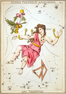
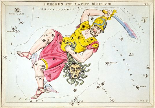 Plate 6: Perseus and Caput Medusæ
.jpg)


.jpg)
.jpg)
.jpg)
.jpg/Nom_2)
_A_set_of_five_prints_for_the_Hisakataya_poetry_c..._-_Google_Art_Project.jpg)
.jpg)
- Reason
- I don't want to put up thirty-some images at once, so I'm trying to provide reasonable groupings. Some of the parts of the sky form patterns related to their mythology or nature. For instance, The Sea, or Orion fighting Taurus to rescue the Pleiades, or, for our antipodean friends, Chamaeleon eating Musca, or Centaurus fighting Lupus. One grouping involves the myth of Perseus and Andromeda, both them and Andromeda's parents all appearing next to each other in the sky, which is today's nomination. Interestingly, an inability to properly put clothes on one's upper body runs in Andromeda's family.
- Articles in which this image appears
- All are in Urania's Mirror, each is also used in their respective constellations as linked, except Andromeda is not used in Triangulum.
- FP category for this image
- I believe they've been getting put into Wikipedia:Featured pictures/Artwork/Others, though I suspect that, by the time the set's done, we should consider giving it a new category.
- Creator
- Sidney Hall and Richard Rouse Bloxam, restoration by Adam Cuerden.
- Support as nominator --Adam Cuerden (talk) 05:30, 19 March 2014 (UTC)
- Support: useful, resolution is good, colors are nice, can be used individually (which helps put space between complaints about birds). — Crisco 1492 (talk) 09:32, 19 March 2014 (UTC)
- Support Saffron Blaze (talk) 21:08, 19 March 2014 (UTC)
- Support good images; it's too bad most people will likely pass over it - just one of these things you glance over and just move on. (I accidentally did that in your other nomination (Plate 10 and 27)). --CyberXRef☎ 02:42, 20 March 2014 (UTC)
- Support Nice colors, good restoration.--Godot13 (talk) 15:41, 20 March 2014 (UTC)
- Support Some are sharper than others for some reason, but very interesting indeed. – Kerαunoςcopia◁galaxies 17:22, 22 March 2014 (UTC)
- @Keraunoscopia: The LoC scans do vary a bit in quality, but keep well above the limit. Given it's about 450dpi, it's acceptable, I think. Though two images (not nominated yet - Cancer and Leo) were scanned much later at 600 dpi, and you'll definitely notice the difference between the more modern LoC equipment. Also, some of the variation is likely down to how much of the light blue paint was used, and - since there's a tendency for darker lines to appear sharper - the amount of fading and the exact settings I ended up with will matter. Adam Cuerden (talk) 19:42, 22 March 2014 (UTC)
- For the record, there's four more sets left: The Sea, The Cat and the Dog, Around the Pole, and Constellations of the Ecliptic. They're rough groupings, of course, and will exclude anything already promoted, and Orion and Pegasus will be excluded simply because the LoC hasn't yet scanned them - I've sourced substitutes, but they're under-resolution. Adam Cuerden (talk) 19:46, 22 March 2014 (UTC)
Promoted File:Sidney Hall - Urania's Mirror - Cassiopeia (image right side up).jpg --Armbrust The Homunculus 05:30, 29 March 2014 (UTC)
Promoted File:Sidney Hall - Urania's Mirror - Cepheus.jpg --Armbrust The Homunculus 05:30, 29 March 2014 (UTC)
Promoted File:Sidney Hall - Urania's Mirror - Gloria Frederici, Andromeda, and Triangula.jpg --Armbrust The Homunculus 05:30, 29 March 2014 (UTC)
Promoted File:Sidney Hall - Urania's Mirror - Perseus.jpg --Armbrust The Homunculus 05:30, 29 March 2014 (UTC)
- I added the images to Wikipedia:Featured pictures/Space/Understanding (and moved the others there too). Armbrust The Homunculus 05:30, 29 March 2014 (UTC)
Charles Dana Gibson (1902) Studies in expression. When women are jurors
Voting period is over. Please don't add any new votes. Voting period ends on 30 Mar 2014 at 04:41:49 (UTC)
_Studies_in_expression._When_women_are_jurors_(compressed).jpg)
- Reason
- High-res scan of the original drawing for a cartoon by Charles Dana Gibson, one of the premier cartoonists of the late-19th–early-20th centuries. Famous for his Gibson Girl, this cartoon shows the range of types and expressions Gibson was capable of. Gibson's signature hatching is clearly reproduced.
- Articles in which this image appears
- Charles Dana Gibson, Women in United States juries
- FP category for this image
- Wikipedia:Featured pictures/Artwork/Others
- Creator
- Charles Dana Gibson
- Support as nominator --Curly Turkey (gobble) 04:41, 20 March 2014 (UTC)
- Support, though I find that this has more EV in Gibson's article than in Women in United States juries (which desperately needs expanding). — Crisco 1492 (talk) 13:18, 20 March 2014 (UTC)
- I have no idea why the LoC let this happen, but they cropped off the left and right edges of the artwork. That's the LoC's fault, though. Weak oppose, but this really is a heartbreaker. Adam Cuerden (talk) 16:00, 20 March 2014 (UTC)
- Oppose - It is blurry down the edges, and the containing border drawn by the artist and integral to the artwork has been removed. So has part of the figure to the left. Also, it is seen here on a stark white background. These images were originally o paper with an ivory or buff tint. The artist composed for a coloured background, not for a white background. Amandajm (talk) 10:01, 23 March 2014 (UTC)
- Oppose per Adam Cuerden and Amandajm. Lewis Hulbert (talk) 11:44, 24 March 2014 (UTC)
Not Promoted --Armbrust The Homunculus 04:51, 30 March 2014 (UTC)
Palau de la Música Catalana
Voting period is over. Please don't add any new votes. Voting period ends on 30 Mar 2014 at 13:26:06 (UTC)

- Reason
- The photo perfectly illustrates the architecture and layout of the main feature of the historic building. It is technically superb: well composed, brilliant colours, perfect focus.
- Articles in which this image appears
- Palau de la Música Catalana
- FP category for this image
- Wikipedia:Featured pictures/Places/Interiors
- Creator
- Jiuguang Wang
- Support as nominator --Rwxrwxrwx (talk) 13:26, 20 March 2014 (UTC)
- Weak Oppose. I wouldn't say it's technical superb. In fact, it's quite technically flawed in my opinion. It's a really interesting scene and compositionally it's fine, but there is a lot of chromatic aberration on the sides, the stained glass is washed out and has blown highlights and the shadows are a little dark and muddy. I'm quite biased towards these sort of photos as I've been doing a lot of similar photography recently. I put quite a lot of work into mosaic-stitched, HDR tone mapped post processing to get my images looking crisp and clean, and I just don't think this image matches those standards. I'm not saying every image needs a similar level of complexity for me to support it, but some scenes such as this one, with stained glass, really cry out for that kind of processing. Ðiliff «» (Talk) 09:45, 21 March 2014 (UTC)
- Oppose — Colors look artificial. Sca (talk) 00:55, 25 March 2014 (UTC)
- Weak Support — The lighting is a little uneven, but otherwise great photograph. Sanyambahga (talk) 06:39, 26 March 2014 (UTC)
Not Promoted --Armbrust The Homunculus 15:49, 30 March 2014 (UTC)
Siproeta stelenes
Voting period is over. Please don't add any new votes. Voting period ends on 30 Mar 2014 at 23:11:32 (UTC)

- Reason
- High resolution and quality. Featured on Commons and the German Wikipedia. Flies past the bug bar.
- Articles in which this image appears
- Siproeta stelenes
- FP category for this image
- Wikipedia:Featured pictures/Animals/Insects
- Creator
- Böhringer Friedrich
- Support as nominator -- — Crisco 1492 (talk) 23:11, 20 March 2014 (UTC)
- Support Jee 16:19, 21 March 2014 (UTC)
- Support Adam Cuerden (talk) 05:12, 26 March 2014 (UTC)
- Support - Sanyambahga (talk) 06:33, 26 March 2014 (UTC)
- Weak oppose. I'm going to go against the grain on this one. I've looked at it a few times and never been entirely happy with it. I think I know why now. The focus is slightly off (it appears sharp only on one small part of the middle of the wing), and depth of field is more limited than (IMO) it needs to be, which further exacerbates the issue. It was taken at f/6.3 and I think f/8 or f/11 would have been more appropriate, especially given lighting conditions. It was only taken at ISO 200. It could have been bumped as high as ISO 800 without becoming too noisy, which would have allowed a much more suitable aperture for getting as much of the butterfly in focus as possible. Ðiliff «» (Talk) 10:33, 28 March 2014 (UTC)
- Support - I want this!! Herald 15:09, 28 March 2014 (UTC)
Promoted File:Malachitfalter, Bambuspage, Siproeta stelenes 3.JPG --Armbrust The Homunculus 23:13, 30 March 2014 (UTC)
Grey Go-away-bird
Voting period is over. Please don't add any new votes. Voting period ends on 31 Mar 2014 at 14:14:10 (UTC)

- Reason
- Nice image, good quality and high EV
- Articles in which this image appears
- Grey Go-away-bird
- FP category for this image
- Wikipedia:Featured pictures/Animals/Birds
- Creator
- Hans Stieglitz
- Support as nominator --Tomer T (talk) 14:14, 21 March 2014 (UTC)
- Comment Is it just me, or does the image look a little noisy or artefacted? It's a very good image, but I'm not quite sure if there's something odd about it at full resolution. Adam Cuerden (talk) 03:29, 22 March 2014 (UTC)
- It looks to me like the uploader didn't get rid of the ISO noise. — Crisco 1492 (talk) 09:33, 22 March 2014 (UTC)
Not Promoted --Armbrust The Homunculus 14:16, 31 March 2014 (UTC)
Gonepteryx rhamni
Voting period is over. Please don't add any new votes. Voting period ends on 31 Mar 2014 at 14:19:11 (UTC)

- Reason
- Good quality and high EV. Commons FP and QI.
- Articles in which this image appears
- Gonepteryx rhamni, Gonepteryx
- FP category for this image
- Wikipedia:Featured pictures/Animals/Insects
- Creator
- H. Krisp
- Support as nominator --Tomer T (talk) 14:19, 21 March 2014 (UTC)
- Weak oppose - Animal is partially obscured. — Crisco 1492 (talk) 15:33, 21 March 2014 (UTC)
- Support Perfect angle of view. Abdomen of butterflies usually hidden in closed wing position. (Yellows always rest with wings closed, even during basking. They just turn around to face the sun with one side after other.) So the obscured parts are very minimal. Jee 16:18, 21 March 2014 (UTC)+
- Support Adam Cuerden (talk) 15:55, 26 March 2014 (UTC)
- Oppose. I agree with Crisco, but it's not just because it's partially obscured. I know it's difficult to get all the important parts of butterflies in focus, but the angle also is poor IMO. Looking straight into the grass makes the composition pretty messy, and the focus is not great. Taken at 1/13th of a second, the antennae are a little motion blurred (minor issue, but contributing). Also, I think it's slightly overexposed. I've looked at other photos and it always tends to be a very light yellow-green, but this one seems a little more so. It's a nice photo and obviously illustrates the article satisfactorily but I don't think it's featureable. Ðiliff «» (Talk) 10:42, 28 March 2014 (UTC)
Not Promoted --Armbrust The Homunculus 14:19, 31 March 2014 (UTC)
Dizzee Rascal
Voting period is over. Please don't add any new votes. Voting period ends on 31 Mar 2014 at 14:25:47 (UTC)

- Reason
- Quite good concert picture, nice expression, quality image in Commons
- Articles in which this image appears
- Dizzee Rascal
- FP category for this image
- Wikipedia:Featured pictures/People/Entertainment
- Creator
- Achim Raschka
- Support as nominator --Tomer T (talk) 14:25, 21 March 2014 (UTC)
- Weak support - Noisy at full size, and the blown highlights on his face stick out bad... but a very useful image, and nice pose. — Crisco 1492 (talk) 15:42, 21 March 2014 (UTC)
Not Promoted --Armbrust The Homunculus 14:25, 31 March 2014 (UTC)
Diploria strigosa
Voting period is over. Please don't add any new votes. Voting period ends on 31 Mar 2014 at 14:42:00 (UTC)
_closeup.jpg)
- Reason
- Nice underwater picture of the pattern of Diploria strigosa, with good quality and high EV
- Articles in which this image appears
- Diploria strigosa, Patterns in nature
- FP category for this image
- Wikipedia:Featured pictures/Animals/Cnidaria
- Creator
- Nhobgood
Not Promoted --Armbrust The Homunculus 14:43, 31 March 2014 (UTC)
Paysandisia archon
Voting period is over. Please don't add any new votes. Voting period ends on 31 Mar 2014 at 14:50:43 (UTC)

- Reason
- Good quality and high EV
- Articles in which this image appears
- Paysandisia archon
- FP category for this image
- Wikipedia:Featured pictures/Animals/Insects
- Creator
- Archaeodontosaurus
- Support as nominator --Tomer T (talk) 14:50, 21 March 2014 (UTC)
- Support - Lighting is a bit harsh, but to be expected from a nocturnal species. — Crisco 1492 (talk) 15:48, 21 March 2014 (UTC)
- Support Adam Cuerden (talk) 15:58, 26 March 2014 (UTC)
- Support Jee 17:30, 26 March 2014 (UTC)
- Oppose. I feel like I'm shooting down all the insect FPCs at the moment. :-( The lighting is a bit harsh, agreed, but the aperture used is also terribly inappropriate. f/29! This results in extremely soft details of the moth due to diffraction. Viewing the image at 100%, it looks rather strange. Ðiliff «» (Talk) 10:52, 28 March 2014 (UTC)
- Support - Disagree with Diliff.. Herald 15:10, 28 March 2014 (UTC)
Promoted File:Paysandisia archon MHNT Dos Vif Fronton.jpg --Armbrust The Homunculus 14:51, 31 March 2014 (UTC)
Clarendon Building
Voting period is over. Please don't add any new votes. Voting period ends on 31 Mar 2014 at 22:09:05 (UTC)

- Reason
- high quality and EV
- Articles in which this image appears
- Clarendon Building (most EV), Nicholas Hawksmoor
- FP category for this image
- Wikipedia:Featured pictures/Places/Architecture
- Creator
- Diliff
- Support as nominator --Armbrust The Homunculus 22:09, 21 March 2014 (UTC)
- Support - Centered subject, good lighting, colours and details. ///EuroCarGT 02:37, 22 March 2014 (UTC)
- Comment - It shows the building clearly, but Nicholas Hawksmoor (one of Britain's greatest architects) would have a fit if he were to see that his carefully contrived "perspective adjustments" could all be undone (without even demolishing the building). The curve that was on the outer pilasters is is known as entasis. They appeared to lean slightly inwards because they do lean slightly inwards. That is what an architect would call "perspective adjustment". The moment that you straighten the lines of a Classical building, you have diminished its aesthetics.
- Presumably, in this case, it was impossible to take a whole photo that did justice to the building. However, stitching the shots together requires looking very hard at what the building actuallly does. What is straight and parallel, and what is not straight and parallel? One of the results of straightening the lines has been to make the cornice top-heavy. Don't over compensate. Amandajm (talk) 09:00, 23 March 2014 (UTC)
- Support - picture perfect for me. Sanyambahga (talk) 06:32, 26 March 2014 (UTC)
Opposeper Amandajm. Adam Cuerden (talk) 16:03, 26 March 2014 (UTC)- I don't mean to start an argument with you Adam, but as I've explained numerous times in other nominations to Amandajm, I believe that her arguments against correcting vertical lines to be poppycock, generally speaking. She has an understanding of architectural history but not of perspective as it relates to geometry and photography, in my opinion, and this clouds her judgement on architectural photography. If you examine the photo in detail, you will see that the 'inwards leaning columns' do actually still lean inwards so I don't see how this image misrepresents the columns in significant way. The correction I made was based on the outer walls (which as far as I know, do not curve inwards as the columns do). Also, I'm concerned that Amandajm has made claims about this building's design that have not been demonstrated with a source. Certainly there is no information in the article about how exactly the building was designed and what Ancient Greek architectural principles were applied, so claiming that the Parthenon has curves does not prove that this building does. In any case, it could well be argued that correcting verticals actually shows the building's geometry more accurately than an uncorrected image. If the image were uncorrected, you would see inward leaning verticals but you could not determine easily if they were leaning inwards due to the camera's perspective, or because they actually do lean inwards in reality. Anyway, with critics like these, it's impossible to please everyone. All perspectives, projections and corrections require compromises. There is no one perfect view, and certainly not when the photographer is limited in the locations he can shoot from. One can never step back far enough from the subject to remove perspective distortion from architectural photography. It needs to be allowed for. Ðiliff «» (Talk) 10:10, 27 March 2014 (UTC)
- You're probably right, though I don't know Hawksmoor's work well enough to judge in that case. Striking my vote, but not replacing it. Adam Cuerden (talk) 11:17, 28 March 2014 (UTC)
Not Promoted --Sven Manguard Wha? 22:20, 31 March 2014 (UTC)